A Brief Revolution @ the Photographers’ Gallery

The Architectural Review is a monthly international architectural magazine. It was founded in London in 1896 and does what its title suggests, covering all aspects of the built environment.

Manplan

Just over 50 years ago, in 8 issues from September 1969 to September 1970, the Review ran a series of eight specially commissioned reports on the state of architecture at the end of the 1960s. It was to review not just architecture in the narrow sense but the entire state of town planning, in an age when old Victorian slums were being torn down to make way for gleaming new towns made of high-rise towers, medium-rise blocks characterised by lifts and concrete walkways, subways under sweeping new ring roads, nicely laid-out grassed areas and so on.

The Review’s editors called the series of articles ‘Manplan’ and hired leading photojournalists and street photographers to address a set of eight themes, being:

  1. Frustration
  2. Travel and communication (‘Society is its contacts’)
  3. Town Workshop
  4. Education (‘The continuing community’)
  5. Religion
  6. Health and Welfare
  7. Local government
  8. Housing

The result was a series of brilliant photos shot on a 35mm camera in a spirit of photo-reportage – vivid and dramatic black-and-white works which captured a nation in the midst of great social, cultural and environmental change. To the horror of some of its contributors and readers, the magazine turned its back on large-format, heroic photography of buildings and their details, instead embracing a grainy, 35mm black-and-white reportage aesthetic, where people were as, if not more, important than the places. In the words of The Royal Institute of British Architects, publishers of the Architecture Review:

The aim was to propose an alternative and more holistic approach to urban planning, which would look at all basic human needs as a whole. The photographs illustrating the issues were created in the spirit of photo reportage and often featured people inhabiting the spaces studied by the survey, thereby shifting the focus from the architecture itself to the human element within the built environment.

So it was intended to be polemical stuff. The photographers were:

  • Ian Berry
  • Tony Ray-Jones
  • Tim Street-Porter
  • Patrick Ward

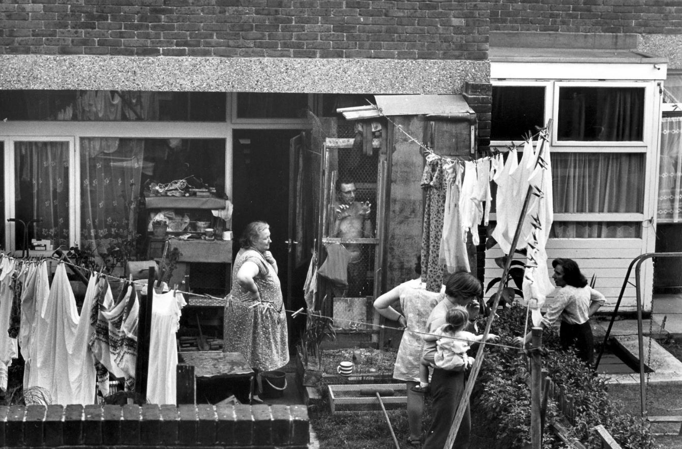
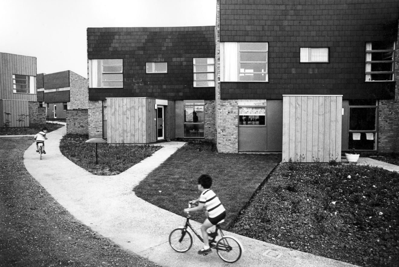
Altogether the Architectural Review published about 80 photographs. Just 16 are on display here, but every single one of them is a masterpiece; there’s no slack. Each one is a densely packed, highly charged vignette. This exhibition isn’t big but it is packed with social history, with memories and nostalgia for a time within the living memory of many but feeling evermore distant.

Design and layout

On a separate wall is a display of the actual copies of the magazine which the photo-essays appeared in, along with the words and designs of ‘Manplan’ editor Tim Rock and designers Michael Reid and Peter Baistow. This section goes into detail about how the photographs were processed, reproduced and printed (using ‘special matt black ink’) along with analysis of the layout and typography. All a bit over my head but interesting for students of design.

The photographs

Private terraced houses on the Old Kent Road opposite Camelot Street Estate, London by Tony Ray-Jones (1970) part of ‘Manplan 8: Housing’, in Architectural Review, September 1970. Courtesy Architectural Press Archive / RIBA Collections

Housing at New Ash Green, Kent by Tony Ray-Jones (1970), part of ‘Manplan 8: Housing’, in Architectural Review, September 1970. Courtesy Architectural Press Archive / RIBA Collections

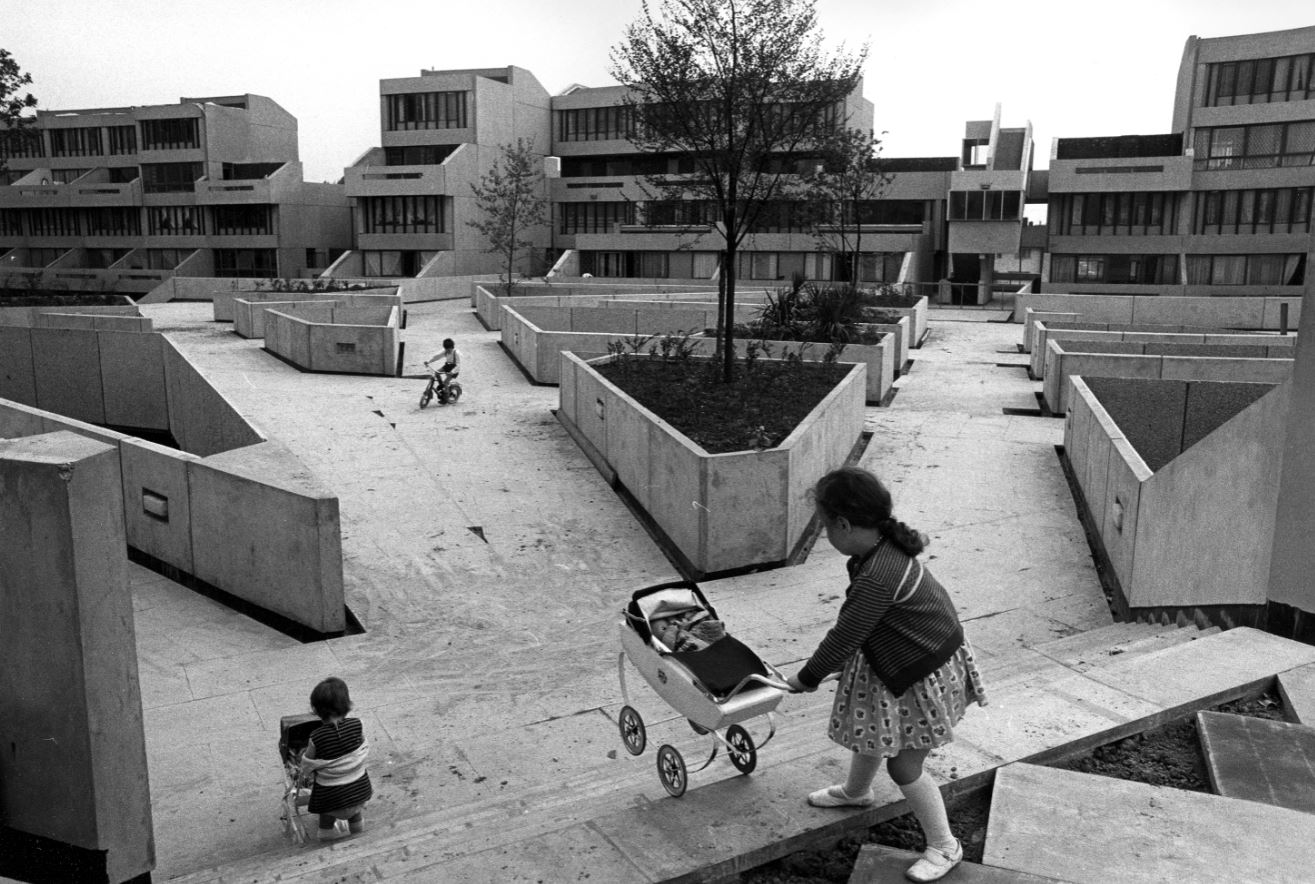
Low-rise housing, Tavy Bridge, Thamesmead, Greenwich, London, 1970 by Tony Ray-Jones, part of ‘Manplan 8: Housing’, in Architectural Review, September 1970. Courtesy Architectural Press Archive/RIBA Collections

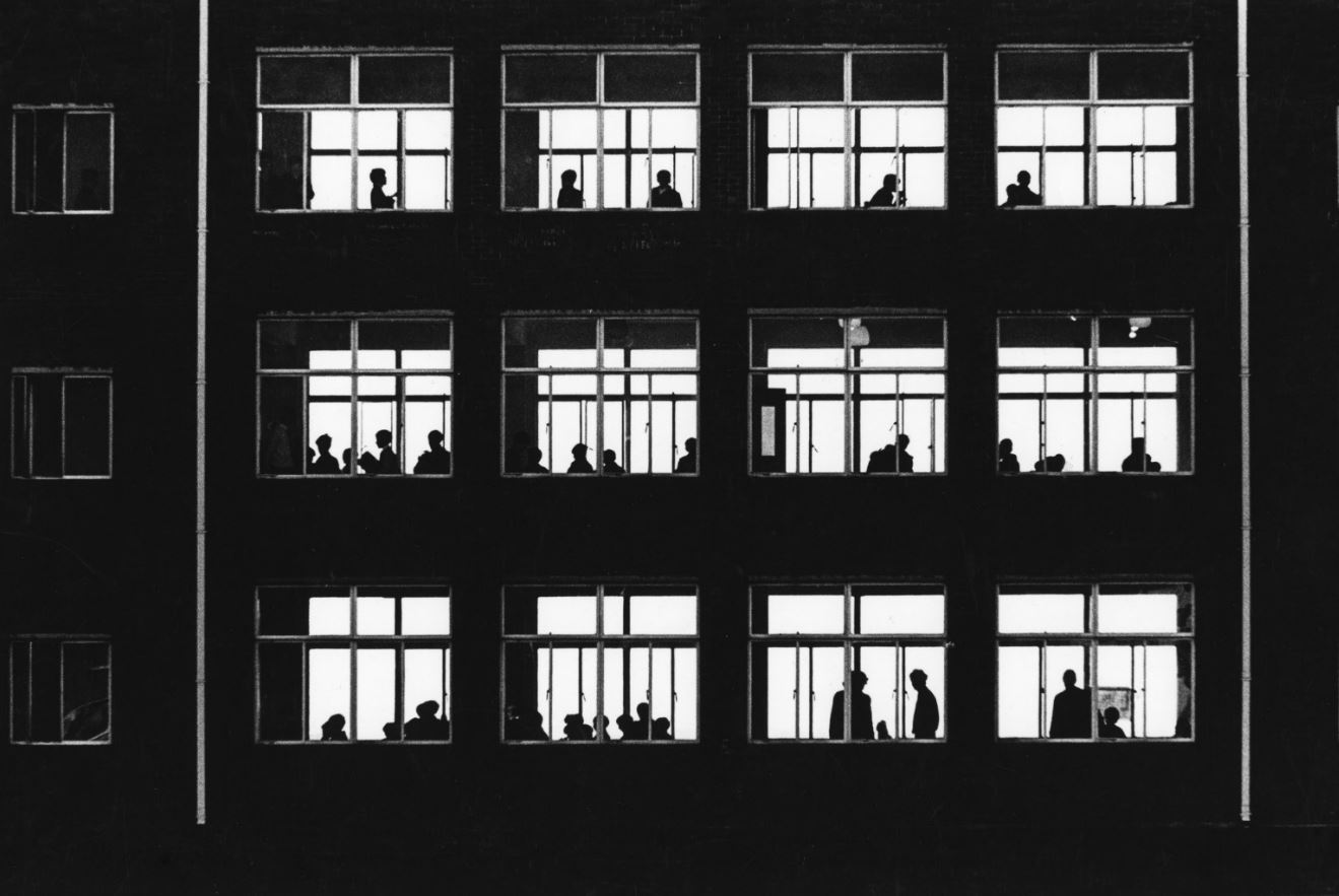
Classroom windows in a school in Wales, 1969 by unknown photographer, part of ‘Manplan 4: The continuing community (education)’, in Architectural Review, January 1970. Courtesy Architectural Press Archive / RIBA Collections

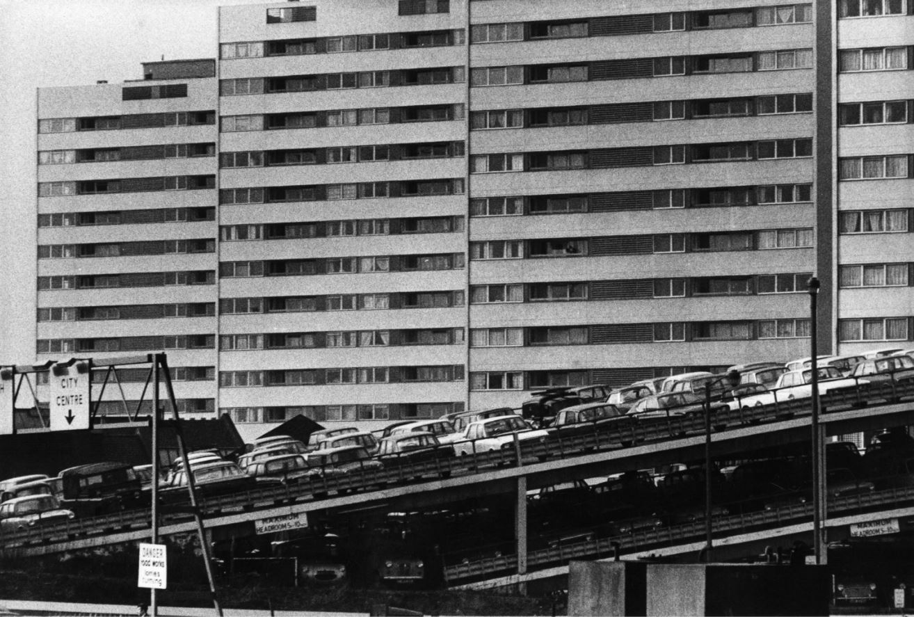
High-rise flats and multi-storey car park, Birmingham, 1970 by Peter Baistow, part of ‘Manplan 5: Religion’, in Architectural Review, March 1970. Courtesy Architectural Press Archive / RIBA Collections

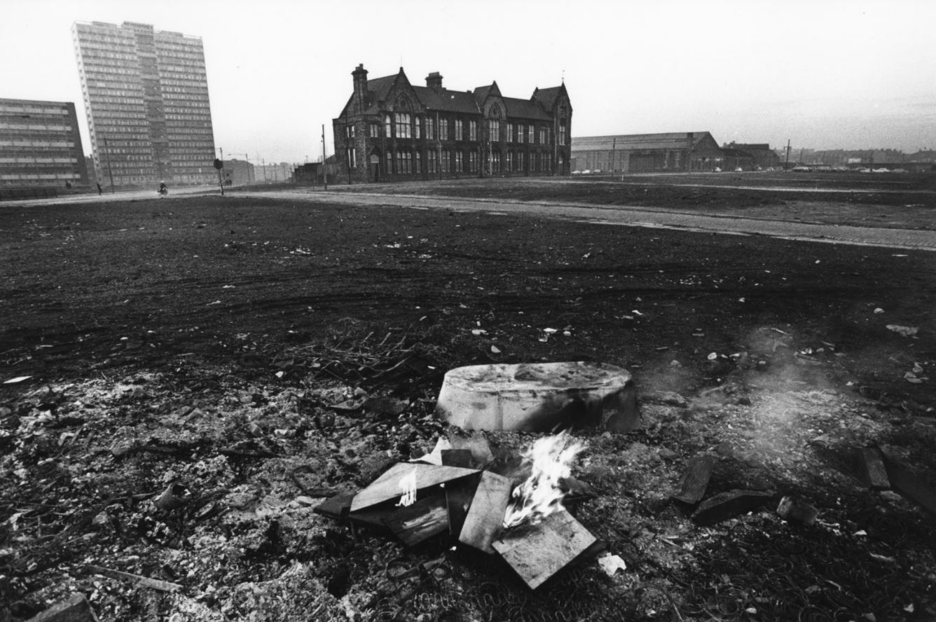
Chatsworth Street school and high-rise housing block overlooking the cleared site, Liverpool, 1969 by Tom Smith, part of ‘Manplan 4: The Continuing Community (education)’ in Architectural Review, January 1970. Courtesy Architectural Press Archive / RIBA Collections

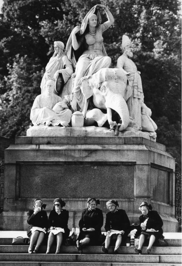
Salvation Army officers picnicking on the steps of the figure group Asia by J H Foley, Albert Memorial, Kensington Gardens, London, 1969 by Peter Baistow, part of ‘Manplan 5: Religion’, in Architectural Review, March 1970. Courtesy Architectural Press Archive/RIBA Collections

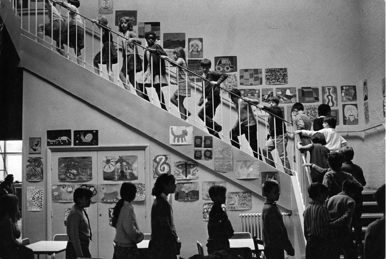
Unidentified primary school, 1969 by unknown photographer, part of ‘Manplan 4: The continuing community (education)’, in Architectural Review, January 1970. Courtesy Architectural Press Archive / RIBA Collections

Thamesmead film

To one side of the 16 framed photos on the wall, is a TV monitor showing a film from around the same time (in fact the year before the project, 1968). So far as I can tell it’s not directly connected with RIBA or the Manplan project except for the slender link that one of the 80 Manplan photos happens to cover the same subject as the film, namely the new estate being built at Thamesmead.  So it wasn’t directly related to the Manplan project but gives context to the kind of architectural and town planning thinking which was going on at the time of the Manplan project.

Directed by Jack Saward, this 25-minute public education film gives an overview of the history and construction of Thamesmead, a sort of new model suburb built down the River Thames from London on the site of the old Royal Arsenal, a site that extended over Plumstead Marshes and Erith Marshes.

Alas, to quote the introduction to the video on YouTube:

The ambition is commendable but it didn’t quite work in practise, with Thamesmead becoming a notoriously problematic estate and its architects perceived as exhibiting many of the faults of post-war planning, with communities being tinkered with from above like a real-life experiment. This is where utopia meets authoritarianism.

Hard to believe, but the planners that designed the place provided insufficient transport links with London, no way of crossing the Thames for 5 or 6 miles in either direction and – best of all – an almost complete lack of shopping facilities and banks. Lots of pretty little lakes but…nowhere to buy food. According to the label in the exhibition, the estate ‘was soon plagued by social problems caused by lack of facilities and public transport’.

The half-built estate won an unwanted fame when American film director Stanley Kubrick used parts of it as the setting for his notoriously violent 1971 movie, A Clockwork Orange, a vision of an alienated, dystopian society. Here’s the photo of it taken by the brilliant Tony Ray-Jones which provides a sort of coincidental link between the Manplan series and the film.

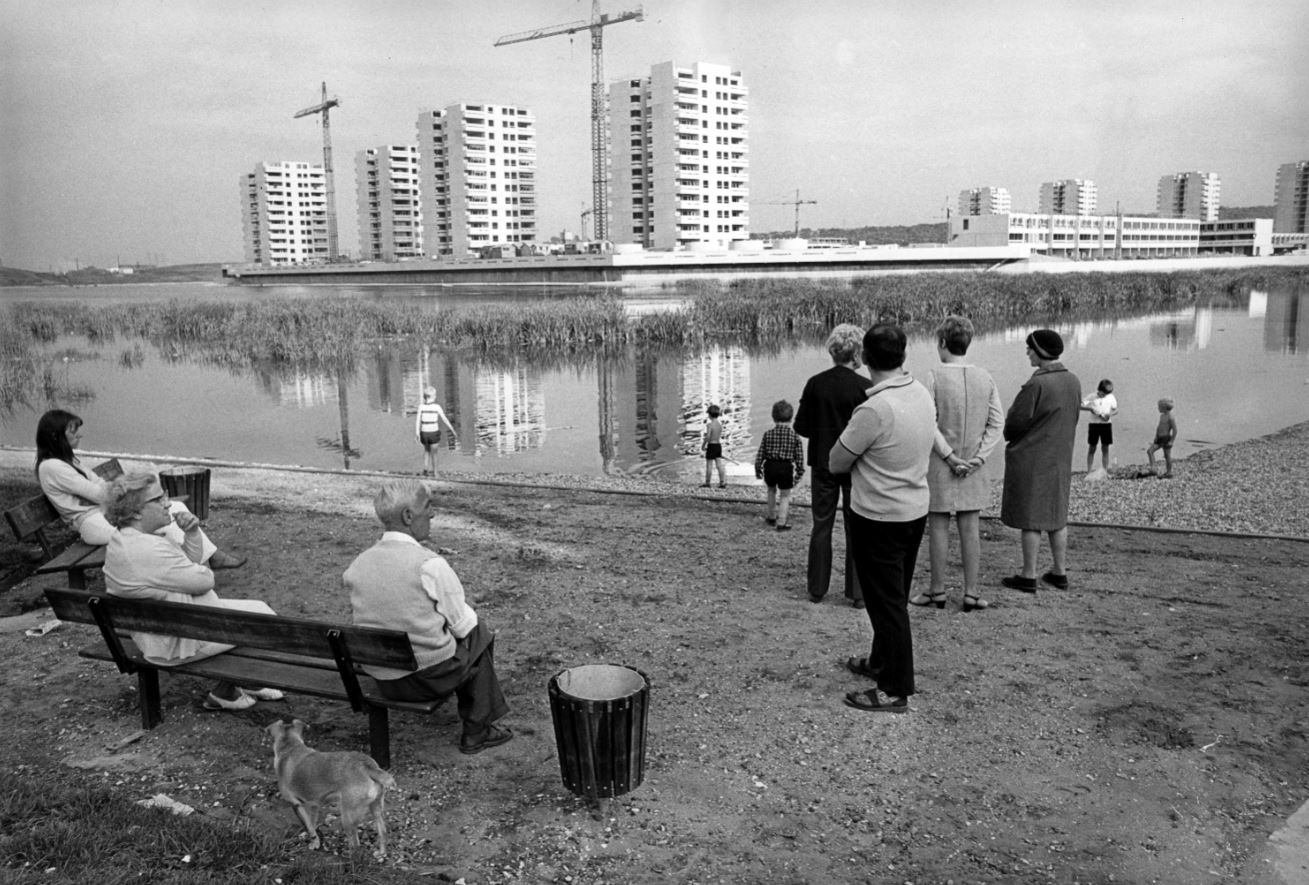
Thamesmead under construction, Greenwich, London, 1970 by Tony Ray-Jones in ‘Manplan 8: Housing’, Architectural Review, September 1970. Courtesy Architectural Press Archive / RIBA Collections

Which do you prefer? Which do you think is telling the truth, the film or the photo?

The Robert Elwall Photographs Collection

All the materials for the Manplan exhibition, photos and old copies of the AR magazine, come from the Robert Elwall Photographs Collection. This comprises around 1.5 million images from the earliest days of photography to the present day. The collection includes photographic archives of individual architects and practices, travel and topographic images from across the world, press photographs from major architectural journals, and large bodies of work by some of the best known architectural photographers of the 20th century. The collection includes prints, negatives, slides, transparencies, photographically illustrated books and digital files. It is itself part of the larger Royal Institute of British Architects collections.

Conclusion

Flicking through some of the text on the walls is a dispiriting experience. These 1970 writers were raging against the soulless design of modern cities, the daily struggle of commuting to work on overcrowded public transport, against air pollution, excess traffic and the destruction of the environment, against the dominance of the car over human-friendly spaces, against the dehumanising effects of modern technology, against social inequality and the lack of social housing, against the prioritising of profit over people.

It’s as if, 53 years later, nothing has changed except we all have smart phones to share our frustration about how things obstinately carry on being rubbish. The Manplan writers’ rage and frustration is captured by this, the last entry in the exhibition.

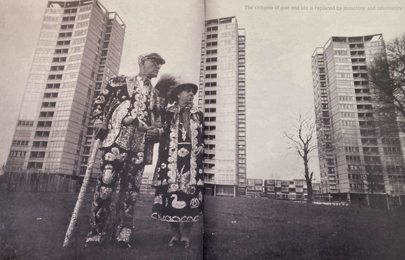
Double page spread from Manplan 1. ‘Frustration’

It’s a copy of the original magazine, open to a double page spread showing a traditional Pearly King and Queen standing in front of the typically sterile, barren waste ground surrounding a clutch of looming, threatening tower blocks. Up in the top right is a text reading: ‘The richness of East End life is replaced by monotony and inhumanity.’

Yep. that’s the world I grew up into and which punk rock, with its angry nihilism, was a direct response to. Eternal shame on England’s architects and town planners.


Related links

More Photographers’ Gallery reviews

The Great British Seaside @ the National Maritime Museum

‘Don’t take boring photos’
(Tony Ray-Jones)

To my shame I hadn’t been to the National Maritime Museum since it added a new exhibition wing back in 2011. The new wing is a startlingly modern, light, bright and airy building with a number of galleries showing the history of the Royal Navy through the centuries across two floors.

The temporary exhibition space is down some wide stairs (or you could take the swish glass lift) into a light airy reception area, then through swing doors and into half a dozen large, well-lit rooms.

The Great British seaside

It’s a simple idea. Bring together photos of the British seaside by four great English photographers of the past forty years or so. To quote the exhibition blurb:

From the abandoned piers to the dazzling arcades, celebrate the British seaside through the lenses of Britain’s most popular photographers, featuring Tony Ray-Jones, David Hurn and Simon Roberts and new work by Martin Parr.

Examine the ambiguities and absurdities of seaside life through this major exhibition of over 100 photographs. All four photographers share a love of the seaside which reveals itself in playful and often profound representations of the British by the sea while still bringing their own distinctive take on the seaside experience.

Ray-Jones gives us a social anthropologist’s view, Hurn’s is a nostalgic love letter to the beach, Parr provides an often-satirical examination of class and cliché while Roberts explores our collective relationship with, and impact on, the coast.

The Great British Seaside includes images from the archival collections of each of the photographers, new films, and new work by Martin Parr.

Tony Ray-Jones (1941 to 1972) 20 photos

Three years ago the Science Museum held an exhibition, Only in England, which featured black and white photos by Tony Ray-Jones, and was curated by Martin Parr. Both there and here, Ray-Jones emerges as a brilliant, inspiringly acute observer of the quirks and oddities of the English. A big wall label quotes his aim:

‘I have tried to show the sadness and the humour in a gentle madness that prevails in a people.’

In the mid-60s Ray-Jones set off on a two-year-long mission in a camper van to capture the oddness of English life: he was worried about the creeping Americanisation infecting English life (as, I think, every generation since about 1920 has been) so he wanted to capture in photographs the enduring and endearing qualities of the English before they disappeared.

The result is a treasure trove of black and white images of the English bravely enduring the grim weather, cobbly beaches, and freezing winds of their inhospitable seafronts.

Eastbourne, East Sussex c.1968 © Tony Ray-Jones. National Science and Media Museum

Eastbourne, East Sussex c.1968 © Tony Ray-Jones. National Science and Media Museum

Ray-Jones’s images show working class people wearing thick clothes, in respectable haircuts or wearing cloth caps, the women in shawls and cardigans, gathered into protective groups, munching on sandwiches, sharing round the thermos flasks of tea, squashed into deckchairs, with a tin of Fray Bentos corned beef part of the general picnic.

There’s an image of one old man wearing a thick suit and shirt, a cloth cap on his head, with his trousers rolled up, standing in seawater up to his knobbly knees. Ah, the English!

The overwhelming impression is that the English don’t know what to do with their seaside. They treat it as in inconvenience which has somehow invaded their living rooms – so the old ladies on show here have clustered together behind their tied-together windbreaks, put on extra layers to keep warm, and continued knitting or reading the paper as if they were still indoors.

For the most part, the adults don’t know how to dress or behave. A million miles away from being ‘beach body ready’, the old boys figured here are still wearing their best suits, the old ladies their necklaces and even decorative hats.

Only the kids, the under-12s, have a clue. For some reason they are licensed to wear swimming trunks and actually go into the sea. Maybe it was seen as a childish thing to do while the old (who look really, really, really old) paddle in the shallows or warm up another brew on the carefully protected gas heater.

A handful of pictures of badly dressed, long-haired teenagers snogging on the beach under the disapproving stare of a deckchair attendant make you realise this is not the 1930s or 40s. These young lads could be Mods, but even their provincial gracelessness makes you realise what a long, long time it took for the shiny London fashions and liberal attitudes of the 1960s to penetrate beyond the bright lights of Swinging London.

Here’s a trendy young woman making herself at home on the horribly cobbly beach at Brighton and playing singles on her Dansette portable record player. I wonder what the singles are. More importantly, and so English, she is on a seafront beach fully clothed.

Brighton, East Sussex c.1967© Tony Ray-Jones, National Science and Media Museum

Brighton, East Sussex c.1967 © Tony Ray-Jones, National Science and Media Museum

David Hurn (b.1934) 20 photos

The Museum has taken a lot of time and trouble to stage the exhibition, including a number of humorously seaside-themed accessories, for example a little flowerbed width of white cobbled stones in front of some of the exhibition walls.

Among these features is a ‘Seaside Cinema’, a kind of fairground booth decorated with pavilion-style stripes and its name beaming out in shiny fluorescent lights. It has one or two life sized stuffed seagulls perched on the walls. Alas, it is not showing ‘What the Butler Saw’ or other saucy seaside entertainment, but the rather more worthy content of four 3-minute videos, one for each of the photographers in the show.

These films turn out to be extremely useful, revealing insights into the biographies and approaches of the three surviving photographers, in particular. YouTube has a brief selection of clips from them which give you a good flavour.

In his video interview, David Hurn emphasises his own working class roots in the coal mining community of South Wales. He was born in 1934 in the depths of the Great Depression and he remembers as a small boy how the mines used to close for two weeks for safety and repairs and so entire workforces and their families went on holiday at the same time. He remembers whole villages catching trains down the valley to the coast en masse.

Thus some of his photographs feature people who he knew all lived in the same street, for example a classic photo of a group of twenty or so fully dressed adults who have created a circular windbreak and are all huddling against the chill wind on an otherwise deserted beach. They’ve paid for their holiday in windy Aberavon and they’re damn well going to enjoy it.

Whistling Sands, Pothoer, Aberdaron, 2004© David Hurn / Magnum Photos

Whistling Sands, Pothoer, Aberdaron, 2004 © David Hurn / Magnum Photos

Possibly his most striking photo is of an attractive young woman in a bikini lighting a cigarette, watched by a more traditional family who are slouched, fully dressed, against a wooden groyne. It is a striking image in itself but lends itself to numerous interpretations. The old boy and his wife are looking on disapprovingly, the adult son is looking on with – shall we guess – lust in his heart, his wife can’t be bothered. And bikini-ed babe herself? Represents a kind of Julie Christie breaking free of the shackles and limitations of grim, repressed English physicality.

Herne Bay, Kent 1963 © David Hurn / Magnum Photos

Herne Bay, Kent 1963 © David Hurn / Magnum Photos

Martin Parr (b.1952) 41 photos

Why has Parr got twice as many photos as the other three? This becomes clear when you walk into the room titled ‘The Essex Seaside’ where a wall label explains that the National Maritime Museum commissioned Parr in 2017 to take photos of London’s beach resorts i.e. the ones within easy train journey of London. Whitstable, Margate and Ramsgate on the North Kent coast suggest themselves, let alone the obvious Brighton, but Parr ended up concentrating on resorts along the Essex coast of the Thames Estuary.

Hence there is a room giving a selection of his seaside photos – like the other three – PLUS this extra room devoted to 20 photos from the Essex seaside project.

COLOUR

But the most important development is that, as you enter the Martin Parr section, the exhibition changes from the black-and-white and fairly standard print size of Ray-Jones and Hurn, into a new world of vivid colour and BIG prints.

Martin Parr is colour photography with a vengeance.

Margate 1986 © Martin Parr / Magnum Photos

Margate 1986 © Martin Parr / Magnum Photos

There’s no doubting that Parr’s images are big and bright and striking. But coming directly from looking closely at the grainy old images of Ray-Jones and Hurn gives the visitor a strong sense that with colour something is lost and something gained. I tried to figure out what and why:

BLACK AND WHITE

  • gives a a feeling of history, a mood of nostalgia, conjured by the old clothes, old hairstyles, old ‘looks’
  • black and white photos are somehow more homely, unthreatening, even inviting
  • in black and white photos all elements of the composition are equal; there is a kind of democracy of details – you are drawn to elements of the composition in structural or diagrammatic terms i.e. shapes and patterns, lines and shadows, are much more prominent or discernible

COLOUR

  • big colour photos undoubtedly have an advert-type ‘hit’, are more prone to deliver impactful images – but the downside is the loss of subtle integrated composition you get in black and white

The more I looked at Parr’s big professional photos the more I found the garish colours disparate, jarring and distracting. There’s a huge print of an Asian woman on a beach with her head leaned far back, finishing off a big green bottle of Sprite. Your eye is immediately startled, grabbed, overwhelmed by the greenness of the plastic bottle, and by the vivid colours of her husband’s top and her nearby son’s t-shirt.

After half an hour spent cultivating a sensitive approach to the subtle details in the works of Hurn and Ray-Jones, it is like someone has turned up the volume to earsplitting level.

Somehow, in colour photos like these, the main central image tends to shout, to dominate and drown out the wealth of smaller, minor details which are what make the black and white photos so quaint and – dare I say it – endearing, lovable almost.

Dorset from West Bay 1996 © Martin Parr / Magnum Photos

Dorset from West Bay 1996 © Martin Parr / Magnum Photos

Where black and white warmly invites you in, colour pushes the viewer away.

In his video interview in the ‘Seaside Cinema’, Parr makes a number of revealing points.

Experimentation

One is how, over the course of his career, he has experimented with different cameras and different lenses. Recently he has been using a long lens. This explains works like the massive print showing a woman in the centre of shot wearing dark sunglasses in which her entire face is strongly out of focus.

I didn’t like this photo at all, but can see how it forms part of a continuum of technical experimentation which might intrigue and instruct other photographers and students.

Cruelty

A few years ago I visited an exhibition of Parr’s work devoted to London’s annual Lord Mayor’s Show or, more specifically, to the bedraggled visitors and crowds who come up from the suburbs and out of town to line the route of the parade despite the fact that, the year in question, it was tipping down with rain.

It was in reviews of that exhibition that I first read the criticism that the clarity and detachment, and the vibrant colours which Parr uses, can often result in images with a harsh and even a humiliating clarity.

There is a ghost of contempt for his human subjects hovering around some of Parr’s big, unsparing photos of poor, fat, tasteless chavs and their pitiful seaside amusements. Something merciless.

Photography as therapy

This suspicion was confirmed by the video about Parr in the ‘Seaside Cinema’. An amiable, easy-going-sounding bloke, he explains that he has had a love-hate relationship with Britain all his life and that his photos are a sort of therapy which help him work through his feelings.

His comments really crystallise something about these big, garish, colour photos, which show the English in all their obesity and bad clothes, inhabiting a decayed world of derelict bus shelters and overflowing litter bins. Not very far beneath the surface briliance is contempt and, maybe, even despair at the wretched human condition.

None of the works by Ray-Jones nor Hurn make you feel that.

Simon Roberts (b.1974) 21 photos

The fourth ‘Seaside Cinema’ video, in effect an extended interview with Simon Roberts, is just as interesting and revealing, as he explains his approach, his aims and techniques.

Among other things, Roberts says that he likes to take photographs from above and to prove it we saw footage of him standing on the roof of his traveller van parked on some beachfront esplanade, and photgaraphing downwards onto the beach.

Cleethorpes Pier, North East Lincolnshire, 2012 © Simon Roberts, Courtesy of Flowers Gallery London

Cleethorpes Pier, North East Lincolnshire, 2012 © Simon Roberts, Courtesy of Flowers Gallery London

Raising his point of view like this means that many of his photos have not only a horizon and foreground but what he appeared to call a ‘midriff’.

In this central stretch of the image Roberts is at pains to look for narratives, stories and incidents. Thus, in the photo above, the pier provides the horizon and there’s the dad digging in the foreground who provides maybe the foreground focus of the image – but there’s a whole load of other small narratives going on all over the ‘midriff’, to distract and amuse and entertain the viewer.

The Roberts room is the final room of images and what became obvious was:

The size of the prints – some of them are simply huge, even bigger than Parr’s, several yards across

The emptiness – the example shown above is a relatively standard example of a seaside snap, with a pier and people in the sand – but a lot of Roberts’ images really aren’t actually like that at all. The best ones are Big and almost Empty. I realised after looking at them for a while that two things were going on on these bigger, more atmospheric works:

1. He has an almost classical regard for the horizon. There is almost always a horizon in his seaside photos and the horizon is always horizontal. Sounds obvious, but the horizon hadn’t been much of a concern for the previous three photographers; often the sea level was quite obviously wonky because the photographer was concentrating on the human subjects in the foreground.

Not so in Roberts’ work: in almost all his 21 photos there is a dead straight horizon and it is exactly parallel to the top and bottom of the frame, giving the whole thing a very composed and classical feel.

2. And the second thing is how many of his beaches are almost empty. Striking examples are:

Some of them are more cluttered with people, seafront roads and buildings than these two, but there were quite a few others which managed to transform the English beach into not only a surprisingly beautiful but even a haunting and spiritual location.

The progression of images

The human mind has evolved to find patterns even where there aren’t any.

I went back to the start and walked slowly back through the exhibition, noticing the progression from minutely detailed black and white sociological studies (Hurn and Ray-Jones) which reek nostalgia for a black and white 1960s, then turning into studies of long-haired layabouts from the 1970s – which suddenly and dramatically morphs into the big, brash, supercoloured images of Martin Parr, a vulgar brashness we might associate with Mrs Thatcher’s 1980s and Tony Blair’s 1990s – and then the show ends with a completely unexpected turn into Roberts’s genuinely haunting and spectrally beautiful images from the 2000s.

I don’t know if we can draw any conclusions at all from this progression, but that’s how it felt.

Effort and staging

I mentioned the tremendous effort the National Maritime Museum has gone to in order to make the staging and setting of this exhibition really special.

This photo shows you the ‘Seaside Cinema’ booth in the background (alas, you can’t see the stuffed seagulls) and a row of deckchairs laid out in front of some photos by Martin Parr.

Installation view of The Great British Seaside showing deckchairs facing two photos by Martin Parr with the Seaside Cinema in the background

Installation view of The Great British Seaside showing deckchairs facing two photos by Martin Parr with the Seaside Cinema in the background

Outside the exhibition itself, in the main ‘lobby’ area, they’ve gone to the trouble of creating a ‘British Seaside set’, complete with an enormous backdrop, two deckchairs and various blow-up plastic seaside toys, all designed for you to sit in with your mates and take selfies of each other.

The nearby gallery attendant kindly offered to take a photo of me and I was tempted for a moment to roll up my trousers and put in a knotted hankie for the occasion, like one of the old boys in a David Hurn photo, but managed to resist the temptation.

Installation photo of the selfie set outside the Great British Seaside (photo by the author)

Installation photo of the selfie set outside the Great British Seaside (photo by the author)

Conclusion

This is a very interesting and thought-provoking exhibition, on one level a sociological tour of the English and their seaside holidays, a social history of changing attitudes and seaside dress; on another level a selective history of the development of photographic technique and attitude over the last 50 years, taking the seaside as its guiding thread.

And, on a simpler level, it just contains lots and lots of beguiling, striking, brilliant, repellent and haunting photographs.

And the funkiest take-home message for any budding photographers?

In his video interview David Hurn says that one of the most important things he ever learned from Tony Ray-Jones was – to wear comfortable shoes. The good photographer, the really inquisitive, curious, exploratory and investigative photographer, is going to be on his or her feet for up to twelves hours a day in order to catch that perfect moment, that perfect shot.

By all means invest in good kit, in good cameras and lenses and the rest of it but also – Respect Your Feet!

The promotional video


Related links

The photographers’ websites

More photography reviews

Only in England @ the Science Museum

This is a fabulous exhibition of black and white photographs of ordinary English life in the 1960s and 70s. It’s divided into three sections:

  1. Photos of English life by pioneering b&w photographer Tony Ray-Jones, taken 1965 to 1969.
  2. Early photos by English photographer Martin Parr, from his first work, The Non-Conformists, a five-year project to photograph the people and life of Hebden Bridge in Yorkshire from 1974 to 1979.
  3. Photos by Ray-Jones selected by Parr from the 2,500 negatives held in the Ray-Jones archive in Bradford, and exhibited here for the first time.
Blackpool, 1968 by Tony Ray-Jones © National Media Museum

Blackpool, 1968 by Tony Ray-Jones © National Media Museum

1. Tony Ray-Jones (1942 to 1972)

Tony Ray-Jones died in 1972 from leukaemia, aged just 30. After studying photography in England in the late 1950s he went for further study in New York between 1961 and 1964. The exhibition explains that in America ‘the street’ was much more a focus of outdoor life and community and was much more photographed and described than in rainy England.

When he returned to the UK in 1965, Ray-Jones was determined to apply the American aesthetic to record the quirks and character of English street life and his pioneering approach to the drama and narrative of ‘ordinary’ life became hugely influential on all succeeding photographers.

The exhibition commentary picks out the importance of the seaside resort as a kind of quintessence of Englishness and the exhibition is full of images of stoic holidaymakers braving bad weather while drinking tea. In image after image Ray-Jones captures that special atmosphere of drizzle and disappointment only to be experienced in a rainy English seaside resort. As Martin Parr points out in the short film which accompanies the exhibition, England’s seaside resorts are often less changed than inland towns. In some ways being at the seaside is like travelling back in time.

Beauty contestants, Southport, Merseyside, 1967 by Tony Ray-Jones © National Media Museum

Beauty contestants, Southport, Merseyside, 1967 by Tony Ray-Jones © National Media Museum

Ray-Jones spent the later 1960s travelling extensively all over England, observing human beings in all their eccentricity and quirkiness. He was photographing what he saw as a disappearing way of life, aware of the onrushing encroachment of Americanisation, of consumerism, of white goods and conveniences which was replacing the England of back-to-backs, outside loos and heavy prams.

Ramsgate, 1967 by Tony Ray-Jones © National Media Museum

Ramsgate, 1967 by Tony Ray-Jones © National Media Museum

Ray-Jones made extensive preparations for his visits to each location, treating his work almost as an anthropologist’s project, setting out to learn about the place and people he was about to study. The exhibition shows his notebooks along with lists of books and articles to read. He was also fond of writing lists of dos and don’ts to himself:

  • stay with the subject matter
  • be patient
  • vary composition – Be aware of composition
  • Get in closer. ‘If a photograph isn’t interesting enough you’re not close enough’ – Robert Capa
Location unknown, possibly Morecambe, 1967 – 68 by Tony Ray-Jones © National Media Museum

Location unknown, possibly Morecambe, 1968 by Tony Ray-Jones © National Media Museum

I think two closely-related things are going on in these photos, to do with narrative and composition.

1. Narrative

The commentary talks about the influence of film, comedy, maybe even cartoons on Ray-Jones’s eye for narrative, by which it means his eye for dynamic interaction between his human subjects. Something is always happening, often something ordinary and small, but something dynamic nonetheless: the woman in the second row of deckchairs giving us a baleful look; the beauty contestant wiping her mouth while the young man at the counter admires her bum and the old man sips his tea oblivious to both; lots of things in the Ramsgate photo; and the interplay between the four men and dog in the Morecambe photo can also be studied and pondered and enjoyed for some time. These photos are wonderful because they show us how rich and strange and complicated the most mundane of human moments are.

2. Composition

The frame is full with incident always occurring at the edge. Your eye is drawn to the people at the edges, and then back to the central figure(s), who are often interacting with figures at the periphery, after looking at which you look again at the central figures – in a repeating loop, as you discover more and more disconcerting or odd or amusing details – making the experience of looking at these photos very dynamic and rich. Another photographer might have been content to frame the three beauty contestants, as quite a lot is going on with just them. But Ray-Jones widens the frame to include the old man drinking tea and the whole group at the desk or cupboard, turning a snap into something more like a short story with half a dozen characters all interacting in ways only their glances and looks and bodily attitudes can reveal.

2. Martin Parr b.1952

Martin Parr is, according to the exhibition, one of the most successful and interesting photographers working today. Born ten years after Ray-Jones, he was inspired by his photography course at Manchester poly in 1973 to be more personal, to incorporate elements of narrative into his pictures. He had discovered Ray-Jones’s photos in the year of his death and was very influenced by their power and depth. The exhibition features a set of prints from Parr’s first work, a five-year-long study of life among the hill farmers and non-conformist chapels of Hebden Bridge in Yorkshire which resulted in a book The Non-Conformists.

Mankinholes Methodist Chapel, Todmorden 1975 by Martin Parr © Martin Parr/ Magnum

Mankinholes Methodist Chapel, Todmorden 1975 by Martin Parr © Martin Parr/ Magnum

Like Ray-Jones, Parr also felt he was documenting a vanishing way of life, visibly so as the congregations in the chapels aged and died and weren’t replaced by the young, distracted by the ever-widening consumer culture. I loved photos of the Hebden Bridge Mouse show and pigeon competition or an evocative image of the 1977 jubilee celebration tables abandoned in pouring rain. Parr’s prints are bigger and easier to read and enjoy than the early Ray-Jones ones, which required a bit of bending into and using glasses. Not only are they bigger but their use of space is cleaner and more monumental. He tends to have one person or only a few people as the focus, unlike the impression of teeming multitudes given by many of the Ray-Jones’ photos.

Tom Greenwood cleaning 1976 by Martin Parr © Martin Parr/ Magnum

Tom Greenwood cleaning 1976 by Martin Parr © Martin Parr/ Magnum

3. Martin Parr selects Tony Ray-Jones

In the third part of the exhibition, Parr was invited to make a new selection of over 50 previously unseen works from the National Media Museum’s Ray-Jones archive. This archive holds some 2,500 contact prints, vastly more than the 80 or so photos included in Ray-Jones’s only published work A Day Off: An English Journal, unfinished at the time of his death and published posthumously in 1974.

The short film in the exhibition has Parr sharing the excitement of opening and seeing some of the collection for the first time, being amazed by not only the number of images, but the memorabilia and especially the notebooks which Ray-Jones kept. The images from this section were printed bigger than the earlier vintage stuff, remastered or something to make the prints the same size as the Parr ones. This made them easier to see, allowing the viewer to enjoy the drama and narrative of the compositions.

Eastbourne Carnival, 1967 by Tony Ray-Jones © National Media Museum

Eastbourne Carnival, 1967 by Tony Ray-Jones © National Media Museum

The commentary points out that Ray-Jones was also attracted to the ‘Season’ of regular annual fixtures – Epsom, Ascot, Crufts, Chelsea Flower Show – which continually throw up the dysjunction between the ‘glamour’ or ideal version of events, and the mundane and sometimes bizarre realities as men carry heavy pots of flowers to and fro or groups of dogs cluster incongruously around their owners before going onstage.

But it’s the beach photos which, in the end, speak of something permanent in English life, a heedless provinciality, a blithe gracelessness, a lumpiness and ugliness and crudeness and vulgarity, which is in Chaucer’s dirty stories and Shakespeare’s rude mechanicals, an enduring part of the mongrel English character – which speaks to us of a pre-media, pre-celebrity, pre-image-obsessed era, of a kind of innocence which seems fragile and precious, and which Tony Ray-Jones’s great works of art will record forever.

Brighton Beach, 1967 1967 by Tony Ray-Jones © National Media Museum

Brighton Beach, 1967 by Tony Ray-Jones © National Media Museum

You get a useful overview from the YouTube video of the show.

The exhibition is now, unfortunately, closed in London, but is moving to the National Media Museum in Bradford where it opens on 28 March and runs until 29 June.


Related links

More photography reviews