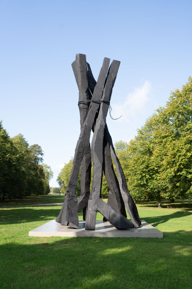
Born 1938 in Deutschbaselitz, Saxony, Georg Baselitz is one of the world’s most prolific living artists. The Serpentine Gallery is hosting a stunning FREE exhibition of his work, which features 10 sculptures plus a monumental nine-metre-tall sculpture, Zero Dome, just outside the gallery.
In the 1960s Baselitz became well known for his figurative, expressive paintings. In 1969 he began painting his subjects upside down in an effort to overcome the representational, content-driven character of his earlier work and stress the artifice of painting. Drawing from myriad influences, including art of Soviet era illustration art, the Mannerist period and African sculptures, he developed his own, distinct artistic language.
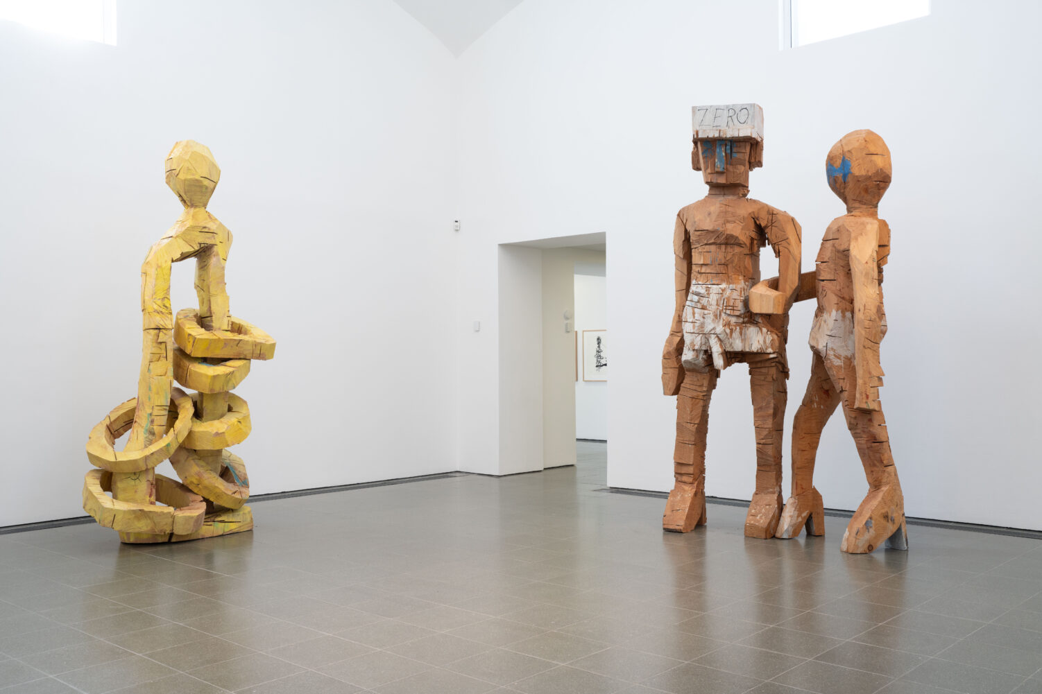
In the 1980s Baselitz continued to explore the tensions between the figurative and the abstract through his crude approximations of figures and body parts carved from wood. The Wikipedia entry at one point uses the word ‘unfettered’ and that struck a chord with me. He doesn’t care. What comes over is a lack of concern or intimidation by the Western Tradition, and the freedom to express himself as he wants. The video accompanying the exhibition shows him taking a chainsaw to huge chunks of wood to carve out extremely rough and rugged sculptural shapes.
As well as the 10 wooden sculptures – which have never been exhibited before – there are 68 related loose, inky drawings’ rendered in pencil, pen and ink. They also partake of the clenched, heavy, contorted power of the sculptures though obviously, as per the medium, are more fluid and flexible.
The curators’ aim in combining the drawings and sculptures is to give visitors insights into the artist’s studio work and ‘how his sculptural undertaking relates to his two-dimensional practice, to shed light on how the artist considers different approaches to the central themes in his work.’
This is, perhaps, an advanced ambition for those of us not particularly familiar with Baselitz’s work in the first place. More accessible is the idea that these ten wooden sculptures were not originally intended for public exhibition, as they were made as maquettes for bronze works. Each one is carved from a single tree trunk, reduced by using power saws, axes and chisels. This method gives form to solid, impactful figures while maintaining the materiality of timber with distinctive incisions and notches on its surface.
The accompanying drawings were made not as preparatory sketches for the maquettes, but during the sculpting phase. Together, the drawings and maquettes highlight the synthesis of Baselitz’s two and three dimensional ways of making and explore the possibilities and impossibilities of translating from painting to sculpture, and from sculpture to drawings. Baselitz is quoted as saying:
‘Sculpture is a thing like a miracle. It is built up, decked out, made arbitrary not as the sign of thoughts but as a thing within the limits of the shape. Even if a sculpture is hung from the ceiling, it remains a thing.
‘My carvings are best described by Immanuel Kant: ‘Out of the crooked wood of humanity, nothing entirely straight can be built. It is only the approximation of this idea that nature imposes upon us.”‘
Outside on the grass of the Royal Parks stands the biggest work, Zero Dome 2021, a nine-metre-tall patinated bronze sculpture on a plinth (we can see its corresponding raw maquette inside the gallery). Made from five carvings in the form of legs, it references Baselitz’s fascination in the foot motif.
The Architectural Review is a monthly international architectural magazine. It was founded in London in 1896 and does what its title suggests, covering all aspects of the built environment.
Manplan
Just over 50 years ago, in 8 issues from September 1969 to September 1970, the Review ran a series of eight specially commissioned reports on the state of architecture at the end of the 1960s. It was to review not just architecture in the narrow sense but the entire state of town planning, in an age when old Victorian slums were being torn down to make way for gleaming new towns made of high-rise towers, medium-rise blocks characterised by lifts and concrete walkways, subways under sweeping new ring roads, nicely laid-out grassed areas and so on.
The Review’s editors called the series of articles ‘Manplan’ and hired leading photojournalists and street photographers to address a set of eight themes, being:
Frustration
Travel and communication (‘Society is its contacts’)
Town Workshop
Education (‘The continuing community’)
Religion
Health and Welfare
Local government
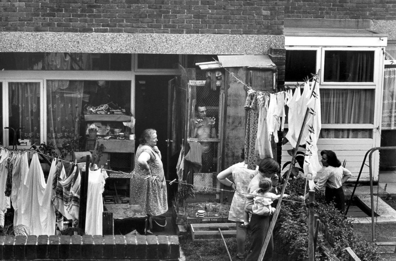
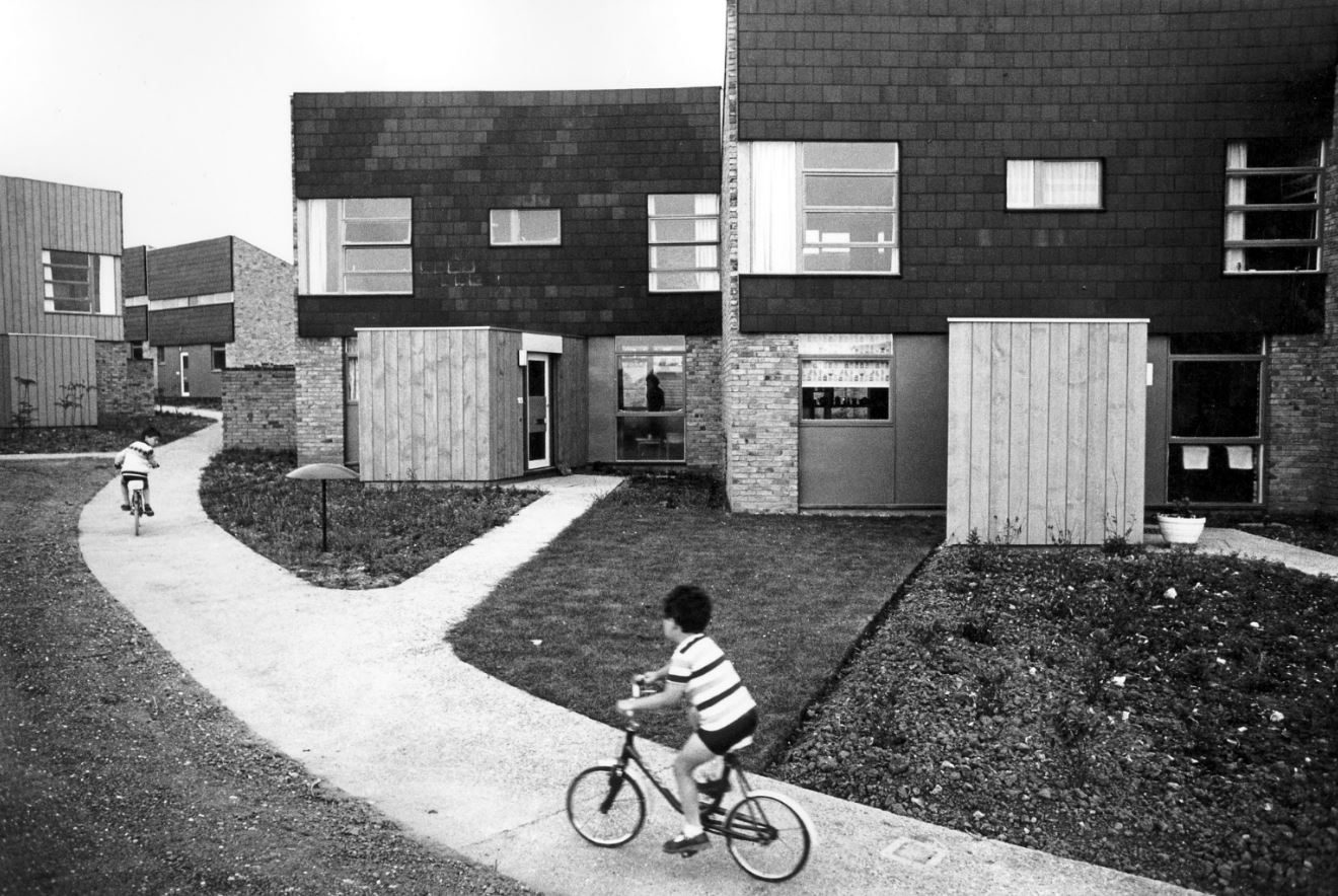
Housing
The result was a series of brilliant photos shot on a 35mm camera in a spirit of photo-reportage – vivid and dramatic black-and-white works which captured a nation in the midst of great social, cultural and environmental change. To the horror of some of its contributors and readers, the magazine turned its back on large-format, heroic photography of buildings and their details, instead embracing a grainy, 35mm black-and-white reportage aesthetic, where people were as, if not more, important than the places. In the words of The Royal Institute of British Architects, publishers of the Architecture Review:
The aim was to propose an alternative and more holistic approach to urban planning, which would look at all basic human needs as a whole. The photographs illustrating the issues were created in the spirit of photo reportage and often featured people inhabiting the spaces studied by the survey, thereby shifting the focus from the architecture itself to the human element within the built environment.
So it was intended to be polemical stuff. The photographers were:
Ian Berry
Tony Ray-Jones
Tim Street-Porter
Patrick Ward
Altogether the Architectural Review published about 80 photographs. Just 16 are on display here, but every single one of them is a masterpiece; there’s no slack. Each one is a densely packed, highly charged vignette. This exhibition isn’t big but it is packed with social history, with memories and nostalgia for a time within the living memory of many but feeling evermore distant.
Design and layout
On a separate wall is a display of the actual copies of the magazine which the photo-essays appeared in, along with the words and designs of ‘Manplan’ editor Tim Rock and designers Michael Reid and Peter Baistow. This section goes into detail about how the photographs were processed, reproduced and printed (using ‘special matt black ink’) along with analysis of the layout and typography. All a bit over my head but interesting for students of design.
The photographs
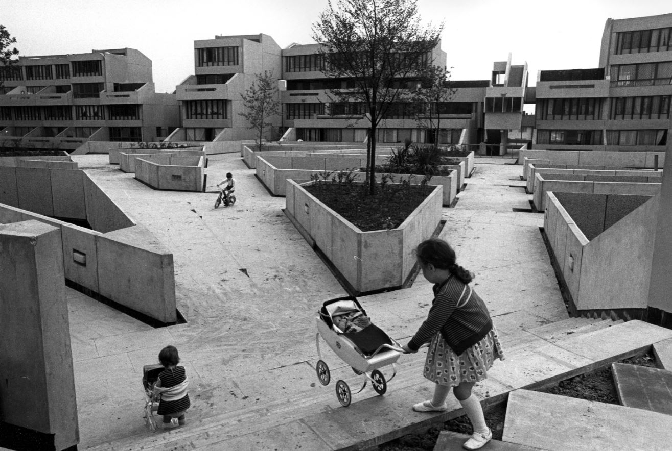
Private terraced houses on the Old Kent Road opposite Camelot Street Estate, London by Tony Ray-Jones (1970) part of ‘Manplan 8: Housing’, in Architectural Review, September 1970. Courtesy Architectural Press Archive / RIBA Collections
Housing at New Ash Green, Kent by Tony Ray-Jones (1970), part of ‘Manplan 8: Housing’, in Architectural Review, September 1970. Courtesy Architectural Press Archive / RIBA Collections
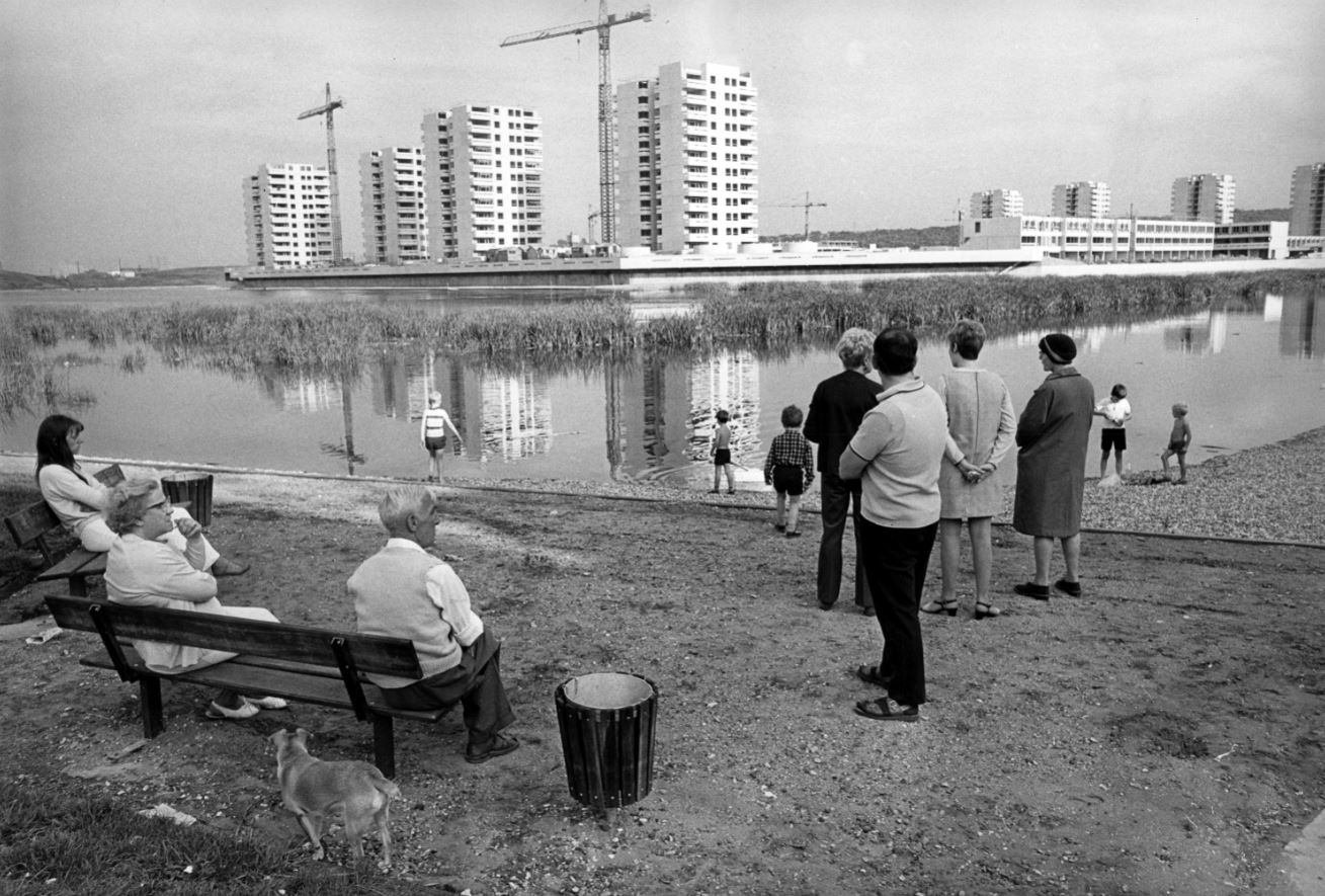
Low-rise housing, Tavy Bridge, Thamesmead, Greenwich, London, 1970 by Tony Ray-Jones, part of ‘Manplan 8: Housing’, in Architectural Review, September 1970. Courtesy Architectural Press Archive/RIBA Collections
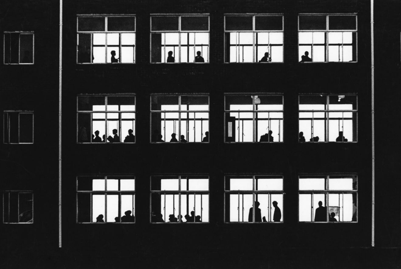
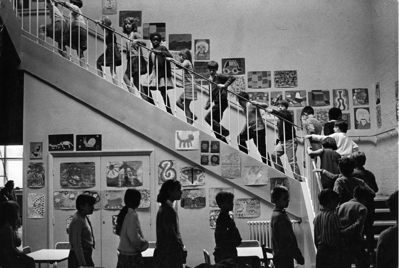
Classroom windows in a school in Wales, 1969 by unknown photographer, part of ‘Manplan 4: The continuing community (education)’, in Architectural Review, January 1970. Courtesy Architectural Press Archive / RIBA Collections
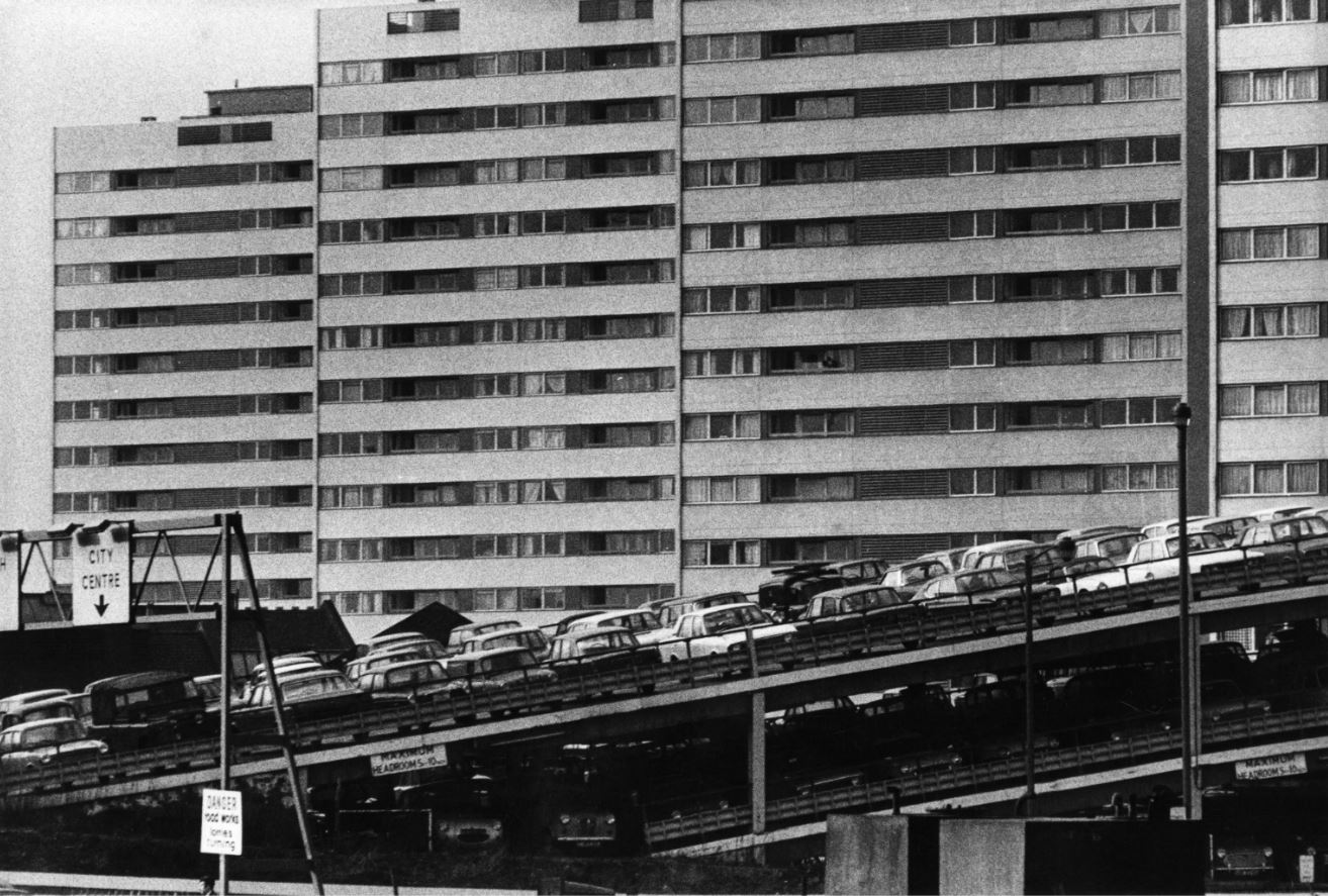
High-rise flats and multi-storey car park, Birmingham, 1970 by Peter Baistow, part of ‘Manplan 5: Religion’, in Architectural Review, March 1970. Courtesy Architectural Press Archive / RIBA Collections
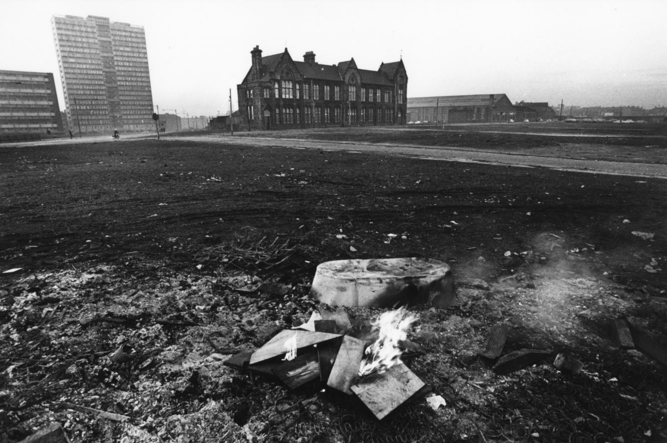
Chatsworth Street school and high-rise housing block overlooking the cleared site, Liverpool, 1969 by Tom Smith, part of ‘Manplan 4: The Continuing Community (education)’ in Architectural Review, January 1970. Courtesy Architectural Press Archive / RIBA Collections
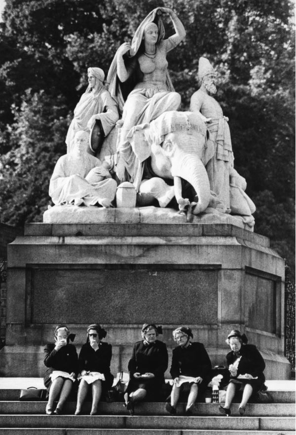
Salvation Army officers picnicking on the steps of the figure group Asia by J H Foley, Albert Memorial, Kensington Gardens, London, 1969 by Peter Baistow, part of ‘Manplan 5: Religion’, in Architectural Review, March 1970. Courtesy Architectural Press Archive/RIBA Collections
Unidentified primary school, 1969 by unknown photographer, part of ‘Manplan 4: The continuing community (education)’, in Architectural Review, January 1970. Courtesy Architectural Press Archive / RIBA Collections
Thamesmead film
To one side of the 16 framed photos on the wall, is a TV monitor showing a film from around the same time (in fact the year before the project, 1968). So far as I can tell it’s not directly connected with RIBA or the Manplan project except for the slender link that one of the 80 Manplan photos happens to cover the same subject as the film, namely the new estate being built at Thamesmead. So it wasn’t directly related to the Manplan project but gives context to the kind of architectural and town planning thinking which was going on at the time of the Manplan project.
Directed by Jack Saward, this 25-minute public education film gives an overview of the history and construction of Thamesmead, a sort of new model suburb built down the River Thames from London on the site of the old Royal Arsenal, a site that extended over Plumstead Marshes and Erith Marshes.
Alas, to quote the introduction to the video on YouTube:
The ambition is commendable but it didn’t quite work in practise, with Thamesmead becoming a notoriously problematic estate and its architects perceived as exhibiting many of the faults of post-war planning, with communities being tinkered with from above like a real-life experiment. This is where utopia meets authoritarianism.
Hard to believe, but the planners that designed the place provided insufficient transport links with London, no way of crossing the Thames for 5 or 6 miles in either direction and – best of all – an almost complete lack of shopping facilities and banks. Lots of pretty little lakes but…nowhere to buy food. According to the label in the exhibition, the estate ‘was soon plagued by social problems caused by lack of facilities and public transport’.
The half-built estate won an unwanted fame when American film director Stanley Kubrick used parts of it as the setting for his notoriously violent 1971 movie, A Clockwork Orange, a vision of an alienated, dystopian society. Here’s the photo of it taken by the brilliant Tony Ray-Jones which provides a sort of coincidental link between the Manplan series and the film.
Thamesmead under construction, Greenwich, London, 1970 by Tony Ray-Jones in ‘Manplan 8: Housing’, Architectural Review, September 1970. Courtesy Architectural Press Archive / RIBA Collections
Which do you prefer? Which do you think is telling the truth, the film or the photo?
The Robert Elwall Photographs Collection
All the materials for the Manplan exhibition, photos and old copies of the AR magazine, come from the Robert Elwall Photographs Collection. This comprises around 1.5 million images from the earliest days of photography to the present day. The collection includes photographic archives of individual architects and practices, travel and topographic images from across the world, press photographs from major architectural journals, and large bodies of work by some of the best known architectural photographers of the 20th century. The collection includes prints, negatives, slides, transparencies, photographically illustrated books and digital files. It is itself part of the larger Royal Institute of British Architects collections.
Conclusion
Flicking through some of the text on the walls is a dispiriting experience. These 1970 writers were raging against the soulless design of modern cities, the daily struggle of commuting to work on overcrowded public transport, against air pollution, excess traffic and the destruction of the environment, against the dominance of the car over human-friendly spaces, against the dehumanising effects of modern technology, against social inequality and the lack of social housing, against the prioritising of profit over people.
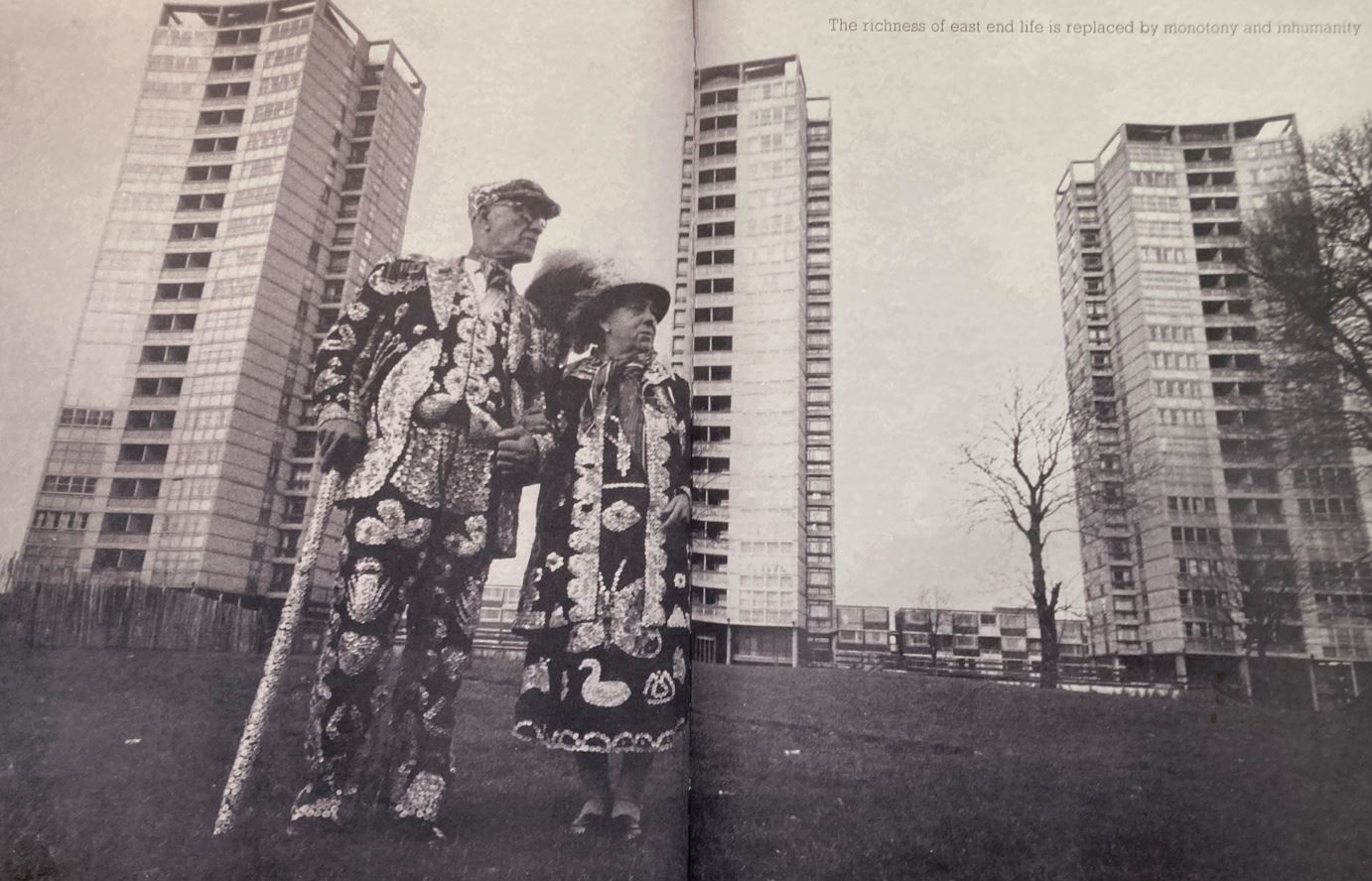
It’s as if, 53 years later, nothing has changed except we all have smart phones to share our frustration about how things obstinately carry on being rubbish. The Manplan writers’ rage and frustration is captured by this, the last entry in the exhibition.
Double page spread from Manplan 1. ‘Frustration’
It’s a copy of the original magazine, open to a double page spread showing a traditional Pearly King and Queen standing in front of the typically sterile, barren waste ground surrounding a clutch of looming, threatening tower blocks. Up in the top right is a text reading: ‘The richness of East End life is replaced by monotony and inhumanity.’
Yep. that’s the world I grew up into and which punk rock, with its angry nihilism, was a direct response to. Eternal shame on England’s architects and town planners.
Related links
A Brief Revolution continues at the Photographers Gallery until 11 June 2023