Ocean Liners: Speed and Style @ the Victoria and Albert Museum

This is one of the most spectacular and dramatically staged exhibitions I’ve ever been to.

Normandie in New York (1935-39) Collection French Lines

Normandie in New York (1935 to 1939) Collection French Lines

The golden age of the ocean liner from the turn of the twentieth century to the Second World War coincides with the evolution of key decorative trends of the 20th century – Art Nouveau, Art Deco, and Modernism. This exhibition takes a systematic approach to showcasing not only the decorative arts movements but a whole range of elements connected to the rise of the great ocean liners. To name a few:

  • national prestige: European nations competed to have the biggest, most luxurious ocean liners
  • technical competition to, for example, cross the Atlantic in the quickest time and win the Blue Riband
  • engineering: with a room devoted to black and white films of liners being built, models of steam turbines and other technical aspects
  • quite a number of very big models of classic liners, some with cutaway views so you can see into everything from cabins and dining rooms down into engine rooms and cargo holds

But where the exhibition really impresses is in the extraordinary thoroughness with which the entire environment has been conceived, and the scale of some of its key rooms.

For example, the first room has a wall with a big wall label introducing the history and art of ocean liners. It took me a while to realise that the wall itself is painted black with a red line along the bottom and slopes gently outwards like the hull of an actual liner. In front of it is a metal bollard of the kind the liner would tie mooring lines onto, and down at ground level was a concealed light projecting the shimmering as of water onto the lower part of the wall. It is the hull of a ship. Next to it is a wall of posters, and some monitors showing footage of people getting on to old liners – and then, to continue the exhibition, you walk through a doorway cut into this imaginary hull. It’s clever and stylish.

The wall of stylish Art Deco posters at Ocean Liners: Speed and Style at the Victoria and Albert Museum exhibition

The wall of stylish Art Deco posters at Ocean Liners: Speed and Style at the Victoria and Albert Museum exhibition

The next room wonderfully recreates the dark wood feel of a pre-Great War liner, heavy with wood panelling and Art Nouveau glass, both which featuring motifs derived from Versailles Palace of Louis XIV, the Sun King.

Installation view of Ocean Liners: Speed and Style at the Victoria and Albert Museum exhibition

Installation view of Ocean Liners: Speed and Style at the Victoria and Albert Museum exhibition

Another room examines smaller aspects of shipboard design as it developed from the 1920s through to the 1960s. This features a wonderful mural by English artist Edward Bawden (soon to be the subject of an exhibition at Dulwich Picture Gallery), as well as a monitor with footage showing how the stylish evening dress of the 20s and 30s declined into the relaxed casual wear of the 50s and 60s.

The Art Deco objects are thrilling and sleek – it is a style which never goes out of fashion – whereas the wall lamps and mounts from the 50s and 60s look tacky and dated.

The English Pub Mural for the SS Oronsay by Edward Bawden (1949-51)

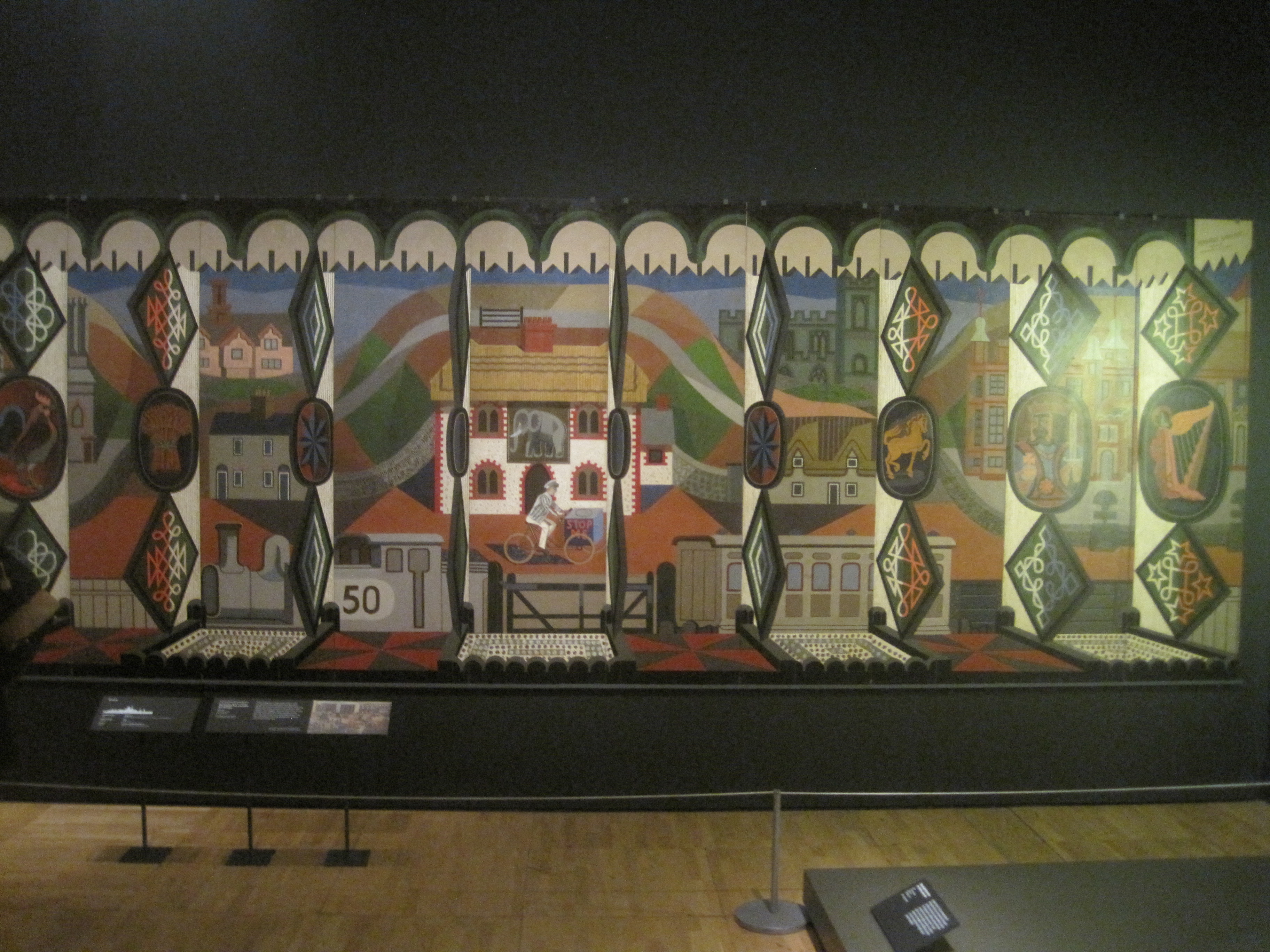
The English Pub Mural for the SS Oronsay by Edward Bawden (1949 to 1951)

On a similar scale is the room about Engineering and the War. The engineering element is conveyed by cutaway models of ships highlighting the enormous coal-powered turbines, by highly evocative black and white footage of shipbuilders working in the Clyde or Belfast shipyards.

But the attention to detail, to creating a total sensory and visual experience which I mentioned re the sloping hull-wall, comes out in the way the engineering ‘room’ has a deep thrumming sound in it, the sound engines actually beneath the ship’s decks – and by the way the floor changes from parquet to metal plate decking with chevron mouldings, giving just this room a more industrial feel. In one corner is an enormous model of a ship’s funnel painted black and red which also forms part of the wall of the next room. This room contains one of Stanley Spencer’s inspirational paintings of shipworkers on the Clyde.

Shipbuilding on the Clyde by Sir Stanley Spencer (early 1940s)

Shipbuilding on the Clyde by Sir Stanley Spencer (early 1940s)

It also contains a wall describing ocean liners in war, with a focus on the horrific sinking of the Lusitania by German U-boat on 7 May 1915 with the loss of 1,201 people. This section includes photos of the ship, a film recreation of the event, and the stirring patriotic poster which resulted.

'Enlist' by Fred Spear (1915)

Enlist by Fred Spear (1915)

This feel of a ‘sensaround experience’ – the opening room with its curving ship’s hull wall, the engine room with its humming engines – is reinforced by a wonderful Art Deco room adorned with strong vertical lights and displaying the enormous interior panel from the Smoking Room of the French liner, Normandie, created by leading Art Deco lacquer artist Jean Dunand. Photos show it in situ but none of them can convey the sheer scale of the thing itself.

Interior panel from the Smoking Room of the French liner, Normandie by Jean Dunand

Interior panel from the Smoking Room of the French liner, Normandie by Jean Dunand

But impressive though all these rooms are, they turn out to be mere foreplay for the stunning centrepiece of the show.

The V&A has converted a large room in the North Court into a kind of night-time fantasia of the gracious living to be found on the classic ocean liners. The high ceiling of this huge space has been covered in black felt and dotted with lights to recreate the sparkling stars to be seen at night-time far out in the light-free ocean. Reaching up into this night sky is a tower of huge video screens onto which are projected time lapse footage of a man in evening dress and a woman in an elegant gown stylishly descending imaginary stairs down to our (ground level).

Installation view of Ocean Liners: Speed and Style at the Victoria and Albert Museum

Installation view of Ocean Liners: Speed and Style at the Victoria and Albert Museum

This central column is surrounded on three sides with display cases showing all aspects of the luxury of life on a cruise: a whole load of evening gowns and dresses in beautiful Deco fashion, studded with pearls and jewels; earrings, necklaces, jewellery that would have been worn; and an entire wall dedicated to food with footage of the famous chef Auguste Escoffier preparing meals for his lucky passengers alongside luxury sets of plate, the cutlery and tea services you would have found in tip-top VIP accommodation.

But that isn’t all. You enter this enormous space by walking around a mock-up of a typical ocean liner swimming pool made of coloured glass, around which and in which are shop window mannekins wearing stylish swimsuits from the era. Behind them, and the length of one wall, is an enormous wide-screen projection of a liner sailing slowly across a panoramic view of a beautiful calm tropical sea.

Installation view of Ocean Liners: Speed and Style at the Victoria and Albert Museum

Installation view of Ocean Liners: Speed and Style at the Victoria and Albert Museum

Wow! Just wow! I’ve never seen something so ambitious and overwhelming as this one huge display. You go around looking at the tea services and dresses and so on, but keep returning to just gaze in awe up at the tower of stylish evening-wear models or across at the stately liner in the blue sea, and are continually gobsmacked at the size and ambition of the whole space.

There are panels about the importance of class distinctions on the liners, about the difference in conditions, food and facilities for first, second or third-class passengers. There is another room full of the art inspired by ocean liners, including paintings by the likes of Albert Gleizes and Charles Demuth and some great black and white photos by Le Corbusier and Eileen Gray.

There are objets de luxe to coo over, like a precious Cartier tiara recovered from the sinking Lusitania in 1915 or the Duke of Windsor’s sumptuous 1940s Goyard luggage. There’s a little corner devoted to the wonderful Marlene Dietrich, including footage of her posing onboard a liner and a case containing a Christian Dior suit worn by the lady herself.

The show also includes what the museum describes as one of the most important flapper dresses in the V&A’s collection – Jeanne Lanvin’s ‘Salambo’ dress – a version of which was displayed at the Exposition Internationale des Arts Décoratifs et Industriels Modernes in Paris in 1925. The dress belonged to Emilie Grigsby, a renowned wealthy American beauty, who regularly travelled between the UK and New York aboard the Aquitania, Olympic and Lusitania throughout the 1910s and 1920s.

The silk georgette and glass-beaded Salambo dress designed by Jeanne Lanvin of Paris (1925)

Silk georgette and glass-beaded Salambo dress designed by Jeanne Lanvin of Paris (1925)

And for anyone (like my Dad) who likes big scale models of ships, this exhibition is nirvana.

But after looking at display cases showing all these items or explaining all the industrial, technological and social history of the ocean liner, from Isambard Kingdom Brunel to the Queen Mary, you keep returning to the Big Room, and the sheer scale of its awesome display of swimming models, night gowns, the moving footage, all unfolding under the mocked-up night sky.

This really is an amazing and dazzling exhibition.

Installation view of Ocean Liners: Speed and Style at the Victoria and Albert Museum

Installation view of Ocean Liners: Speed and Style at the Victoria and Albert Museum


Related links

More V&A reviews

America after the Fall: Painting in the 1930s edited by Judith Barter (2017)

This is the book accompanying the exhibition at the Royal Academy of 45 or so oil paintings from the 1930s designed to give you an overview of the many different, competing and clashing visions of American art during that troubled decade, what the foreword, rather surprisingly describes as ‘aesthetically, perhaps the most fertile decade of the twentieth century.’

It significantly expands your knowledge and understanding of the period by including illustrations of many more paintings than are in the show, along with comparison art works from contemporary and Old Master Europe, as well as photos, sketches, architects plans and related visual information.

The book is structured around five long essays by experts in the period, each of which is fascinating and informative in equal measure (the writers being Judith A. Barter, Sarah Kelly Oehler, Annelise K. Madsen, Sarah L. Burns and Teresa A. Carbone). I picked it up for £15, a snip considering the high quality of the reproductions and the intelligence of the commentary and analysis.

Regionalism versus modernism

The squabble between the Regionalists and the New York-based modernists is only mentioned for a minute or so on the exhibition audioguide, but spills across several of the essays here. This allows you to understand its history, main participants, the arguments on either side, to weigh their merits, as well as considering the whole thing’s relevance to the present day.

Regionalism championed the depiction of realistic scenes of rural and small-town America primarily in the Midwest and Deep South. It was popular and populist. It defined itself against the modernism imported from Europe by New York-based artists, despite the fact that the trio of artists who became most associated with Regionalism – Grant Wood, Thomas Hart Benton and John Steuart Curry – had all made at least one study visit to Europe and were well aware of developments there.

Regionalism is itself subsumed under a broader term – the American Scene – which also covers ‘Social realism’ paintings, also realistic and figurative in nature, but more committed to the world of urban work than the predominantly rural Regionalist ethos. If it’s about small town life it’s American regionalism; if it’s a realistic work about the city, about industrial workers, and especially if it emphasises class consciousness, then it’s American Social Realism.

The most famous example of Regionalism is Grant Wood’s American Gothic, which depicts in a minutely detailed style reminiscent of early Flemish painters, a romantically unromantic vision of the gaunt, upright honest Mid-Western farmer. In the same spirit, though softer edged, is his Daughters of the Revolution (1932), its unflatteringness easy to confuse with a type of realism. Others of his rural pictures shown here are more gently bucolic:

The most fervent regionalist was Thomas Hart Benton. In the exhibition he’s represented by paintings of rural, especially Southern, life depicted with a distinctive wriggly serpentine style.

  • Cradling wheat by Thomas Hart Benton (1938) Note the wriggly lines in the clouds, the clothes, the distant hill.

But the book adds hugely to our understanding by expanding on his activities as a muralist, works which, by definition, can’t be shown in travelling art exhibitions. The New Deal administration, via its huge Public Works of Art Project, helped fund and commission a vast range of public art for public spaces – city halls, post offices, railway stations – across America. Over 4,000 murals in public buildings were commissioned from a huge range of artists in 1934 and 1935. Benton was a leader in the field, producing works like America Today for New York’s New School for Social Research, The Social History of the State of Missouri and The Cultural & Industrial Progress of Indiana for the 1933 Chicago World’s Fair. In these he combines his sinewy, sinuous way with the human body with a kind of muscular social realist style to portray a fascinating cross-section of American activity and enterprise.

Benton not only painted, he engaged in a fierce polemic with a leader of the New York modernists, Stuart Davis, decrying modernism as effeminate, chaotic, elitist and un-American. You can see why his Mid-Western sponsors and many left-wing-minded artists and writers (some influenced by the new dogma of Socialist Realism emanating from the Soviet Union) would support his easily accessible, heroic depictions of the working man and woman, as the real America.

But of course they were up against New York, with its sheer size (with a population of 7 million, by far the largest US city) and its entrenched, articulate and well-publicised intellectual and artistic sets, such as the circle around critic and photographer, Alfred Stieglitz (which included the artists Charles Demuth, Arthur Dove, Marsden Hartley, John Marin and Georgia O’Keeffe) or George L.K. Morris and the American Abstract Artists group.

It was the modernist painter Stuart Davis who ended up defending cosmopolitan modernism against Benton’s Regionalism, in a series of lectures, pamphlets, articles and a few bad-tempered personal encounters – attacking Regionalism as populist, demagogic, conservative even reactionary in form, naive, simple-minded and so on. He was even involved in a petition drawn up by New York art students to have one of Benton’s murals destroyed, because of its alleged stereotyping of African Americans. They hated each other.

Above all, the New York modernists thought Regionalism was holding America back, restraining and imprisoning American art and thought in a utopian fantasy of the past. It was provincial in the worst sense of the word, because it limited American culture to fantasies of a fast-disappearing rural reality while the entire world was urbanising and the great capitals – Paris, London, Rome, Berlin – were developing dazzling new techniques, styles and methods which it would be fatal to ignore.

Why go backwards when the rest of the world was hurtling into the new, they argued. America, above all other countries, should throw off the past and embrace the future.

There are several ways to think about this:

1. On purely personal terms, which do you enjoy most – now? To be honest, I like Grant Wood’s cartoony works and am impressed by Benton’s murals, idealised and muscular representatives of the spirit of the age. Whereas I like the overall impact of Davis’s work – extraordinarily bright and jazzy – but don’t respond to any individual work of his as strongly.

2. In terms of the debate, who do you think was right, at the time? Again, I’m inclined to think the American Scene artists depicted the country and its cultural and political moment better than Davis and the other wannabe modernists. They were right for their time. The Public Works of Art Project wanted art for the broadest mass of the public, which would reflect their local area, their local history, which would provide a unifying focus for thousands of communities across the States. Over 4,000 murals in public buildings were commissioned from a huge range of artists in 1934 and 1935. It seems unlikely that a thousand variations on Davis’s watered-down Paris abstractions could have done that.

3. Who won? With the benefit of hindsight we know that Regionalism had nowhere to go: as America became more fully industrialised during the Second World War, it became more urbanised and rural life became more and more remote from most Americans. The Regionalist artists proved incapable of developing their style: even at the time it was acknowledged to be a romanticised, idealised vision which was actually far removed from the brutal reality of the Dustbowl droughts which were afflicting the southern states. (Captured in one bleak and almost science fiction painting here, Our American Farms (1936) by Joe Jones.) Regionalism proved to be in every way a dead end.

4. Also, in the new atmosphere of the Cold War, the Social Realism of much American Scene art came to look suspiciously like the same kind of thing being churned out by the Soviet Union and her satellites. When the House Un-American Activities Committee got round to investigating artists in the 1950s, it was the Social Realists they accused of being dangerous subversives: in total some 350 artists were accused by the committee of being communists or harbouring unhealthy left-wing tendencies. In the event, the Abstract Expressionism of Jackson Pollock et al was to take the art world by storm at the end of the 1940s and, with government help, transform American aesthetics. Regionalism became an isolated backwater in the history of art.

5. However, studying the debate in some detail throws up surprising insights into our present situation, where a demagogic president has been elected on a platform of appealing to ordinary folk, especially the working class disenfranchised by globalisation, and railing against Big City corruption and cosmopolitanism. There is unemployment – 4.7% (though nothing approaching Depression-era figures, which at their worst had 30% of the workforce without jobs). There’s disillusion with the conventional parties and a rise in racism and xenophobia. Powerful reminders that so many of a country’s political or social issues never really go away but are reborn in each generation in new disguises.

The above is a partial summary of the first of the five essays in the volume. The other four:

  • Transatlantic Expressions
  • 1930s Modernism and the use of history
  • Painting the American wasteland
  • Bodies for the 1930s

are just as in-depth and illuminating, adding to our understanding of a host of other artists of the time.

These include lesser known figures like Marsden Hartley, Arthur Dover, Charles Green Shaw, Millard Sheets, Doris Lee, Helen Lundeberg, Walt Kuhn, Ivan Albright, Peter Blume, Alice Neel, Paul Cadmus, Archibald Motley, Philip Evergood, Reginald Marsh, Paul Sample – as well as, for me, the standout artist of the era – the great Georgia O’Keeffe, with her triumphant marriage of the distinctive New Mexico landscape with an unsettling modernist sensibility.

Cow's Skull with Calico Roses (1931) by Georgia O'Keeffe. Photo Alfred Stieglitz Collection. The Art Institute of Chicago / (c) Georgia O'Keeffe Museum / DACS 2016

Cow’s Skull with Calico Roses (1931) by Georgia O’Keeffe. Photo Alfred Stieglitz Collection. The Art Institute of Chicago / (c) Georgia O’Keeffe Museum / DACS 2016

New names

Presumably familiar to any student of American art, the following were artists who I first learned about at the exhibition and who then especially benefited from the longer treatment and further illustrations provided in this book:

Charles Sheeler

Represented in the show by his wonderful linear depiction of the River Rouge Ford Motor factory – American landscape (1930) – Sheeler is explored in further detail in the book. Not only did he produce these wonderful linear, monumental evocations of pure architecture, but also took many modernist photographs of industrial buildings, interiors and machines. Just my kind of thing.

But Sheeler is also one of the beneficiaries of the well-known phenomenon that some art works which are easy to overlook in the flesh, look much better in reproduction, in book form. Thus the exhibition – divided into 8 or 9 themes – has one devoted to interiors, generally depicting old-fashioned styles and furnishings, and it would be easy to overlook Sheeler’s item in the set, Home Sweet Home. But the book reproduces it in big and lovely colour detail and highlights the continuity between the fascination with geometry and lines evinced in his well-known industrial photos and paintings, and his more recherche interest in traditional fabrics, Shaker furniture and so on, which combine in this quiet but mesmeric interior.

Aaron Douglas

Represented by one work in the show, the impressive mural Aspiration, in the show, the book gives a lot more about his life and work – and searching the internet reveals a brilliantly dazzling talent. Douglas uses a kind of Art Deco silhouette-based style, flooded by geometric washes of pastel colours, to depict an amazingly bold, explicit overview of the African American story, from Africans in Africa dancing and celebrating, their capture into slavery, transport across the seas, to African Americans throwing off their shackles and then Ayn Rand-style monuments of them contributing to the building of the modern (1930s) city with its outline of soaring skyscrapers.

Conclusion

This is a genuinely interesting book, not just about American art but about a pivotal moment in American history. By the end you are ready to believe the claim made at the start (several times) that the 1930s was ‘the most artistically creative and important period of the twentieth century’ (p.24).


Related links

Reviews of other American art exhibitions

Reviews of books about America

Reviews of other Royal Academy exhibitions