BEYOND THE STREETS LONDON @ the Saatchi Gallery

This is a huge, vast, awe-inspiring, ginormous exhibition, full of riches and surprises and fun. The Saatchi Gallery is housed in a grand and spacious building just off the King’s Road. It has three floors of exhibition space (ground, 1st and second floors), some of its rooms are huge, plus little side-rooms, nooks and crannies, corridors and the stairwells you go up to move between floors.

Every inch of this space, all the rooms and all the walls are covered with wild and vivid examples of the exhibitions subject, for this is a huge, comprehensive exhibition of Street Art and Graffiti. Wow, is it big! Wow, is there a lot, a huge amount, to take in! It aims to be the most comprehensive exhibition of graffiti and street art ever held in the UK and surely it is.

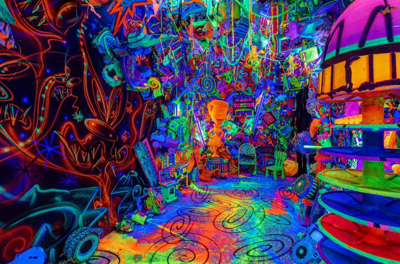
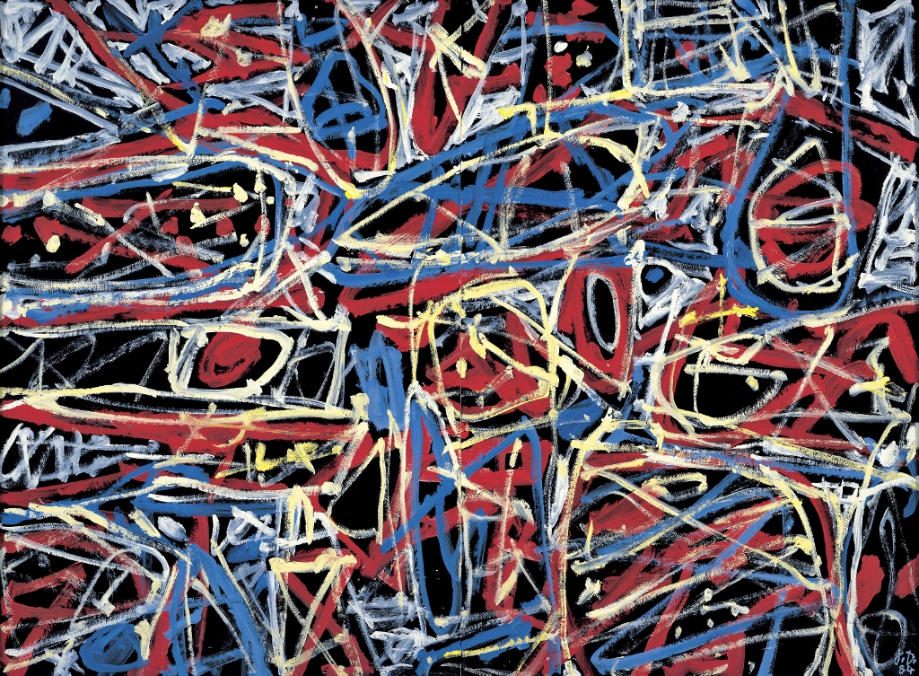
The Cosmic Cavern by Kenny Scharf – a dayglo party installation, inspired by the night-clubs and discos of the 1980s in BEYOND THE STREETS LONDON at the Saatchi Gallery

To give a quick sense of the scale, here’s a list of some of the participating artists:

10Foot, AIKO, Alicia McCarthy, André Saraiva, BÄST, Beastie Boys, Beezer, Bert Krak, BLADE, BLONDIE, Bob Gruen, Brassaï, Broken Fingaz, C. R. Stecyk III, CES, Charlie Ahearn, Chaz Bojórquez, Chris FREEDOM Pape, Christopher Stead, Conor Harrington, CORNBREAD, Craig Costello, CRASH, DABSMYLA, Dash Snow, DAZE, DELTA, DONDI, Duncan Weston, Dr. REVOLT, Eric HAZE, Escif, Estevan Oriol, Fab 5 Freddy, FAILE, Felipe Pantone, FUME, FUTURA2000, Glen E. Friedman, GOLDIE, Gordon Matta-Clark, Gregory Rick, Guerrilla Girls, Gus Coral, Henry Chalfant, HuskMitNavn, IMON BOY, Jaimie D’Cruz, Jamie Reid, Janette Beckman, Jason REVOK, Jenny Holzer, Joe Conzo, John Ahearn & Rigoberto Torres, José Parlá, KATSU, KAWS, KC ORTIZ, Keith Haring, Kenny Scharf, KING MOB, LADY PINK, Lawrence Watson, Lisa Kahane, Malcolm McLaren, Maripol, Martin Jones, Martha Cooper, Maya Hayuk, Michael Holman, Michael Lawrence, Mister CARTOON, MODE 2, Ozzie Juarez, Pablo Allison, Pat Phillips, Paul Insect, POSE, PRIDE, PRIEST, Richard Colman, RISK, Robert 3D Del Naja, Roger Perry, Shepard Fairey, SHOE, Sophie Bramly, STASH, Stephen ESPO Powers, Stickymonger, SWOON, TAKI 183, Toby Mott, TOX, Tim Conlon, Timothy Curtis, Tish Murtha, Todd James, VHILS , ZEPHYR.

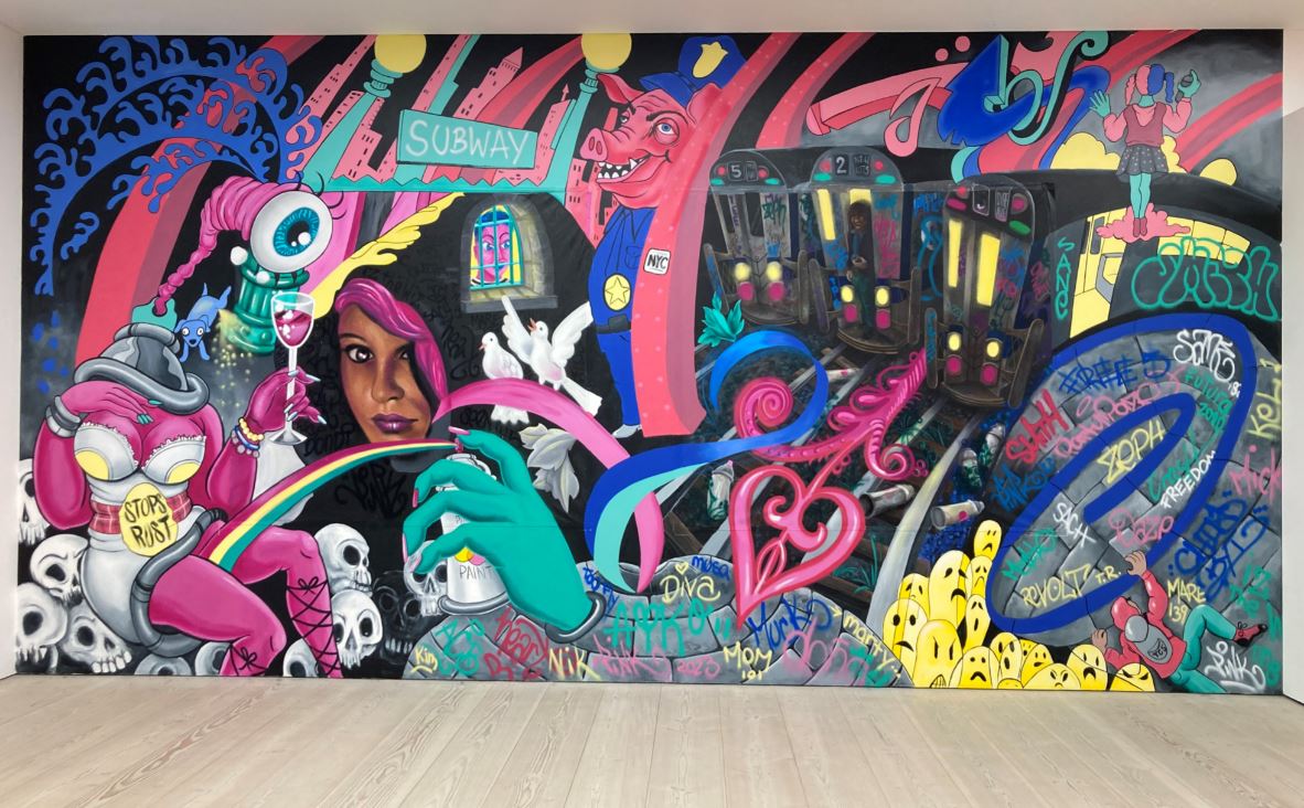
Site-specific mural by selected group of participating artists in BEYOND THE STREETS LONDON at the Saatchi Gallery

Room after room is packed with paintings, artefacts, sculptures, installations. There are standard gallery rooms with paintings hanging discreetly on the wall but there’s also some vivid installations, namely a mock-up of a 1980s record shop whose walls are plastered with old posters, complete with racks holding real LPs you can browse through.

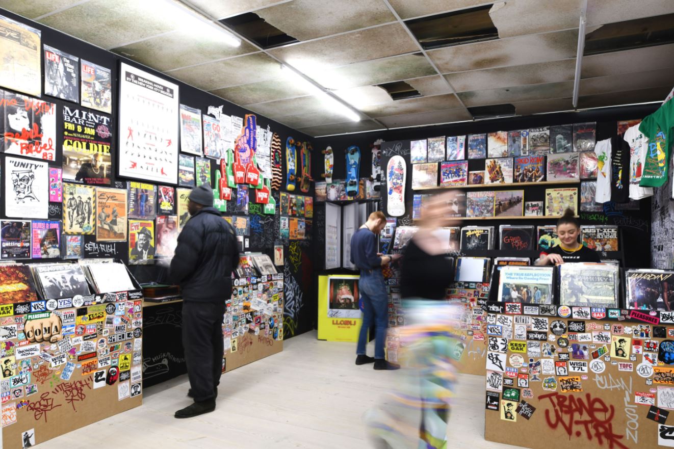
Interior of Trash records, including interactive record player, t-shirts, skateboards, and a multitude of youth culture ephemera in BEYOND THE STREETS LONDON at the Saatchi Gallery

There’s a life-sized shop full of colourful clutter and bric-a-brac. There’s a corridor lined with black and red graffiti, which is illuminated in pinky-red light, giving you a full visual experience as you walk through it. One of the best bits is a room covered with dense black-and-white patterns giving you pleasantly zig-zaggy optical illusions, in the middle of which are some stands with squiggly over-coloured zoomorphic swirl sculptures. All pleasantly weird and wonderful and disorientating. Some toddlers in it at the same time as me loved it.

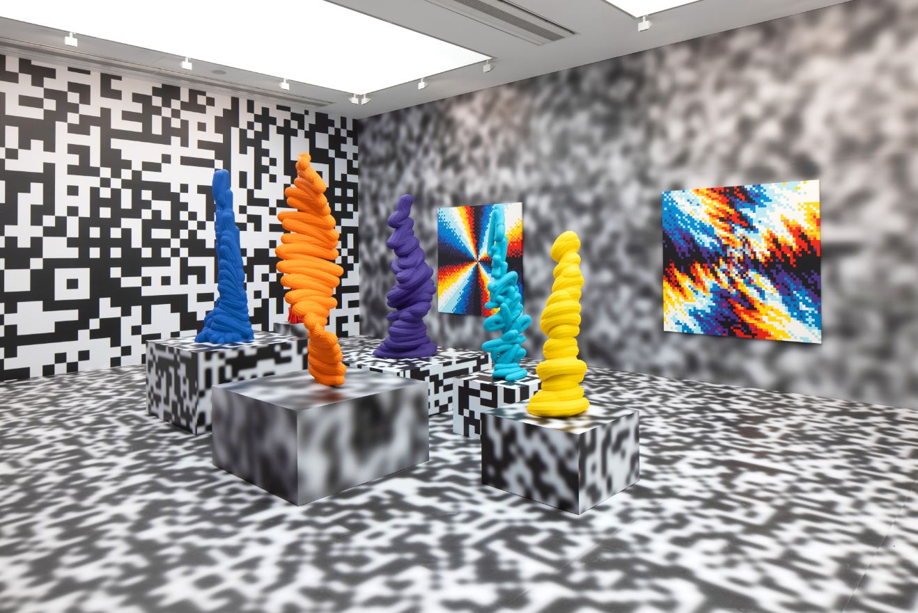
Into the New Realm with Felipe Pantone: installation in BEYOND THE STREETS LONDON at the Saatchi Gallery

There are 13 rooms in all and each one is given a theme, within which what seem like floods of artists are explained and displayed.

The exhibition sets out to give a historical account of the genesis and development of modern graffiti sometime in the 1960s and from then on twines the development of graffiti in basically two places, London and America, specifically Los Angeles.

Accompanying the explanation of the development of street art was a lot about contemporary music, which also came in two essential flavours. First of all there’s what I thought was a surprising amount about English punk, with several walls made up of fabulously retro old posters for scores of punk bands.

There’s a lot about the Clash who in 1980 left sleepy London town for America where they entered into all kinds of collaborations with US hip-hop and rap bands. The show includes FUTURA2000’s legendary 30-foot-long painting, made on stage with The Clash during a performance.

There’s a passage devoted to Don Letts, film director, disc jockey and musician, collaborator with the Clash among many other groups. To my surprise a whole section is devoted to bad boy impresario, Malcolm McLaren. There’s a series of photos depicting the mutations of his shop on the Kings Road, Sex, which morphed into Seditionaries and several other incarnations, and then to his post-punk attempts to stay ahead of the trend by moving to America and exploiting the new sound of hip-hop.

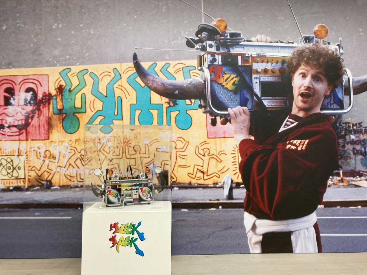
Wall-sized photo of Malcolm McLaren and the arted-up boogie box he’s carrying in a display case in BEYOND THE STREETS LONDON at the Saatchi Gallery

And then of course, there is hip-hop itself, with several galleries devoted to massive photos of key bands such as Public Enemy, NWA and many more rappers and DJs with colourful confrontational soubriquets, juxtaposed with the graffiti and street artists who inspired or were inspired by them.

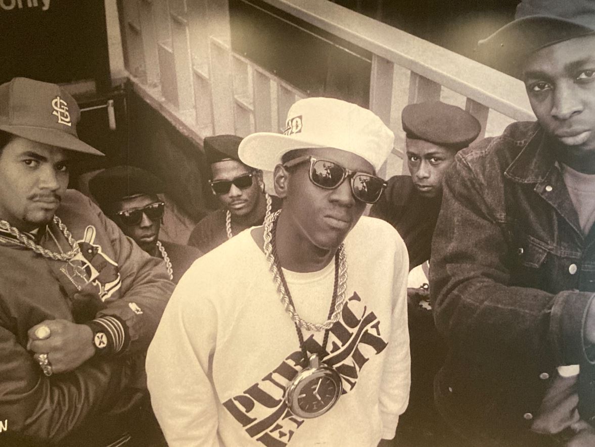
Classic photo of Public Enemy by Glen E. Friedman in BEYOND THE STREETS LONDON at the Saatchi Gallery

I found the jumping between black American culture in the 1980s and essentially white punk culture from the late 1970s quite confusing, but in a fun, disorientating kind of way. London, punk, tower blocks and concrete subways, the Clash, Mrs Thatcher and so on, I immediately get, relate to and remember. Life in some American ghetto, bling and baseball caps, and the complex social legacy of the civil rights movement or Black Power, a lot less so. In fact, not really at all.

I guess there are two ways to approach such a funfair, such a festival of art, such an overwhelm-ment of paintings, installations, set-ups and so on: one is to read the sensible wall labels, which attempt to give a coherent account of the birth and growth of street art, and go slowly mad with the level of detail. The other is just to stroll around and react to the scores and scores of vivid, vibrant setups and displays. Here’s the cluttered shop of bric-a-brac I mentioned. What has it got to do with graffiti, what is it trying to do? To be honest, I don’t know, but I loved it.

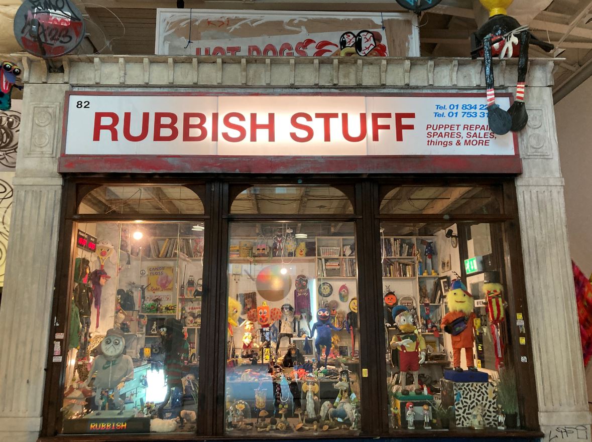
Puppet Workshop ‘Rubbish Stuff’ by Paul Insect in BEYOND THE STREETS LONDON at the Saatchi Gallery

So far I’ve given the impression it’s mad and cluttered and busy, and some of the rooms or spaces definitely are. But others are the complete opposite, big traditional gallery spaces with sensible wood floors, white walls and all kinds of works hung on them.

Some are sets of paintings on wood (or concrete) because one of the things that comes over is that, among the 100+ artists on display, some began as street artists but have been going for 30 years or more and have evolved a more studied conventional practice. Hence a very conventional display which looks like this:

Installation view of BEYOND THE STREETS LONDON at the Saatchi Gallery

In other places, works have been sprayed directly onto the gallery walls by contemporary artists.

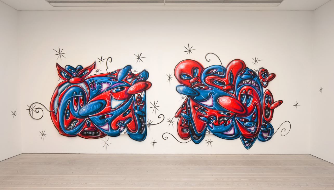
Wall art by Kenny Scharf, created specially for BEYOND THE STREETS LONDON at the Saatchi Gallery

Running the entire height of one of the big stairwells is what amounts to a dense wallpaper made up of hundreds and hundreds of photos of New York subways trains entirely covered with classic urban graffiti. There’s a room devoted to the work of Lawrence Watson (born 1963) who worked his way up through the New Musical Express and The Face, during which he was commissioned to do a photojournalism on the New York hip-hop school and took classic snaps of artists like Run-DMC, LL Cool J and Public Enemy.

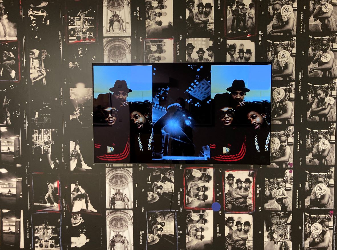
Lawrence Watson installation featuring contact sheets and a performance video of one of the many hip-hop acts he photographed, at BEYOND THE STREETS LONDON at the Saatchi Gallery

There’s what you could call a busy but essentially orderly displays, such as this one of brightly coloured rectangles with catchy images or logos.

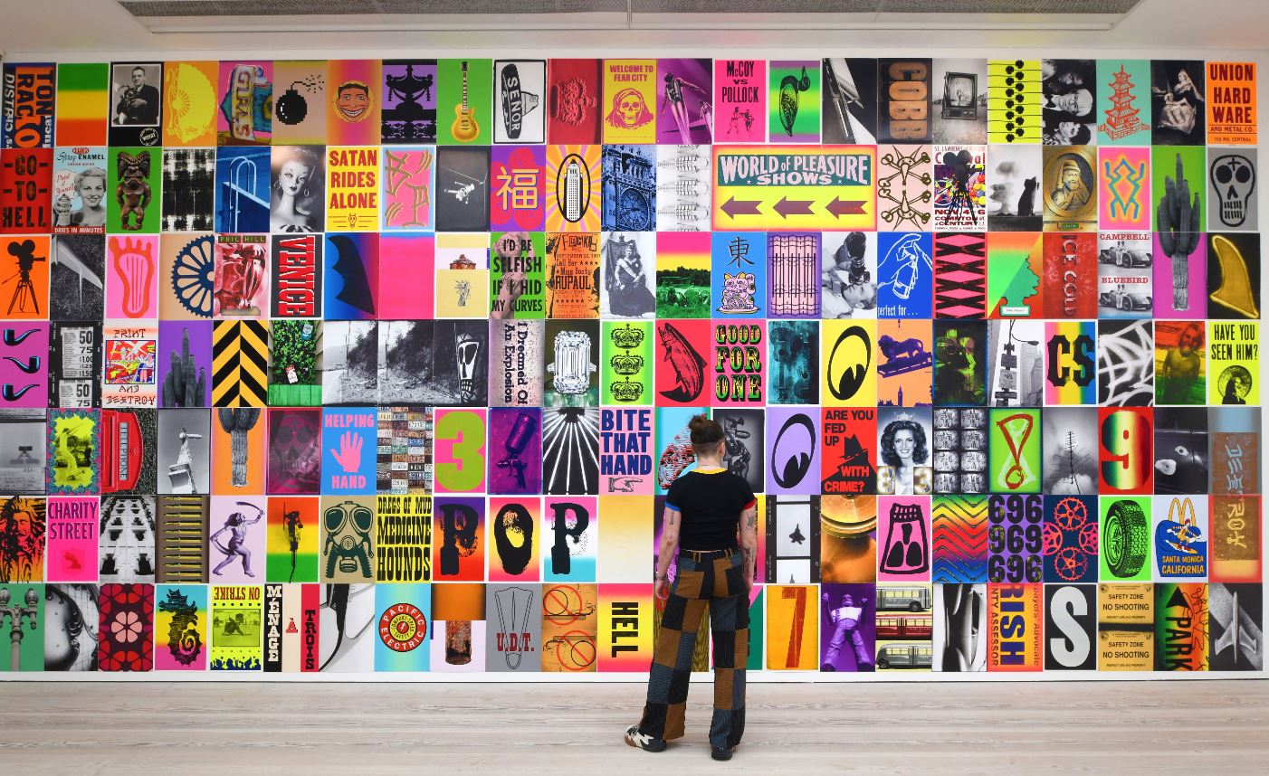
Site-specific poster installation LONDINIUM 2023 by C.R. Stecyk III in BEYOND THE STREETS LONDON at the Saatchi Gallery

Then there’s politics because young people are constantly rebelling, bless them, before they grow up, get married, get a mortgage and kids and vote for people like Boris Johnson or Dominic Raab.

I warmed to the rebel imagery of the English punk strand of things, and especially liked a huge long wall covered in posters for punk bands and gigs in the late 70s, mixed up with posters execrating Maggie Thatcher and weathered old copies of the magazine Class War, which I used to get when I was a student, mainly for the hilarious covers, like the satirical covers of Private Eye, only with added venom. Ah, the Miners Strike, the Battle of Orgreave, bombs in Northern Ireland, Exocets over the Falklands, those were the days, eh?

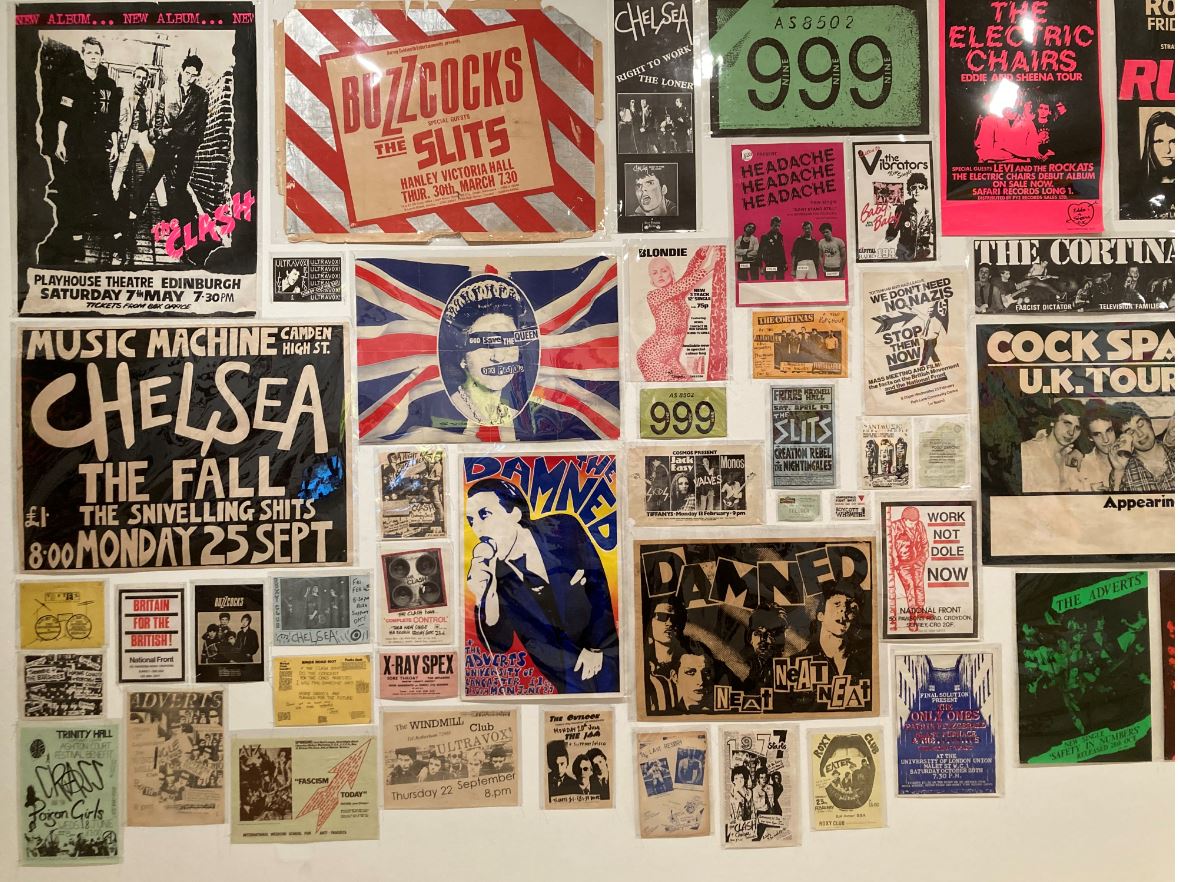
Part of the punk poster collage in BEYOND THE STREETS LONDON at the Saatchi Gallery

Some definitions

1. Graffiti

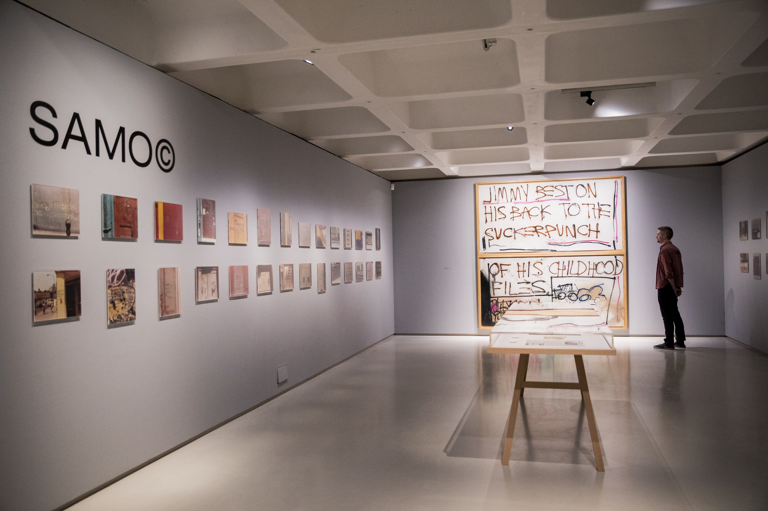
Graffiti is a name-based, usually illegal art work which can range from simple tag signatures to elaborate, multi-coloured designs.

Graffiti is probably as old as civilisation i.e. cities. We have graffiti from ancient Rome (displayed at the British Museum’s Nero exhibition). Modern-day graffiti arose in 1967 in New York and Philadelphia as a form based on repetition of the artist’s name or tag, embellished and stylised. Graffiti movements or communities arose round the increasingly popular. Generally, you gained respect the more daring and illegal your work.

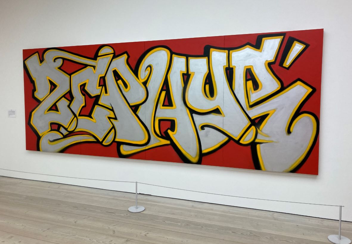
Untitled by ZEPHYR, a venerable graffiti artist who’s been ‘working’ for over 50 years, in BEYOND THE STREETS LONDON at the Saatchi Gallery

2. Street art

Street art is usually illegal work that falls outside the scope of ‘graffiti’, for example, image-based posters, stickers, stencils and installations. In a modern art context, street art dates from as recently as 2000 when a critical mass of artists, many of them originally graffiti-ists, crystallised the practice and attracted attention from curators and art scholars.

3. Murals

Murals are large-scale wall art, whether legal or illegal.

Exhibition contents

Let me try to give a more structured overview of this huge, unwieldy phantasmagoria by, basically, copying the press release.

The curators’ stated aim is to zero in on exceptional moments in the history of street art. These include the emergence of punk, the birth of hip-hop (celebrating its 50th anniversary, happy birthday, chaps) and street culture’s growing influence in fashion and film.

What comes over just from that preliminary introduction is that the exhibition is nowhere near complete. These are just a tiny fraction of works from an art form or movement which was spontaneous, undisciplined and often ephemeral by its nature. It’s a tiny selection of what could arguably be seen as the only really global universal art form, found as much in urban centres in Latin America, Africa, Russia, China, the Far East, as on the mean streets of Brixton or Philadelphia.

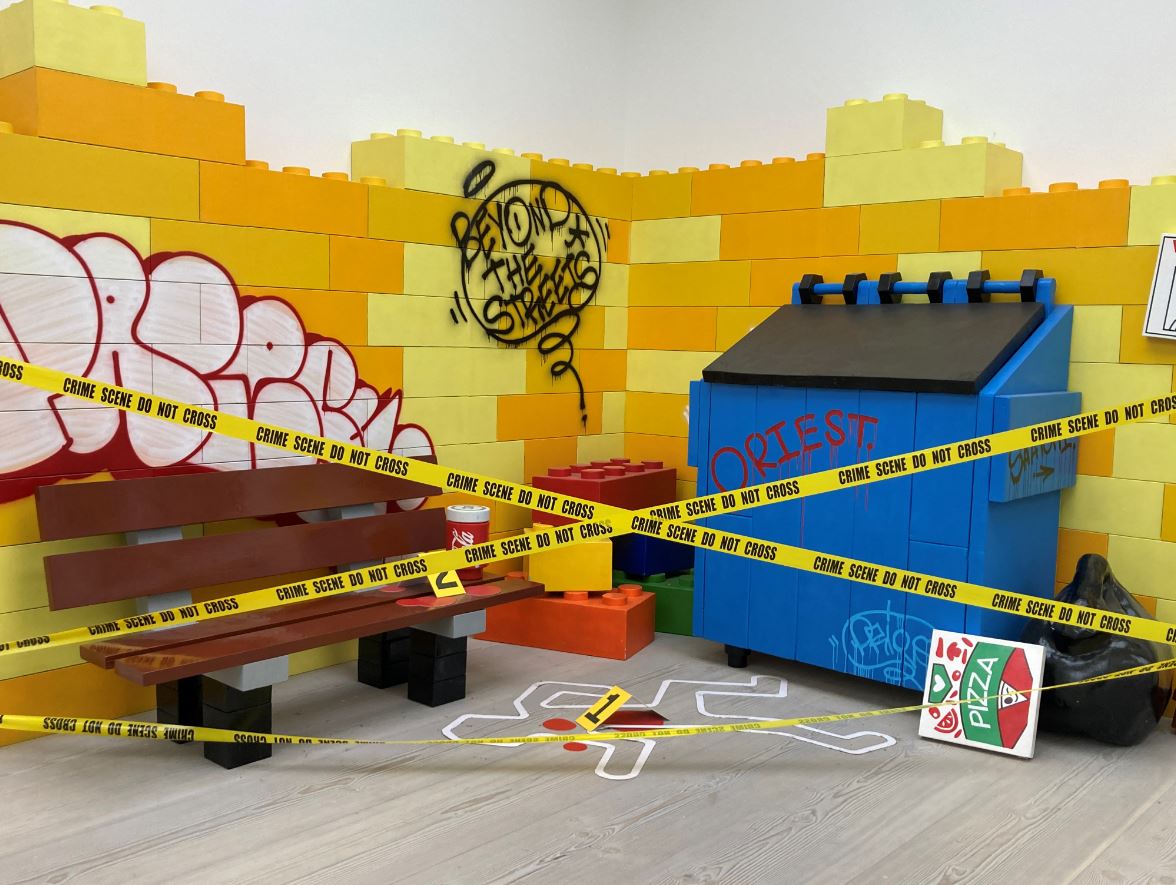
‘Toy Alley.. after the Murder’ installation by PRIEST in BEYOND THE STREETS LONDON at the Saatchi Gallery

Anyway, the exhibition is divided into what the curators call ‘chapters’.

1. Vandal

First thing you see on entering the gallery is a graffiti-filled installation of what looks like a teenager’s bedroom, ‘The Vandal’s Bedroom’ by American artist Todd James, presumably to establish several themes: predominantly that this whole worldview is by and for youth, angry sullen teenagers and students or – in America more than England, I suspect – black kids from ghettos who felt outside all existing norms and social structures. The other theme being mess, it’s a mock-up of the bedroom of the messiest teenager in history, covered in posters and magazines and rubbish and sci-fi paperbacks but mostly festooned with scrawls and tags and ‘toons. Looked like my son’s bedroom on a good day.

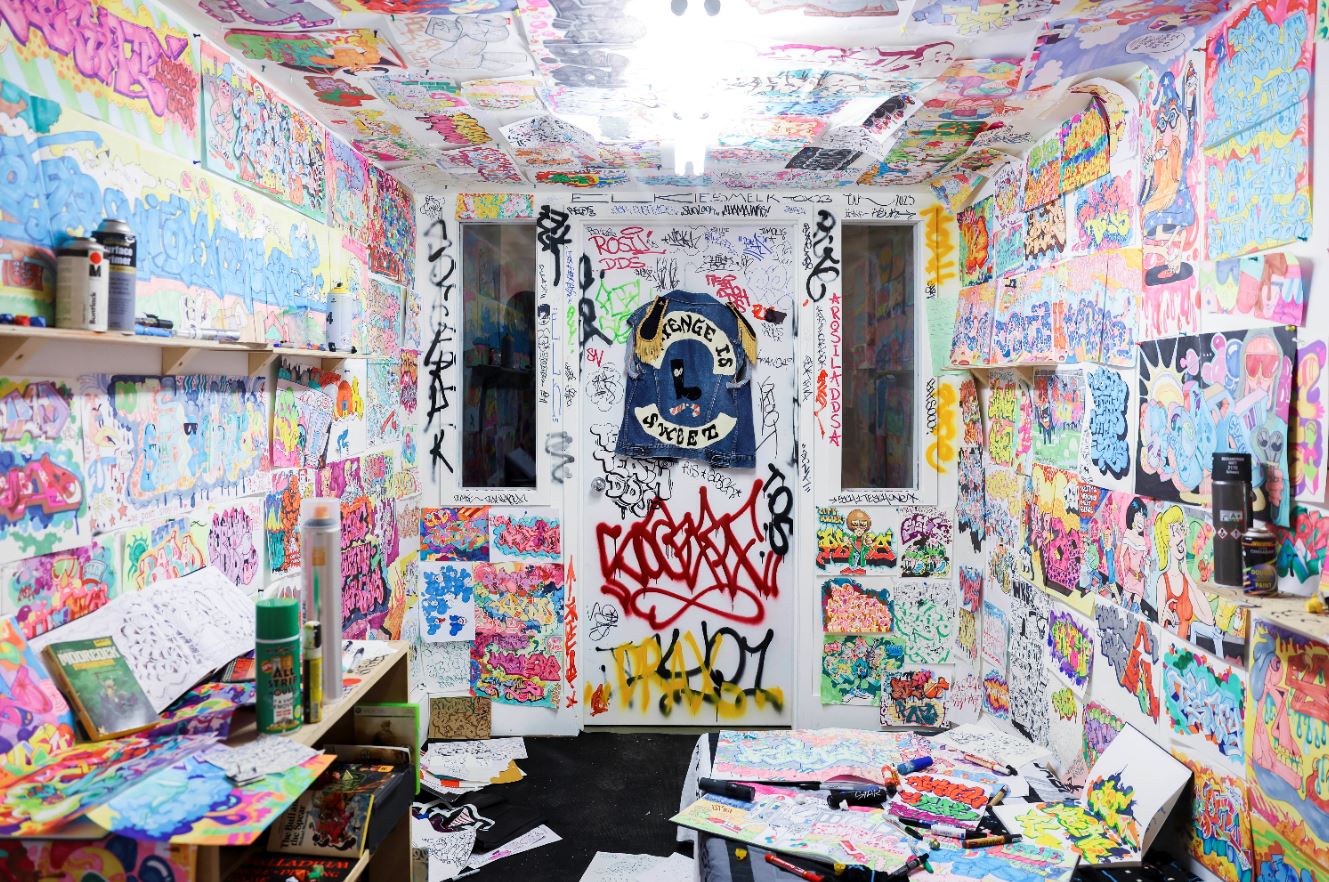
Vandals Bedroom by Todd James in BEYOND THE STREETS LONDON at the Saatchi Gallery

2. Music and art converge

The socio-political turmoil of the late 1970s and 80s, where the decline of cities met artistic resistance, a shift which was felt in both the US and UK. Youth culture responded by painting graffiti on walls and public transport, creating art that reflected and reimagined the times in an explosion of expression on the streets. It was about identity in the face of oppression, self-awareness, and self-discovery in a moment of a depleted economic outlook.

3. Dream galleries

A selection of American and European originators, photo documentarians and cultural icons who helped contextualize and spread graffiti culture around the world. In André Saraiva’s Dream series, there is a visual articulation of how graffiti, street art, hip-hop, punk, fashion and break-dancing all sprung from the late 1970s and early 1980s into the 90s and today, and became a hybrid celebration of underground culture.

Featured artists also include Mister CARTOON, known for his tattooing and Los Angeles murals; a Beastie Boys installation featuring fashion and ephemera from the band’s prolific history; and LADY PINK’s feminist murals, illustrations and paintings.

Feminist mural by LADY PINK, an Ecuador-born artists who started painting New York subway trains aged 15, in BEYOND THE STREETS LONDON at the Saatchi Gallery

4. Legends

Hosts icons such as legendary NYC artist, Eric HAZE, a torch bearer for generations to come; a new large-scale painting by abstract expressionist artist José Parlá; advertisement posters by KAWS; and ephemera by Keith Haring, one of the most popular street artists of the 1980s.

5. Blockbusters

Works commissioned specifically for this exhibition by graffiti trailblazers Shepard Fairey, LA-based activist, and FAILE, a Brooklyn-based artistic duo taking over the streets of NYC since the late 90s.

6. Larger Than Life

A site-specific installation by LA-based icon Kenny Scharf, the largest version to date of his immersive and interactive installation Cosmic Cavern, consisting of Day-Glo paintings, ephemera, and reused materials found in the streets of LA (see first photo in this review). Also the signature puppet characters made from recycled materials by Paul Insect, one of London’s original street art pioneers.

7. Timeline

A deep dive into street culture history through archival photography, ephemera and fashion to examine the cross-pollination of influences across music, fashion and film. Includes a large wall vinyl by feminist collective Guerrilla Girls.

8. Art with conscience

Works by hip-hop pioneer Fab 5 Freddy.

9. Consideration into innovation

Lisbon-based artist, VHILS, who repurposes waste and found materials to reimagine city walls.

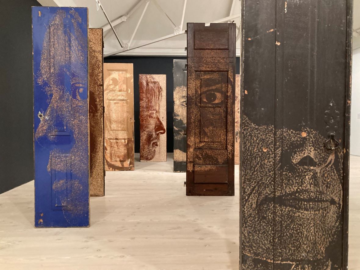
Doors by Portuguese artist VHILS , in BEYOND THE STREETS LONDON at the Saatchi Gallery

10. The Next Phase

The final ‘chapter’ is titled ‘The Next Phase’ and contains new op-art works by Valencia-based artist Felipe Pantone, whose high-contrast, geometric patterns challenge perspective, creating a distinctive digital age aesthetic.

Summary

It’s huge, and there’s loads of wall labels which are on two levels: high-level ones introducing each room and giving overviews of particular moments, themes and places (New York and London, but plenty of others); and then more specific labels zeroing in to give the biographies of the scores and scores of artists featured and descriptions of specific works. If you studied all of them you’d be here all day. It’s a feast of colour, creativity and information.

Rules and respect

The visitor handout includes 6 rules we visitors should comply with, for example ‘Respect the artworks’ and ‘Do not touch them’ etc. Rule 4 is ‘Do not sticker or tag the gallery’. Now I entirely understand why they say that – it is a very nice clean gallery, staffed by nice clean visitor assistants who are extremely helpful. Still, I couldn’t help finding it funny that an exhibition all about the wild, anarchic, street culture of the 70s and 80s is held in such an atmosphere of politeness and respect and silence, in beautifully maintained and utterly sterile white spaces.

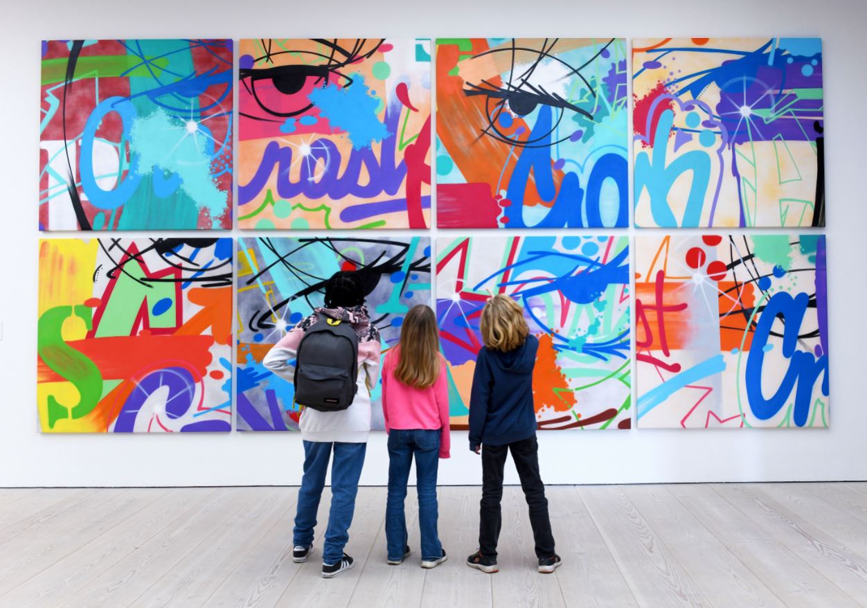
Selection of works from the Afterlife Series by CRASH (2022) in BEYOND THE STREETS LONDON at the Saatchi Gallery
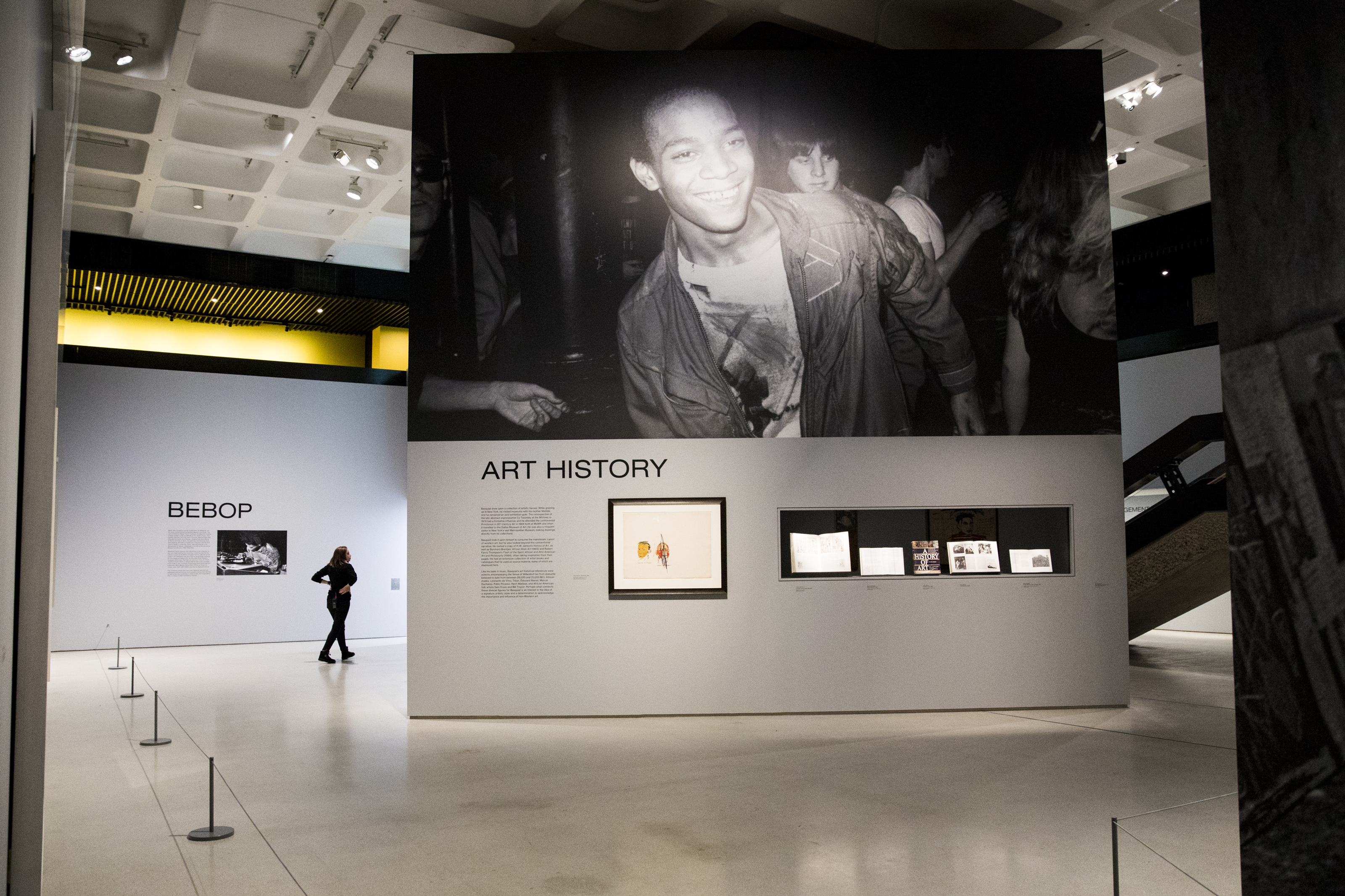
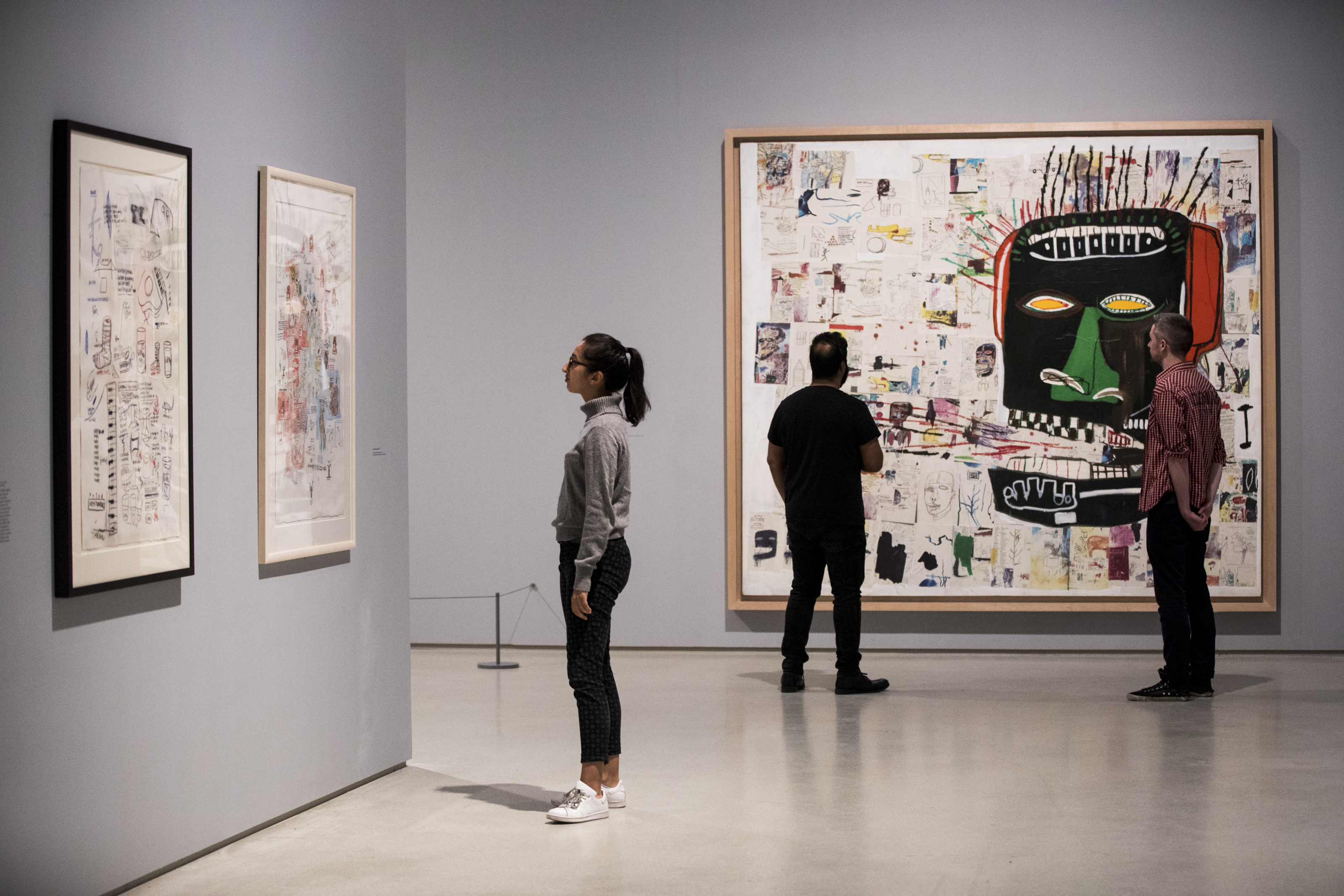
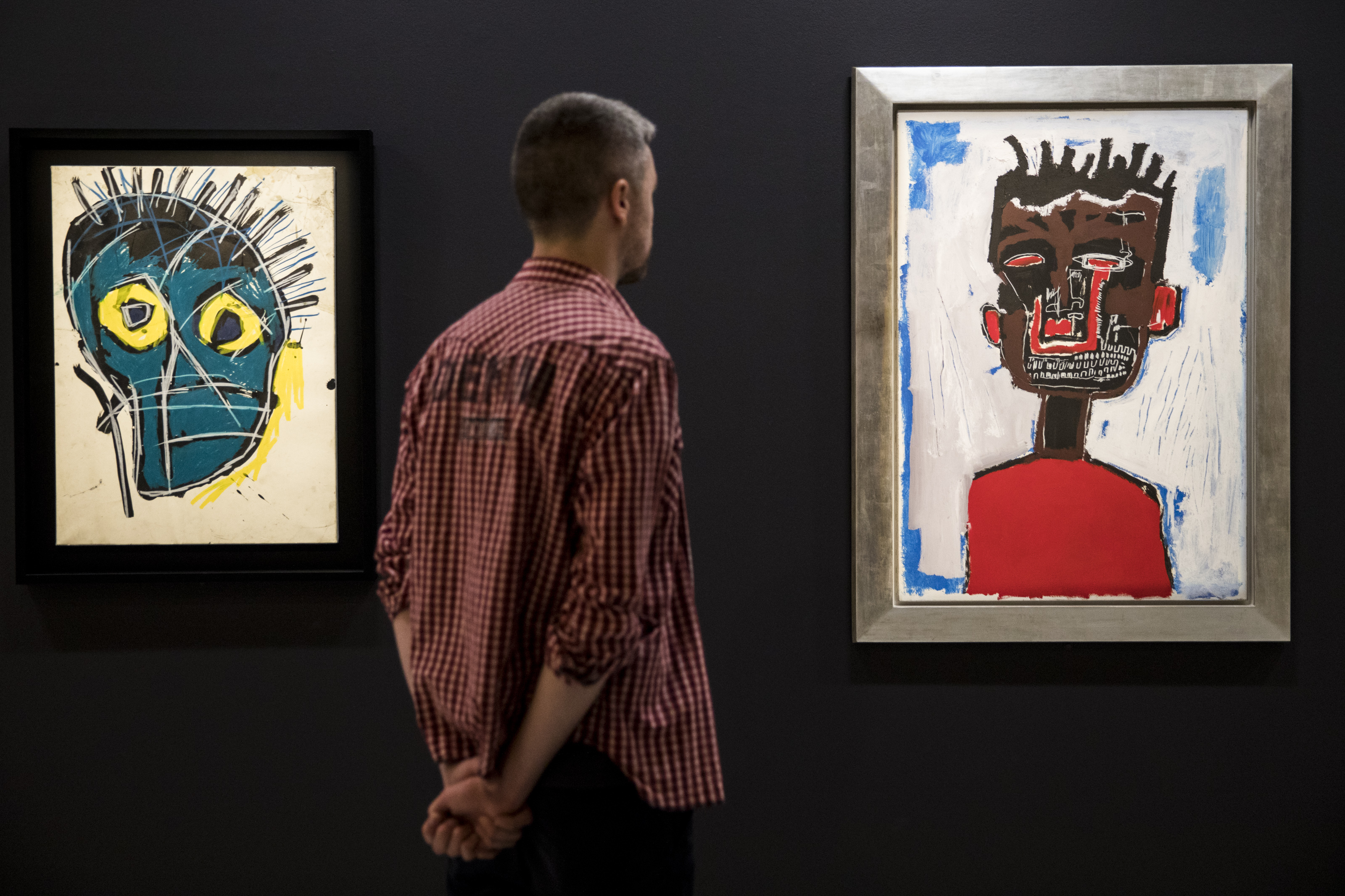
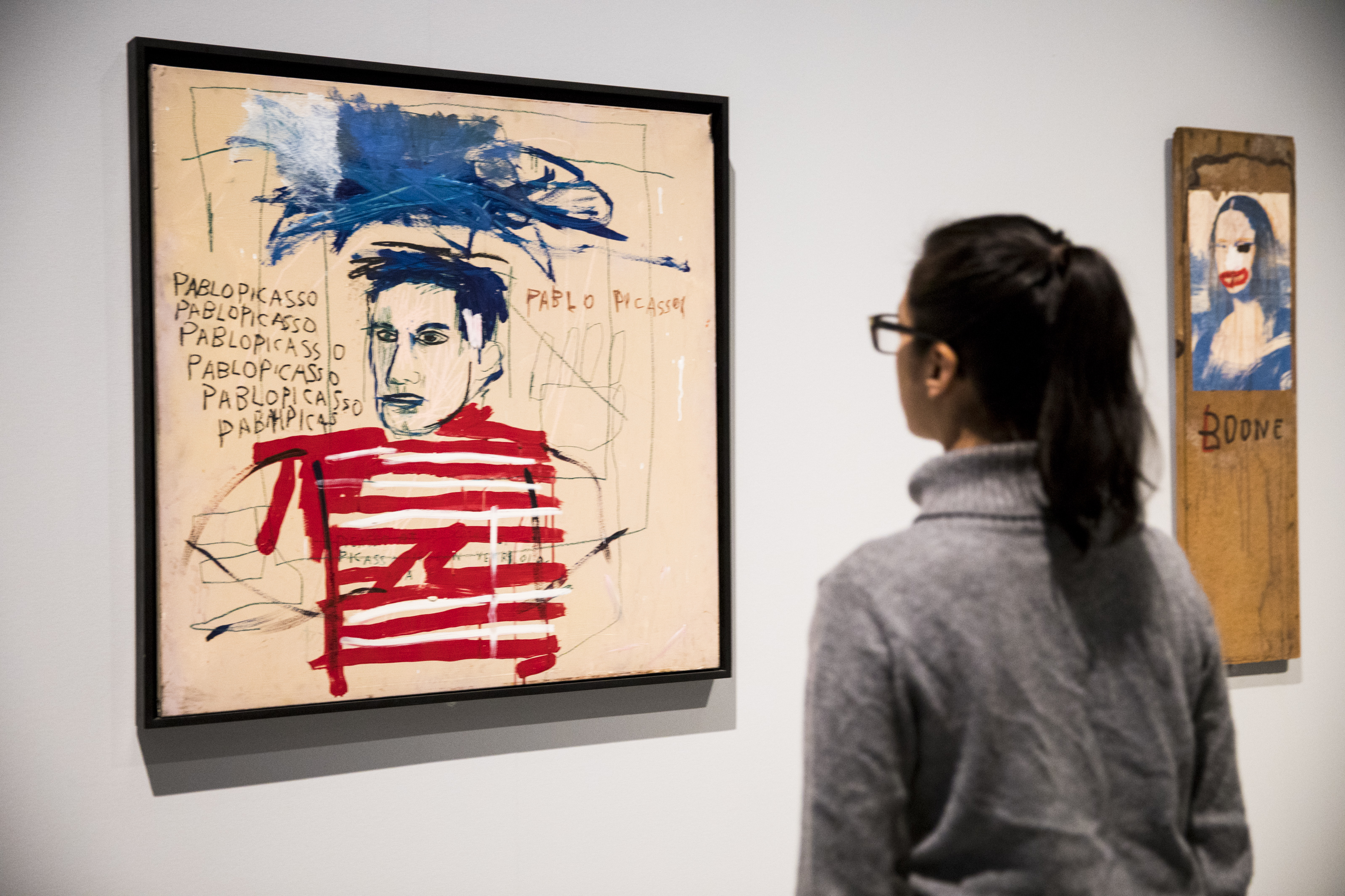
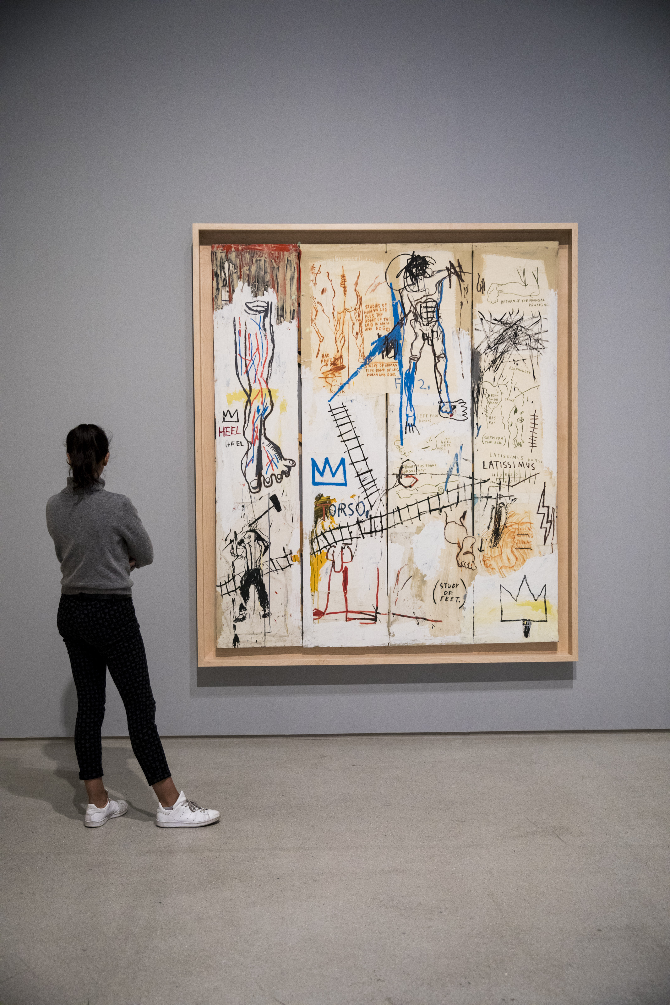
Where’s Basquiat?

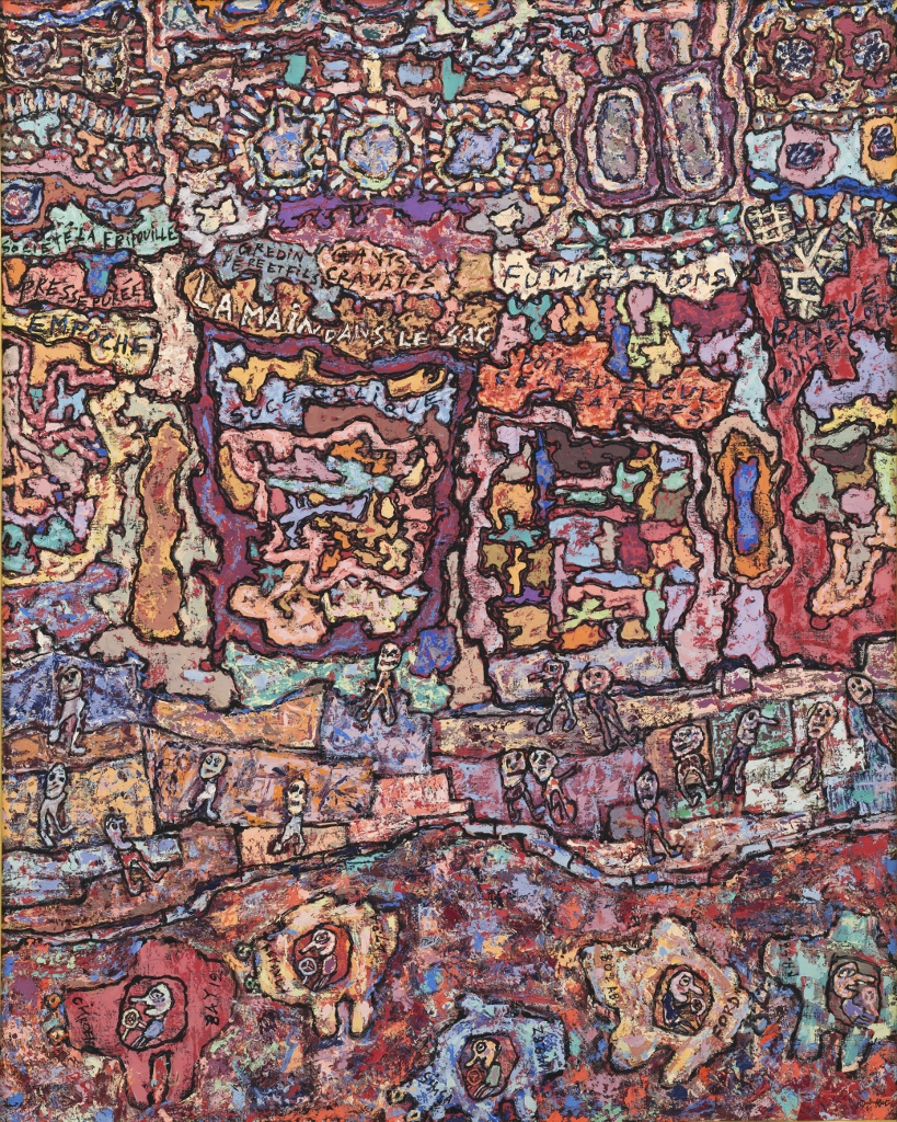
I was surprised there was no mention of New York’s most famous graffiti artist, the devastatingly brilliant, cool and beautiful Jean-Michel Basquiat (1960 to 1988), subject of a brilliant exhibition at the Barbican.


Related links

Related reviews

More exhibitions

Jean Dubuffet: Brutal Beauty @ Barbican

‘The things we truly love, which form the basis of our being, we generally never look at.’

This is a wonderful exhibition, I enjoyed it very much indeed, went round four times and lingered in front of half a dozen standout pieces. After a year in lockdown, I found its  visual energy and originality and diversity immensely refreshing and revivifying.

In a nutshell, Jean Dubuffet (1901 to 1985) rejected the entire tradition of Western art and condemned the whole idea of ‘culture’ as it was understood in his day. As he put it:

Cultural art in its entirety appears to be the game of a futile society, a fallacious parade.

So he set about making art from scratch, basing his aesthetic on graffiti, children’s drawings, finding inspiration in the streets, the look and feel of bricks and dirt and stone and earth, experimenting with found materials like broken glass and torn fabrics, coal dust, pebbles, snips of string, butterfly wings, weeds, handfuls of gravel, unusual industrial oils and waxes and so on.

It sounds dire, but the two big take-homes from this exhibition are that:

  1. in his 45 or so years as a practising artist (1940 to 1985) Dubuffet developed an amazing range of distinct visual styles or approaches
  2. in each of these styles or approaches he created masterpieces, some of them quite stunningly beautiful

‘Jean Dubuffet: Brutal Beauty’ is the first major UK exhibition of Dubuffet’s work in over 50 years, and it is big – it brings together more than 150 works from early portraits, lithographs and fantastical statues to enamel paintings, butterfly assemblages and the later, giant colourful canvases – but it isn’t big enough. I’d liked to have seen more, much more.

Coursegoules by Jean Dubuffet (November 1956) Musée des Arts Décoratifs, Paris © 2021 ADAGP, Paris/DACS, London © MAD, Paris/Jean Tholanc

Introduction

The exhibition begins on the first floor with each of the dozen or so rooms filled with works which reflected his styles from about 1940 to 1961. These are very varied, with each room devoted to a different theme or project. They’re all quite small. It is a succession of rooms of small or medium sized paintings and small sculptures.

The exhibition explodes when you come back down to the ground floor and the 6 or so rooms here which feature a succession of big, awesome and sometimes overwhelming works. It’s a great adventure.

There’s a big introduction wall label, supplemented by a biographical timeline, and both bring out the unusual way that, although he moved from his native Le Havre to Paris when he was 17 to study at the prestigious Académie Julian, he left after six months, realising that he could create his own syllabus of favourite subjects, which included philosophy, literature and ethnography. Although he made friends with fellow artists such as becoming close friends with the artists Juan Gris, André Masson, and Fernand Léger, he preferred to go back to Le Havre, marry and work for his father’s own wine business.

In the 1930s he established his own business and was still running it when the Germans invaded France in 1940 and it is typical of his stroppy, anti-establishment contrarianism that, later in life, he boasted about all the fine wine he sold to the occupying Wehrmacht.

1940s

In 1942 Dubuffet decided to start painting again, and adopted a naive style for painting scenes from Paris life. Early on he abandoned the traditional method of applying oil paint to canvas with a brush and instead created a paste into which he could create physical marks, such as scratches and slash marks. In 1944, as the Americans landed on the Normandy beaches, Dubuffet created a series in which he wrote rough, scrawled ironic messages in the style of graffiti onto fragments of newspaper.

In 1945 Dubuffet began to make portraits of friends. They impressed the wealthy American expatriate Florence Gould, and he ended up doing portraits in pen and ink or oil of most of her circle. He would stare at them for hours then go back to his studio and draw or paint them from memory, the key elements of their faces emerging in childish caricatures.

Dhôtel by Jean Dubuffet (July–August 1947) Private Collection © ADAGP,Paris and DACS, London

In 1947 Dubuffet had his first solo exhibition in America, which was a success among young American artists rebelling against the European tradition and looking for new directions. He met and impressed Jackson Pollock and there’s something of Pollock in his earth paintings and, more surprisingly, in his very late paintings (see below).

Between 1947 and 1949, Dubuffet took three separate trips to Algeria, learned some Arabic and spent time in the desert with bedouin. When he returned to Paris he developed his thickly painted style into a specific set of desert paintings, trying to recapture the primeval sensation of being far from traditional culture, almost alone with the universe, the dense clotted surface gripping meaning, existence and all those other existentialist buzzwords.

Exaltation du ciel by Jean Dubuffet (1952)

Right from the start Dubuffet had dismissed the traditional concept of perspective. You can see it in these desert paintings where 90% of the picture represents the earth with only a sliver of sky at the top, creating a claustrophobic sense of total immersion.It is also a dominant feature of the butterfly paintings

1950s

In the 1950s Dubuffet moved to Vence in the South of France where the climate would be better for his wife, Lili, who had weak lungs. He was inspired by the natural scenery. In 1953 he was on holiday with his friend Pierre Bettencourt who was a lepidopterist, catching butterflies and sticking them to boards. This inspired Dubuffet to experiment with incorporating butterfly wings into paintings. The result was a series of entrancing painting-collages. These were really lovely, inspiring, worth dwelling over each one and savouring.

Landscape with Argus by Jean Dubuffet (August 1955) Collection Fondation Dubuffet, Paris © ADAGP, Paris and DACS, London

In the late 1950s (starting September 1957) Dubuffet embarked on a new series which he called ‘Texturologies’. He developed a technique of putting oil paint onto branches of trees or bushes and then speckling canvases. Sounds silly but the result is a set of captivating canvases which can be enjoyed from metres away as shimmering collections of micro-spots or from close up as surfaces teeming with thousands of dots of a range of earth colours.

Jean Dubuffet with soil (1958) (© Archives Fondation Dubuffet, Paris; photo: Jean Weber and © Fondation Gianadda, Martigny)

1960s

In 1961 Dubuffet returned to Paris after 6 years’ absence and was astonished at its transformation from battered survivor of the war to booming consumer society. He developed an entirely new aesthetic (or reapplied his existing one) to capture the busy-ness of the capital’s streets – what he called the Paris Circus – in paintings which were consistently large and dominating. Many have a deliberately sketchy scrappy style, scratchy but vivid and alive. I was particularly entranced by La main dans le sac.

Caught in the Act by Jean Dubuffet (September 1961) Collection Van Abbemuseum, Eindhoven © 2021 ADAGP, Paris/DACS, London © Peter Cox, Eindhoven, The Netherlands

Right from the start of his career Dubuffet had ignored the entire tradition of perspective, preferring to create a two-dimensional presentation of space, filling every inch of the picture plane, sometimes overlapping solid objects as in the butterfly collages. It is this utter rejection of perspective and a child’s motivation to fill every centimetre of the surface which creates the cramped effect of his works.

L’Hourloupe

One day in 1962 Dubuffet was doodling during a phone call, creating zoomorphic rounded shapes then colouring them with tints of blue and red and stumbled across an entirely new look. He called them ‘L’Hourloupe’ and they developed into a whole new cycle of work, created over a decade and encompassing paintings, sculptures, architectural environments and performances. He created 175 freestanding pieces which he called praticables.

The series culminated in a theatrical performance of a show named ‘Coucou Bazar’ at the Guggenheim Museum in New York in 1973 performed to music composed by Ilhan Mimaroglu. This ‘living painting’ was a one-hour spectacle with sixty artworks animated by performers, motors and remote control. Later the show was recreated in Paris, and then, in 1978, in Turin with music composed by Dubuffet himself. My God, what would that have sounded like?

Hourloupe figures by Jean Dubuffet at the Barbican (photo by the author)

The room devoted to the Hourloupe pieces is the largest in the exhibition and, as well as half a dozen large paintings in this style, it includes a low stage holding no fewer than 16 of the life sized cutouts and four dazzling costumes. This was an amazing visual spectacle. I was entranced. I looked at them from all angles possible. So simple, just doodly lines of black against pure white and tinted with blue and red, so big and fun and goofy and strange and delirious.

Hourloupe figure by Jean Dubuffet at the Barbican (photo by the author)

1970s

In the second half of the 1970s Dubuffet created a series titled ‘Theatres of Memory’, a reference to the history book, The Art of Memory by Frances Yates. They are a return to assemblage (the term he preferred to collage) layering fragments of paintings over each other, arranging and rearranging cutout figures, colours and shapes into the discreet panels.

The largest and one of the most stunning pieces in the show is Vicissitudes (1977). At over 3.5 metres wide it’s huge and fills an entire wall. Dubuffet was now 75 and making works like this involved ‘a good deal of gymnastic exercise on a ladder’. I found myself totally absorbed by this piece, and came back to it again and again.

Installation view of Vicissitudes by Jean Dubuffet at the Barbican (photo by the author)

I love the way it’s made of panels which each have a distinct colour palette and style; but the way the panels are very much not arranged symmetrically or classically and yet, at the same time, feel right. The arrangement and patterning feels just so. This has been true throughout the exhibition.

Works from this series were exhibited in New York in 1979 and influenced, among others, artists Keith Haring and Jean-Michel Basquiat, and my first reaction on seeing it was ‘Basquiat!’, not least because these very same galleries hosted a massive and awesome Basquiat exhibition just two years ago.

1980s

At the end of the 1970s Dubuffet returned to black and white ink drawings, now with the fluid grace of a master. I liked these a lot, but they were a bit eclipsed by another series of large colour paintings, which he called Mires, dense clusters of interweaving lines and shapes in primary colours. Whereas the Theatre of Memory pieces had recognisable, if cartoon-like, faces and other real world objects, the Mires are exercises in pure colour and pattern, extensions of earlier ideas but also surprisingly reminiscent of the Jackson Pollock who he met in New York in the late 1940s.

Fulfilment (Epanouissement) by Jean Dubuffet (November 1984) Collection of Milly and Arne Glimcher © 2021 ADAGP, Paris/DACS, London, Courtesy Pace Gallery

Art brut

A key aspect of Dubuffet’s achievement was the almost single-handed establishment of the concept of art brut, which can be translated as ‘raw art’, in the 1940s, and which later acquired the tag, in the English-speaking world, Outsider Art. (The term outsider art was coined by art critic Roger Cardinal in 1972.)

From the outset, Dubuffet was drawn to other untrained artists, graffitists, tattooists, spiritualists, prisoners in gaol or inmates of asylums, whose creativity felt much more inspiring to him than anything on display in the city’s museums. From 1945 he began to collect them in a systematic way, always keeping his eye open for the strange and non-conformist. During and after the war he built up his own collection of such art, which he called art brut or ‘raw art’.

In 1948 he formed the Compagnie de l’Art Brut along with other artists, including André Breton. The collection he established became known as the Collection de l’art brut. It contains thousands of works and is now permanently housed in Lausanne, Switzerland.

He believed that mainstream culture, fully incorporated into international capitalist consumer culture, assimilates every new development in art, and by doing so takes away whatever power to disturb or astonish that it might have had. The result is to asphyxiate genuine expression. Art brut was his solution: only art brut is immune to the ravening maw of ‘culture’, cannot be easily absorbed and assimilated, because the artists themselves were not willing or able to be assimilated.

Thus a major aspect of the exhibition, a simple but inspired idea by the curators, is to dedicate not one but two entire rooms to pieces from what grew into a huge collection of outsider art which Dubuffet himself amassed. 18 artists are featured from Dubuffet’s huge collection, including Aloïse Corbaz, Fleury-Joseph Crépin, Gaston Duf., but two artists, in particular, stood out for me:

Laure Pigeon

Laure Pigeon (1882 to 1965) was a French medium who produced an oeuvre of 500 drawings related to her Spiritualist practice. When he heard that her entire oeuvre was about to be thrown away after her death in 1965, Dubuffet rang the executors and asked if he could have them. The exhibition includes half a dozen examples of her dynamic dark blue cutouts, like Matisse with attitude.

11 December 1953 by Laure Pigeon (1953) Collection de l’Art Brut, Lausanne. Photograph by Marie Humair, Atelier de numérisation

Madge Gill

Madge Gill’s monumental calico drawings in which scores of cartoon faced-women appear trapped in huge, complex skeins of material.

Faces*

Faces by Madge Gill (1947)

The last room is showing a ten-minute video made up of excerpts from various films about him and interviews shot in the 60s and 70s and 80s. At one point he says there’s only really one way of being normal and it’s boring; but there are a 100 million ways of not being normal and they are all fascinating!

Here’s a montage of Dubuffet art works which gives you a good sense of the variety of effect he could create from such disparate materials.


Related links

Other Barbican reviews

Basquiat: Boom for Real @ the Barbican

This exhibition is great! Jean-Michel Basquiat (1960 to 1988) was cool and street in a way hardly any artists are, even today. He did graffiti, made goofy postcards, he was in bands, he DJed at clubs, he liked bebop, he hung out with early rappers, he painted, drew and created art constantly out of the bombardment of signs, images, words and phrases which surrounded him in the grimy, vibrant New York of the early 1980s.

King of the Zulus (1984-85) by Jean-Michel Basquiat. Photo © Tristan Fewings/Getty Images. Artwork © The Estate of Jean-Michel Basquiat. Licensed by Artestar, New York

King of the Zulus (1984 to 1985) by Jean-Michel Basquiat. Photo © Tristan Fewings/Getty Images. Artwork © The Estate of Jean-Michel Basquiat. Licensed by Artestar, New York

Born in 1960, the son of a Haitian father and a Puerto Rican mother, Basquiat grew up in the post-punk scene in Lower Manhattan. New Wave/No Wave they called it. He attended the alternative school, City-As-School High School, where he came to attention after he developed the moniker SAMO©, along with Al Diaz and other friends, to use in graffiti all across the city. They covered buildings all over the Lower East Side with witty, snappy, poetic or satirical slogans.

SAMO originated in the stoned 17-year-olds talking about smoking the ‘same old shit’ but quickly became a cult movement, with claims and counter-claims about ‘original’ SAMOs, with other artists on the scene photographing the graffitos, exhibiting them and so on. Examples include:

SAMO© AS A CONGLOMERATE OF DORMANT GENIOUS

MY MOUTH / THEREFORE AN ERROR

Not your usual graffiti – it was puzzling, elliptical, intriguing. From really early on everything Basquiat touched had a kind of magic about it. And right from the start he was ambitious, concentrating the graffiti around the SoHo art galleries, currying attention with curators. When the Village Voice magazine finally revealed the identities of the hitherto anonymous authors, Basquiat and Diaz declared SAM dead, fellow artist Keith Haring delivered a mock eulogy at the bohemian Club 57, and Basquiat painted SAMO© IS DEAD over the old graffitos. But he continued to use the identity and the celebrity it had brought. At an arty party in 1979 Basquiat agreed to be captured on film creating a one-off SAMO© graffito on the wall of the art space where the party was happening.

A wall of photos of SAMO© graffiti by Jean-Michel Basquiat. Photo © Tristan Fewings/Getty Images. Artworks © The Estate of Jean-Michel Basquiat. Licensed by Artestar, New York

A wall of photos of SAMO© graffiti by Jean-Michel Basquiat. Photo © Tristan Fewings/Getty Images. Artworks © The Estate of Jean-Michel Basquiat. Licensed by Artestar, New York

With Jennifer Stein Basquiat started producing hand-made postcards – again from the detritus of the street – newspaper headlines, polaroid selfies, cigarette butts, posters, ads, random texts. Hard to imagine, but photocopying was a new technology, and their use of a rare colour photocopier showed an innovative approach to using mundane, workaday technology. On a now famous occasion Basquiat plucked up the courage to approach his hero Andy Warhol in a bar and sold him a card for one dollar.

By the turn of the decade Basquiat scraped together the resources to make paintings in an extremely rough, crude style, incorporating lots of text, phrases, slogans, street poetry, misspelled or misspelt, scrubbed out, as well as countless faces, graffiti with ambition, the street experience on canvas.

Hollywood Africans (1983) by Jean-Michel Basquiat. Photo © Tristan Fewings / Getty Images. Artwork © The Estate of Jean-Michel Basquiat/ Artists Rights Society (ARS), New York/ ADAGP, Paris. Licensed by Artestar, New York.

Hollywood Africans (1983) by Jean-Michel Basquiat. Photo © Tristan Fewings / Getty Images. Artwork © The Estate of Jean-Michel Basquiat/ Artists Rights Society (ARS), New York/ ADAGP, Paris. Licensed by Artestar, New York.

The graffiti is always there as a kind of substratum in the work, but after he exhibited in the scene-defining 1981 exhibition New York/New Wave, Basquiat began to sell pieces and get access to more resources, bigger canvases to mark with acrylics, oil, crayon, pen, using not just paint but wood, scrap metal, foam rubber, all sorts.

The results are scrappy, patchy, quick and dirty, but many are also stunning, stunningly alive, colourful, vibrant, spontaneous, magnificent, in your face, spooky. Of the 1,600 works on show from artists like Warhol, Mapplethorpe, David Byrne and so on, Basquiat was singled out by nearly all the critics. Galleries approached him with contracts, magazines wanted interviews.

Untitled (1982) by Jean-Michel Basquiat. Photo © Tristan Fewings/Getty Images. Artwork Courtesy Museum Boijmans Van Beuningen, Rotterdam. © The Estate of Jean-Michel Basquiat. Licensed by Artestar, New York.

Untitled (1982) by Jean-Michel Basquiat. Photo © Tristan Fewings/Getty Images. Artwork Courtesy Museum Boijmans Van Beuningen, Rotterdam. © The Estate of Jean-Michel Basquiat. Licensed by Artestar, New York

Numerous urban legends quickly gathered round him: a particularly entertaining one is that after his first formal introduction to Warhol at his Factory studio in October 1982, Basquiat rushed back to his gallery and knocked off a painting of himself and Warhol in just two hours and had his assistant take it round to Warhol’s studio still wet. The godfather of Pop was delighted and the two became firm friends. In fact, they went on to collaborate on some 100 works together.

Dos Cabezas (1982) by ean-Michel Basquiat. Photo © Tristan Fewings/Getty Images. Artwork © The Estate of Jean-Michel Basquiat. Licensed by Artestar, New York

Dos Cabezas (1982) by Jean-Michel Basquiat. Photo © Tristan Fewings/Getty Images. Artwork © The Estate of Jean-Michel Basquiat. Licensed by Artestar, New York

The exhibition includes out-takes from the episode of Warhol’s TV show in the 80s where the Bewigged One interviews Basquiat with his arm familiarly round his shoulders, joking and riffing. I see modern bloggers refer to it as a classic ‘bromance’. They collaborated, Warhol creating pop images which Basquiat defaced, rewrote, reinterpreted, remodelled. They did stylish photoshoots.

Andy Warhol and Jean-Michel Basquiat July 10, 1985, by Michael Halsband

Later on in the show, there’s a viewing room where you can see one of the few extended interviews Basquiat did, an amateur effort by some art world friends. Here and in almost all the images – photos, film clips, interviews, TV stuff and some rare footage of him dancing in the studio – he comes over as full of life. You rarely see artists in any medium smile so much – he has a hugely infectious boyish smile. In the scrappy New Wave vibe of Downtown New York, glamour was as important as talent and Basquiat has charisma in buckets.

Jean-Michel Basquiat dancing at the Mudd Club (1979) © Nicholas Taylor © Tristan Fewings/Getty Images

Jean-Michel Basquiat dancing at the Mudd Club (1979) © Nicholas Taylor © Tristan Fewings/Getty Images

But it’s not empty or baseless fame – this astonishingly young man was a fountain of creativity, graffiti turning into postcards and then overflowing into myriads of paintings, drawings, graffitied objects and readymades large and small, scrap-book montages, tell-tale silhouettes, endless self-portraits, notebooks packed full of poetry, film scripts and the bands he was in writing experimental music and lyrics, the DJing, hanging with early rap pioneers, a vortex of energy and exuberance.

Glenn (1984) by Jean-Michel Basquiat. Photo © Tristan Fewings/Getty Images. Artworks © The Estate of Jean-Michel Basquiat. Licensed by Artestar, New York

Glenn (1984) by Jean-Michel Basquiat. Photo © Tristan Fewings/Getty Images. Artworks © The Estate of Jean-Michel Basquiat. Licensed by Artestar, New York

I returned to this particular pair of works again and again. In the century of Picasso, Klee, Kokoschka and hundreds of other semi-figurative modernists, I hadn’t seen anything quite like these, the intuitive use of completely different palettes of colours, the confidence, the lack of fear, the forcefulness of the images blew me away.

Untitled (1983) and Self Portrait (1984) by Jean-Michel Basquiat. Photo © Tristan Fewings / Getty Images. Artwork © The Estate of Jean-Michel Basquiat. Licensed by Artestar, New York

Untitled (1983) and Self Portrait (1984) by Jean-Michel Basquiat. Photo © Tristan Fewings / Getty Images. Artwork © The Estate of Jean-Michel Basquiat. Licensed by Artestar, New York

This is a major exhibition, with both floors of the Barbican’s gallery packed with over 100 works – 14 rooms in all. The eight rooms on the top floor describe a chronological survey of Basquiat’s short life and prodigious output, while the six rooms on the ground floor investigate his influences, a dazzling kaleidoscope of material, from junk TV to the old textbook Gray’s Anatomy, from Picasso and Matisse (paid homage to with Basquiatesque portraits).

Untitled (Pablo Picasso), 1984 by Jean-Michel Basquiat © Tristan Fewings/Getty Images © The Estate of Jean-Michel Basquiat. Licensed by Artestar, New York

Untitled (Pablo Picasso), 1984 by Jean-Michel Basquiat © Tristan Fewings/Getty Images © The Estate of Jean-Michel Basquiat. Licensed by Artestar, New York

Basquiat had an intense involvement with the bebop jazz of Charlie Parker and the other lead boppers (he had a collection of some 3,000 jazz records), but this was just one source of references in a kaleidoscope of ideas and motifs which included anything from Western art which caught his fancy, a dizzying range of African and tribal art, fashion magazines, ad slogans, TV programmes, black sports stars, Hollywood movies, anything he saw, processed and incorporated into his quick vivid works.

Leonardo da Vinci's Greatest Hits (1982) by Jean-Michel Basquiat. Photo © Tristan Fewings/Getty Images Artwork. Collection of Jonathan Schorr © The Estate of Jean-Michel Basquiat. Licensed by Artestar, New York

Leonardo da Vinci’s Greatest Hits (1982) by Jean-Michel Basquiat. Photo © Tristan Fewings/Getty Images Artwork. Collection of Jonathan Schorr © The Estate of Jean-Michel Basquiat. Licensed by Artestar, New York

In the endless vortex of the self-referential New York art world, countless hundreds of thousands of words have been written about Basquiat, raving, promoting, analysing, knocking and dismissing him – but the best summary I’ve read was from his friend, Glenn O’Brien, music columnist in Warhol’s Interview magazine. This quote from him brings out the way Basquiat’s work lets everything in. I think this is much easier for us to understand now, in the age of solid, wall-to-wall social media saturation with images and junk text, than back in the pre-digital 1980s.

He ate up every image, every word, every bit of data that appeared in front of him and he processed it all into a bebop cubist pop art cartoon gospel that synthesised the whole overload we lived under into something that made an astonishing new sense.

‘The whole overload’. Exactly.

In 1980 some of the crowd Basquiat had met at the Mudd Club decided to make a movie about a day in the life of a Boho artist, with Basquiat playing the lead role. When shooting began in December 1980 he was 19 years old! Here’s a clip. God, isn’t he beautiful!

A room is devoted to Basquiat’s involvement with the relatively new music genre of hip-hop. In the late 70s Basquiat was introduced to early cassettes of the new music and found he had much in common with experimental musician-musicians like Rammellzee and graffiti artist Toxic. The painting above (Hollywood Africans) is a portrait of the trio on a trip to California for Basquiat’s exhibition at the Gagosian Gallery, Los Angeles. Back in New York Basquiat and Rammellzee produced a single, ‘Beat Bop’, with J-M doing the cover art. Only 500 copies were pressed. If you own a copy with the original sleeve art, that’s your retirement sorted.

The ‘bop’ in Beat Bop indicates Basquiat’s unexpected devotion to the bebop of the 1940s, and to its tragic genius Charlie Parker (died in 1955, aged just 35, after years of intense drug abuse). Alas, Basquiat also died young, from a heroin overdose in 1988, aged just 27.

Themes

Race

Some parts of the exhibition dwell on Basquiat’s colour. In 1985 he was the first black artist ever to appear on the cover of The New York Times Magazine. In the international art world a black face was a tremendous rarity. There are sections in the show about his references to black sporting heroes, to black jazz heroes, and to the new forms of expression developed by black rap music and hip hop.

This is a massive subject, especially in the fraught context of America’s ongoing problems with its black population (I mean by this the relative poverty of Afro-Americans, the disproportionate number of African-American males in prison, and the seemingly unstoppable cases of American cops beating up and shooting dead black men). I note its presence but I’m not expert enough to comment, apart from to notice the presence in many of the works of the recurrent image of a jet black silhouette, presumably a self-portrait, really powerful in its intensity, a mask, a memento, a magus.

Self-Portrait (1983) by Jean-Michel Basquiat. Photo © Tristan Fewings/Getty Images. Artwork © The Estate of Jean-Michel Basquiat. Licensed by Artestar, New York.

Self-Portrait (1983) by Jean-Michel Basquiat. Photo © Tristan Fewings/Getty Images. Artwork © The Estate of Jean-Michel Basquiat. Licensed by Artestar, New York.

Sex

There’s less about gender and sexuality than you might expect. In fact there’s a striking absence of sexual imagery or anxiety in his paintings. I wasn’t absolutely clear whether he was gay or straight, until I read references to girlfriends in online articles. Given his punk attitude it’s surprising there isn’t more stuff, even about ‘love’, let alone the vast world of sexual imagery.

Signs

Much more evident are the unstoppable flood of signs and symbols. For once a ‘semiotic’ interpretation of an artist would be justified, because Basquiat himself was quite clearly fascinated and obsessed with the strange power of signs and symbols, and the literally infinite combinations which can be made of them. In the rooms on his source materials there’s his copy of Henry Dreyfuss’s book Symbol Sourcebook.

His works are plastered with words and phrases which don’t necessarily mean anything or mean as much as they appear to, starting with SAMO’s deliberately opaque messages. For example, quite a lot of ink has been spilt trying to tease the meaning out of this phrase:

JIMMY BEST ON HIS BACK TO THE SUCKERPUNCH OF HIS CHILDHOOD FILES

which appears in graffitos and in a number of paintings and drawings. He wrote literally thousands of phrases and fragments of phrases across his works. Piecing together the puzzles, themes, meanings or avoidances of meanings strewn across this vast terrain will keep Basquiat scholars in conference invitations for the rest of their lives.

Identity

Identity is one of those themes curators and art critics love to invoke but, again, it is for once justified by Basquiat’s work. From SAMO onwards he played with identities and names for himself and his work. For example, the exhibition devotes some space to his mysterious use of the name ‘Aaron’ written across numerous works – including on the redecorated American football helmet, the image which provides the iconic poster for the whole exhibition. Probably it refers to the Afro-American baseball player and all-time home run king, Hank Aaron.

Basquiat wearing his Aaron football helmet

Music

Another major theme in Basquiat’s output is music – evidenced by the band he was in, Gray, whose album you can still buy, the hip hop single embedded in this review, and all the theme nights he organised at the trendy Area Club, to name just some output. Music appears in his art as reference to his hip hop friends but also as a major thread of works circling around bebop and the great jazz musicians who he worshipped.

Post-modernism

I remember how back in the 1980s we all spent a lot of time discussing what post-modernism meant. I am aware of its derivation from a specific movement in architecture and then its application to literature. But another, popular, interpretation was that it meant the end of High Art as a specially privileged realm. High and low art could be combined and juxtaposed for the sheer hell of it. On this interpretation Basquiat seems a textbook case of an artist who naturally inhabited this new realm, maybe helped to create it. Warhol may have taken commercial products and po-facedly turned them into art objects – Campbell’s soup, the brillo pad box, various iconic movie posters – but these artefacts were themselves highly designed – Warhol’s genius was in recognising beautiful design in the mundane.

Basquiat takes that to the next level, finding – and creating – weird, hypnotically compelling art out of street trash, a graffiti style, spray-can spontaneity, the deliberately undesigned. The Canadian art curator Marc Mayer seems to me to put his finger on it when he notes in Basquiat’s work ‘a calculated incoherence’.

He was teasing, puzzling, refracting, resisting meanings, resisting a simplistic definition of him as a black artist or a musician or a provocateur or a street artist or a naive artist. It seems to me precisely Basquiat’s genius that he was all those things, plus more, much more than the critics can still really get their heads around.

Beautiful

And he was beautiful. You’re just having serious sensible thoughts about his references to the Western Tradition when you turn a corner and there’s some film of him dancing in his studio with a massive smile on his face. I took my 16 year-old daughter and she fell in love with Basquiat. I’ve dragged her along to numerous art shows but she told me this is the only one which has ever made her feel that art can be exciting, fun and cool.

Video

There are quite a few video relics of Basquiat, interviews, documentaries, the full-length indie movie he appears in – Downtown 81 – and the more recent full-length biopic, Basquiat directed by Julian Schnabel. Here’s a documentary about his life & times in which you can hear the man speak for himself.


Related links

Other Barbican reviews

The American Dream: pop to the present @ the British Museum

American prints

The first thing to emphasise is that this is an exhibition of American prints, so it might have been more accurate and factual to have titled the show ‘American Prints’ rather than ‘The American Dream’. The latter title leaves open the possibility that the exhibition includes oil paintings or sculptures, the whole range of artistic media. It also suggests that the selection will be somehow presenting a historical or political or cultural analysis of ‘the American Dream’- and, when it increasingly does this, in the second half of the exhibition, it introduces political and social issues which, I think a) increasingly distract from the art as art and b) are surprisingly limited.

The title, these later political galleries, and even the introduction by exhibition sponsor, the global financial services firm Morgan Stanley – for whom the show ‘charts the story of the modern Western world as seen through the lens of the United States’ – are designed to stimulate the visitor to reflect on the post-war history of America. I have expressed my views in a separate blog post; this post focuses on just the prints themselves.

The American Dream: pop to the present

The British Museum has one of the biggest collections of prints in the world, with more than two million in storage. This huge, beautifully laid out and imaginatively designed exhibition sets out to showcase:

‘the Museum’s outstanding collection of modern and contemporary American prints for the first time… shown with important works from museums and private collections around the world.’

Flags I. Colour screenprint (1973) by Jasper Johns. Gift of Johanna and Leslie Garfield, on loan from the American Friends of the British Museum. © Jasper Johns/VAGA, New York/DACS, London 2016. © Tom Powel Imaging

Flags I (1973). Colour screenprint by Jasper Johns. Gift of Johanna and Leslie Garfield, on loan from the American Friends of the British Museum. © Jasper Johns/VAGA, New York/DACS, London 2016. © Tom Powel Imaging

The American boom in prints

The exhibition covers American prints from the last 60 years. Why that particular period?

A revolutionary and enduring change in the production, marketing and consumption of prints took place in the 1960s. Inspired by the monumental, bold and eye-catching imagery of post-war America, a young generation of artists took to printmaking with enthusiasm, putting it on an equal footing with painting and sculpture and matching their size, bright colour and impact. Meanwhile, the growth of an affluent middle class in urban America also opened a booming market for prints that was seized upon by enterprising publishers, print workshops and artists. Artists were encouraged to create prints in state-of-the-art workshops newly established on both the East and West Coast. The widening audience for prints also attracted some to use the medium as a means for expressing pungent, sometimes dissenting, opinions on the great social issues of the day.

It is also relevant that this exhibition is a sequel. In 2008 the Museum held a big show titled The American Scene: Prints from Hopper to Pollock, which ended at the turn of the Sixties i.e. where this one begins. Both shows were curated by Stephen Coppel, the Museum’s curator of modern prints and drawings.

This exhibition consists of twelve rooms, which take us through American prints from the early 1960s to the present day, each room focusing on a particular group of artists, periods or themes – Pop in the first few rooms, minimalism half way through, the ’80s, and then onto contemporary issues like race, AIDS and feminism in the final three.

Gumball Machine, colour linocut (1970) by Wayne Thiebaud © Wayne Thiebaud/DACS, London/VAGA, New York 2016

Gumball Machine (1970) colour linocut by Wayne Thiebaud © Wayne Thiebaud/DACS, London/VAGA, New York 2016

The process of print-making

Wall labels for separate eras (the 1990s) or groups (the Minimalists) or for individual works, shed light on the multifarious techniques of print making – etching, lithographs, working with stone, wood or silk – along with the micro-histories of the many workshops and businesses set up across the States to cater to the growing market for prints, like Universal Limited Editions in Long Island (est. 1957) and Gemini set up in Los Angeles in 1966.

Half-way through the show there are two big video installations showing artists actually creating prints, including Andy Warhol working with silk prints and Ed Ruscha creating his Dead End signs. A later video includes interview snippets with Lichtenstein, Ruscha, Chuck Close, Kiki Smith, Glenn Ligon and Julie Mehreti.

Interesting though these were, they were really snippets from longer films and so, for example, although I saw Warhol and an assistant running a wooden block up and down a print presumably to press paint into the paper, I still didn’t understand how a silk screen print is made and had to look it up on YouTube.

Standard Station. Colour screenprint (1966) by Edward Ruscha. The Museum of Modern Art, New York/Scala, Florence. © Ed Ruscha. Reproduced by permission of the artist

Standard Station (1966) Colour screenprint by Edward Ruscha. The Museum of Modern Art, New York/Scala, Florence. © Ed Ruscha. Reproduced by permission of the artist

The exhibition room-by-room:

Room 1. Pop art

The early 1960s saw an explosion of artists incorporating the imagery of consumer culture, adverts, movie posters, newspaper photos and so on, adapted whole, or cut up into collages, or remodelled into huge spoof cartoons. The first room (and arguably the entire exhibition) is dominated by Andy Warhol and his genius for identifying stand-out iconic imagery. One wall is covered by ten enormous silk prints of Marilyn Monroe (1962), plus the original poster for the 1953 movie Niagara, which inspired them.

Opposite them is a set of ten prints depicting the electric chair (1964) along with the source photo.

Lining another wall is an enormous 86-foot-long print by James Rosenquist called F-111 (1964), a characteristic hymn to gleaming chrome technology and itself an epitome of America’s super-confidence: Bigger. Brighter. Shinier.

There’s a so-so print of Claes Oldenburg’s Three way plug (1970) beside which is hanging the only non-print in the show, an enormous wooden sculpture of the same object suspended from the ceiling.

It’s the 1960s, pre-feminism and awash with kitsch ads and comics from the 1950s, so American babes can be celebrated without guilt, as in Tom Wesselman’s series The Great American Nude (1963). Work on numerous iterations of this image took up most of Wesselman’s 60s, in fact the final, hundredth, version was only published in 1973. It is odd that an exhibition which (later on) features feminist artists being very cross about the sexual objectification of women opens with such a glaring example.

Next to them is king of comic art, Roy Lichtenstein’s Reverie (1965) hanging alongside is one of his canonical action cartoon-paintings, Sweet Dreams, Baby! (1965).

Repetition

The obvious thing about prints is not only that they can be run off in large numbers to be sold and owned by a potentially limitless audience – but, as Warhol above all else discovered – they can also be repeated with deliberate variations, in detail, design or colouring.

Warhol dominates the field with his series of iconic silk prints of Marilyn, Mao, Elvis and so on, but it is striking the way so many of the other artists shown here, right up to the present day, conceived of their prints as parts of sets or series on specific topics, themes, images, issues. This is not possible in painting; it is an artistic option only really available in print.

What is it about these repetitions and iterations – something unnerving, subverting, and yet mythologising at the same time? All those Marilyns become shallower and shallower and yet simultaneously more and more powerful. Ditto Jasper John’s obsessive reiterations of the American flag or Jim Dine’s multiple series of household tools – Repetition equals… what? Maybe we need a perceptual psychologist to explain what they do to the brain.

Room 2. Jasper Johns, Robert Rauschenberg and Jim Dine

Jasper Johns

comes from an earlier generation than Warhol. He began his blank-faced paintings of humdrum objects in the 1950s. He repeatedly uses motifs of numbers, letters and words, generally working in large sets or series which showcase all the types of variations which print-making produces: there are so many variations on Flags I and Flags II it’s difficult to decide which is the ‘key’ example (see first illustration, above). There are also sets devoted to: Grey alphabetNumbers, Targets.

There’s something about the blankness and the obviousness of these subjects which suggests a kind of zombieness of American culture. I like that Johns has rarely if ever commented or interpreted his work. There it is. The flag. Letters. Numbers imposed over each other (the Colour Numeral series). Make of them what you will. Johns started in the mid-50s and is represented well into the ’80s.

Robert Rauschenberg

Rauschenberg was recently given a massive and hugely enjoyable retrospective at Tate Modern. His prints are as great as everything else he did. Here he is represented by some works from his Stoned moon series, a set of 33 lithographs which he created in response to the manned Apollo flights to the moon (Rauschenberg was actually invited by NASA to be the official Moonshot artist). Make a collage of press photos and technical diagrams. Run off prints of it using different colour washes. Voila! Sky garden at 2.2 metres tall broke the record for the largest hand-printed lithograph of the day. Bigger. Brighter. Shinier.

Sky Garden from Stoned Moon. Colour lithograph and screenprint (1969) by Robert Rauschenberg © Robert Rauschenberg Foundation/DACS, London/VAGA, New York

Sky Garden from the Stoned Moon series (1969) Colour lithograph and screenprint by Robert Rauschenberg © Robert Rauschenberg Foundation/DACS, London/VAGA, New York

One of the Stoned moon variations is Sky rite – I like the blurred, half-obliterated image of the NASA technician pointing to the skies. The selection, the arrangement and then the partial obliteration of these bold clear photos and designs by pencil lines and colour washes say so much – about dynamism and thrusting confidence, but at the same time somehow about those things being eclipsed and washed out – so much that is difficult to put into words – as art should. Nearby was one of another large series based on X-rays of his own body, Booster (1967).

Jim Dine

Dine seems to have rejected big grandiose subjects and concentrated on the here and now, banal household objects, a kind of artistic William Carlos Williams. I liked his series about Paintbrushes (1973), showing different numbers of paintbrushes lined up neatly, but with different amounts of sketching, light and shade in each one. Here we had examples of the ‘first state’, ‘third state’ and ‘sixth state’, presumably as the image became more worked over, scarred and scratched and busy. The more you look, the more beguiling they become.

Given the same treatment are images of a saw, hammers – each becoming strangely luminous, charged with meaning – or just beautiful by virtue of the deadpan depiction of their wonderful functional design. Nearby is one of the extensive series he made of his own dressing gown (1975), for me redolent of the cocaine and rock star 1970s. Why not?

There is a kind of wonderful emptiness about so many of these images. They shoot through the retina and flood the image-recognition centres of the brain as a MacDonald’s hamburger floods the hungry palate, pushing all the big obvious buttons. Lots of fun, but taken together, somehow hinting at a huge emptiness, at the isolated unhappiness which has been the subject of so much American fiction these last 60 years.

Room 4. Made in California: the West Coast experience

The next room swaps focus to the West Coast, to the California of swimming pools and endless sunshine.

  • Claes Oldenburg Profile airflow (1969) an intriguing three-dimensional relief print made of polyurethane.
  • Ed Ruscha – an artist of the archetypal post-War west, with its highways, gas stations and huge signs – Every building on Sunset Strip (1966), Hollywood (1968), Sin (1970), Whiskers (1972) Made in California (1971)
  • Wayne Thiebaud – Careful etchings and linotypes of colourful fatty American sweets – Gumball machine (see above), Boston cremes (1962), Suckers state (1968)
  • Robert Bechtle’s quiet depictions of California suburbs, mostly empty of people with only a parked car suggesting human presence – Burbank Street: Alameda 1 (1967), 60 T-Bird (1967), Alamedo Carrera (1967) cars which make me think of the movies Bullitt (1968) or Dirty Harry (1971)
  • Bruce Naumann – a harsh negative vision obsessed with the power of words, not phrases, just potent words, arranged forwards and backwards, often in slanting italics, often in harsh black and white – Clear vision (1973), Malice (1980)

Talk on the wall label of clear blue skies and swimming pools made me think of David Hockney and, turning a corner, who do we find! Hockney is another great fan of sets and series:

Room 5. Persistence of abstraction: gestural and hard-edge 1960s to 1970s

Pop was seen by many as an anecdote to the angst and bleak psychologising of 1950s Abstract Expressionism (as recently displayed at a major retrospective at the Royal Academy). This room shows how some print-makers continued, despite the shiny externalities of real life celebrated by Pop, to experiment with abstract shapes, and blurs and swirls of paint.

Walking into this room after the previous four was like walking into the screening of some European art movie after spending a couple of hours watching Star Wars and chomping on popcorn. It required quite a change of pace to calm down from the big bright, super-colourful and, above all, instantly recognisable imagery of Pop, to get back to grips with more abstract experiments in colour, texture and design.

Room 6. Minimalism and conceptualism from the 1970s

The sobering up process continued in the next room with a sample of the very black and white, minimalist aesthetic which came in in the early 1970s, as a reaction against everything bright and shiny. I very much like the sculptures of American minimalism – many of which can be seen in Tate Modern – but my palette had been so spoilt by the Mickey Mouse pleasures of the preceding rooms that I found it hard to tune in to their subtleties.

Room 7. Photorealism: portraits and landscapes

Apparently there was a revival in the 1970s of the deeply unfashionable genre of portraiture.

Of the landscapes I liked Craig McPherson’s Yankee stadium at night (1983), a powerful and absorbing image because it is in fact so entirely figurative. Best things in the room were prints of the hyper-realistic / ‘photorealistic’ paintings done by Richard Estes, from his Urban Landscape series.

Room 8 The figure reasserted

Had the figure ever been away? Well figurative depictions of the human form were grouped together in this room, though often in a stilted or deliberately naive style – maybe a refreshing change after the blank coolness of ’70s minimalism.

The standout images were to almost life size prints wonderfully capturing a fully-clothed man and woman in the act of dancing, writhing, jiving.

  • Robert Longo – Eric (1985) from the Men in the cities series. Cindy (2002)

Room 9. Politics and dissent

Once again Warhol trumps the room with his fabulous silk prints of Nixon and Mao (1972), alongside the more subdued print of Jackie II (1966).

Vote McGovern, Colour screenprint (1972) by Andy Warhol © 2016 The Andy Warhol Foundation for the Visual Arts, Inc./Artists Rights Society (ARS), New York and DACS, London

Vote McGovern (1972) Colour screenprint by Andy Warhol © 2016 The Andy Warhol Foundation for the Visual Arts, Inc./Artists Rights Society (ARS), New York and DACS, London

Note these dates, though. This is very old protest. Johnson? Nixon? Beautiful, striking, imaginative but – old.

The Politics and dissent room segues into a room about AIDS which was first clinically observed in the United States in 1981. The 1980s was, therefore, among other things, the decade in which medical investigation of the condition went hand in hand with growing public awareness, with attempts to overcome the stigma of illness and then lobby for more research to be done. This room features prints by gay artists responding to the crisis.

Room 10. Feminism, gender and the body

Big Daddy with Hats (1971) Colour screenprint by May Stevens © May Stevens. Reproduced by permission of the artist and Mary Ryan Gallery, New York

Big Daddy with Hats (1971) Colour screenprint by May Stevens © May Stevens. Reproduced by permission of the artist and Mary Ryan Gallery, New York

I found a lot of this work a little understated, almost amateurish. The correctness of your beliefs or vehemency of your faith don’t of themselves make for particularly interesting art.

For a palette spoiled by big shiny consumer images, the most immediate impact in this room was made by the sharp, advert-based images of the Guerrilla Girls.

If Pop in the ’60s cut up and pasted cheesy adverts, the GGs in the ’80s create what amount to striking ads in their own right. They’re still very active.

Room 11. Race and identity: unresolved histories

The inclusion of a room of Feminist art and a room of Black art gives the visitor a strong sense of the academic background of the exhibition’s organisers. I’m not saying they’re not big issues, but the inclusion of these issues, and only these issues, at the end of the show reflects their dominance of academic life and university campuses and doesn’t necessarily reflect the major social, economic and technological upheavals of the last 30 years.

Stowage. Woodcut on Japanese paper (1997) by Willie Cole © Willie Cole. Reproduced by permission of the artist courtesy of Alexander and Bonin Publishing, New York

Stowage (1997) Woodcut on Japanese paper by Willie Cole © Willie Cole. Reproduced by permission of the artist courtesy of Alexander and Bonin Publishing, New York

In this room the standout artist for me is Kara Walker, with her stylised black and white silhouettes of slave figures. I’ve seen an exhibition of these before, so there’s an element of recognition and familiarity in my positive response. Coming towards the end of a rather exhausting exhibition featuring over 200 images, the clarity, purity of line and savage humour of her work sets her apart.

But it is also capable of a strange dreamlike quality, fantasias of colour, exploitation, journeying across the seas, converting history into eerie illustrations for a very grown-up set of fairy tales.

no world from An Unpeopled Land in Uncharted Waters (2010) Aquatint by Kara Walker © Kara Walker. Reproduced by permission of the artist

no world from An Unpeopled Land in Uncharted Waters (2010) Aquatint by Kara Walker © Kara Walker. Reproduced by permission of the artist

Room 12. Signs of the times

The wall label in this last room mentions 9/11 and the financial crash of 2008 but addresses neither of them directly. Instead the 12 prints in this concluding section comment obliquely on the sense of America’s economic decline, or at least the decline of traditional industries and jobs. Commercial collapse, bankruptcy and anomie. The unwinding of America.

It is a depressing conclusion, but it follows logically from the AIDS, feminism and black rooms. Somewhere in the 1980s America began to hate itself and look for someone to blame. A lot of the AIDS images are angry at the slowness of medical research into the condition, the stigma attached to it, Reaganite persecution of gays, the slander of calling it a ‘gay plague’. The feminist room is full of anger at the Patriarchy, at the countless ways women have been suppressed, silenced, objectified and abused. And the black room is also angry at the grotesque abomination of slavery, the slave trade, the systematic abuse of millions of men, women and children bought and sold like cattle, worked to death, raped and murdered and ongoing discrimination against people of colour, police shootings of black men, the huge black prison population.

A sympathetic reading of these three rooms leaves the visitor shaken and exhausted, and this final small downbeat section matches your mood with images of an America which has somehow reached the end of the line. The breezy confidence of the 1960s has evaporated. Gays, blacks and women are just the most vocal of the groups attacking a culture which seems on its knees.

The most haunting image, deliberately and carefully chosen to end the show, is Ed Ruscha’s reprise of his 1966 brilliant iconic image of a gas station – now redone in pure white, emptied out, a ghost of itself. In fact one of the stylish ‘windows’ cut here and there into the exhibition walls, means you can look directly back into the earlier gallery where the 1966 print is hanging and compare the two.

The hollowing out, the blanking of Ghost station suggests that the chrome-plated consumer paradise depicted in thePop art of the 1960s has become a drug-addicted, derelict shell of itself.

What happened? Where did it all go wrong? And if Donald Trump is the answer, what on earth is the question?


Post script 1. The elephant in the room

This is a panoramic and exciting exhibition which brings together many of the biggest names in American art, alongside lesser-known but just as interesting artists, to give a vivid sense of the boundless experimentation and creativity of this huge country. Above all it successfully stakes a claim for print as a medium as creative, varied and beautiful as painting or sculpture. You exit the show, mind ringing with all kinds of images, ideas, issues and reflections.

For me, at the end, one big question stood out. The exhibition’s publicity encourages us to combine the art with history and politics, to experience post-war American history through these artists’ eyes. Which is why it seems to me extraordinary that there is only one throwaway mention of the single most important event in 21st century American history – 9/11.

From this traumatic attack stem the War on Terror, the Patriot Act, the war in Afghanistan and the ill-fated invasion of Iraq, the abuse of prisoners at Abu Ghraib, official defence of waterboarding and torture at Guantanamo Bay, further acts of domestic terrorism, along with armed interventions in Libya and Syria and the ever-increasing use of drone attacks.

All these events have contributed hugely to the sense contemporary America has of being embattled and threatened by forces it doesn’t understand and can’t contain, to the tide of anxiety and xenophobia which helped Donald Trump to the White House. It seems to me extraordinary that an exhibition which at least in part claims to survey American history ‘to the present’ omits this seismic subject.

Surely there are American artists making prints on these subjects – 9/11 is burned into our minds as a set of horrible images, not to mention iconic images of Osama bin Laden’s face, Saddam’s statue being pulled down, the torture victims in Abu Ghraib, drones cruising the skies. I can’t believe that scores of American artists haven’t addressed these issues and haven’t mined these images for creative purposes.

Why aren’t they here?

Postscript 2. Native Americans

The feminist artists complain about the oppression of women in general, of women artists in particular, of the suppression of their stories and experiences by the Patriarchy, which women artists are only now bravely telling. The black artists complain about the oppression of Africans, the brutality meted out to slaves, the suppression of their narratives and stories, which black artists are only now exploring.

My son asked me, So where’s the room for Native Americans? There isn’t one. Why not? If there aren’t many Native American artists, why not? Isn’t that a bit of an issue? And if there truly aren’t many Native American artists, doesn’t that mean that any history of America told through its art will inevitably privilege European forms of expression and necessarily exclude the voice and experience of its original inhabitants?

In between the endless artworks, books, documentaries and conferences about gender and the body or slavery and the black experience – just possibly the occasional mention should be made of the original inhabitants of this huge continent who were almost exterminated and the survivors shunted to the edge of American life and for so long written out of the American story. And – in this exhibition at least – are still written out of the American story.

No Native American artists? No Native American print makers? No Native American narratives or stories? Not even one solitary mention of them? No.

Gays, blacks, women – these are the academically-approved minorities, the groups which have their own political movements and voices, novels, plays, movies, Hollywood stars lobbying for them, TV shows about them, and art and criticism and exhibitions and academic papers and dissertations and conferences and books devoted to them, which are, in other words, part of the state-approved cultural discourse.

As for the original victims of European colonisation? Silence. Absence. Invisibility…


The video

Related links

Newspaper reviews of The American Dream

Other British Museum reviews