
American prints
The first thing to emphasise is that this is an exhibition of American prints, so it might have been more accurate and factual to have titled the show ‘American Prints’ rather than ‘The American Dream’. The latter title leaves open the possibility that the exhibition includes oil paintings or sculptures, the whole range of artistic media. It also suggests that the selection will be somehow presenting a historical or political or cultural analysis of ‘the American Dream’- and, when it increasingly does this, in the second half of the exhibition, it introduces political and social issues which, I think a) increasingly distract from the art as art and b) are surprisingly limited.
The title, these later political galleries, and even the introduction by exhibition sponsor, the global financial services firm Morgan Stanley – for whom the show ‘charts the story of the modern Western world as seen through the lens of the United States’ – are designed to stimulate the visitor to reflect on the post-war history of America. I have expressed my views in a separate blog post; this post focuses on just the prints themselves.
The American Dream: pop to the present
The British Museum has one of the biggest collections of prints in the world, with more than two million in storage. This huge, beautifully laid out and imaginatively designed exhibition sets out to showcase:
‘the Museum’s outstanding collection of modern and contemporary American prints for the first time… shown with important works from museums and private collections around the world.’
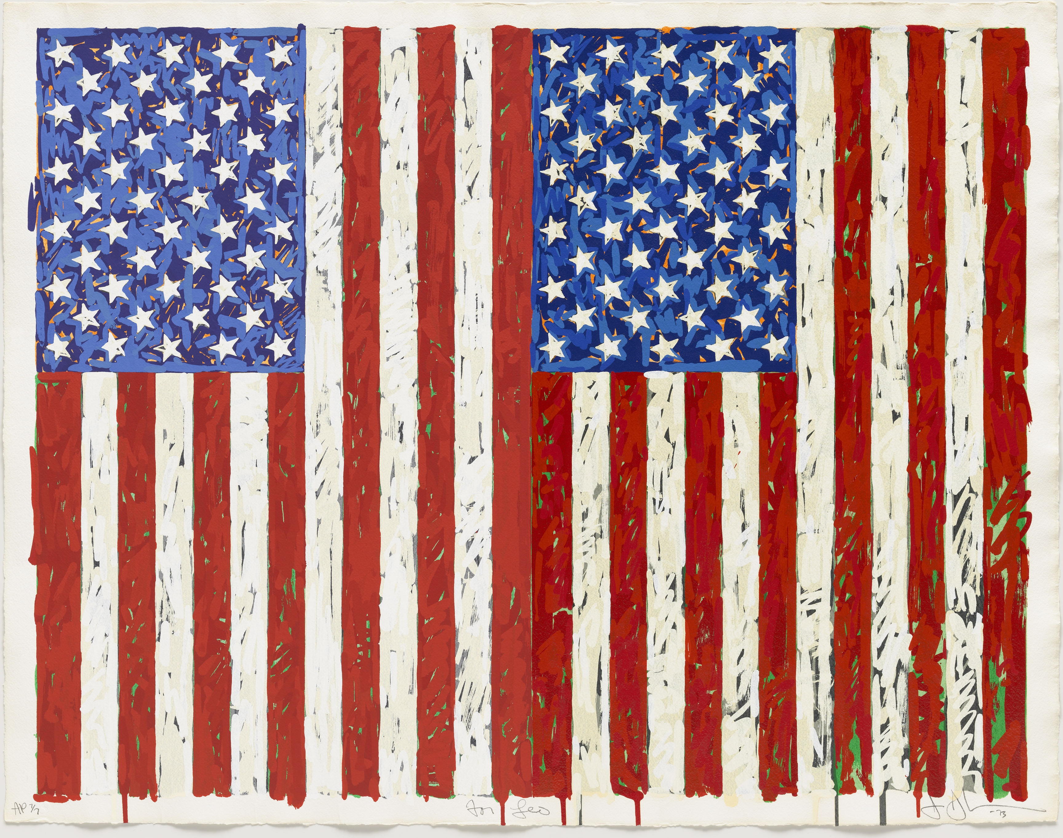
Flags I (1973). Colour screenprint by Jasper Johns. Gift of Johanna and Leslie Garfield, on loan from the American Friends of the British Museum. © Jasper Johns/VAGA, New York/DACS, London 2016. © Tom Powel Imaging
The American boom in prints
The exhibition covers American prints from the last 60 years. Why that particular period?
A revolutionary and enduring change in the production, marketing and consumption of prints took place in the 1960s. Inspired by the monumental, bold and eye-catching imagery of post-war America, a young generation of artists took to printmaking with enthusiasm, putting it on an equal footing with painting and sculpture and matching their size, bright colour and impact. Meanwhile, the growth of an affluent middle class in urban America also opened a booming market for prints that was seized upon by enterprising publishers, print workshops and artists. Artists were encouraged to create prints in state-of-the-art workshops newly established on both the East and West Coast. The widening audience for prints also attracted some to use the medium as a means for expressing pungent, sometimes dissenting, opinions on the great social issues of the day.
It is also relevant that this exhibition is a sequel. In 2008 the Museum held a big show titled The American Scene: Prints from Hopper to Pollock, which ended at the turn of the Sixties i.e. where this one begins. Both shows were curated by Stephen Coppel, the Museum’s curator of modern prints and drawings.
This exhibition consists of twelve rooms, which take us through American prints from the early 1960s to the present day, each room focusing on a particular group of artists, periods or themes – Pop in the first few rooms, minimalism half way through, the ’80s, and then onto contemporary issues like race, AIDS and feminism in the final three.
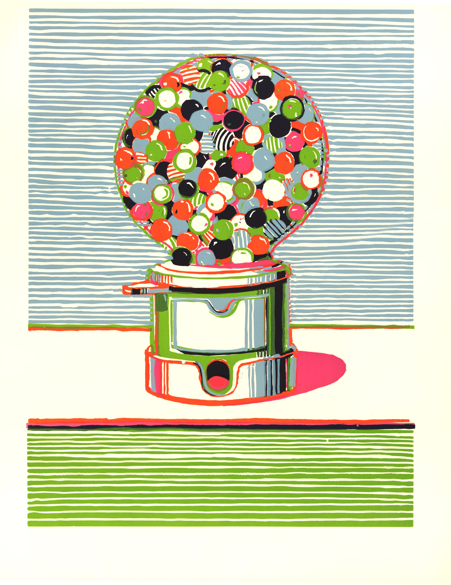
Gumball Machine (1970) colour linocut by Wayne Thiebaud © Wayne Thiebaud/DACS, London/VAGA, New York 2016
The process of print-making
Wall labels for separate eras (the 1990s) or groups (the Minimalists) or for individual works, shed light on the multifarious techniques of print making – etching, lithographs, working with stone, wood or silk – along with the micro-histories of the many workshops and businesses set up across the States to cater to the growing market for prints, like Universal Limited Editions in Long Island (est. 1957) and Gemini set up in Los Angeles in 1966.
Half-way through the show there are two big video installations showing artists actually creating prints, including Andy Warhol working with silk prints and Ed Ruscha creating his Dead End signs. A later video includes interview snippets with Lichtenstein, Ruscha, Chuck Close, Kiki Smith, Glenn Ligon and Julie Mehreti.
Interesting though these were, they were really snippets from longer films and so, for example, although I saw Warhol and an assistant running a wooden block up and down a print presumably to press paint into the paper, I still didn’t understand how a silk screen print is made and had to look it up on YouTube.
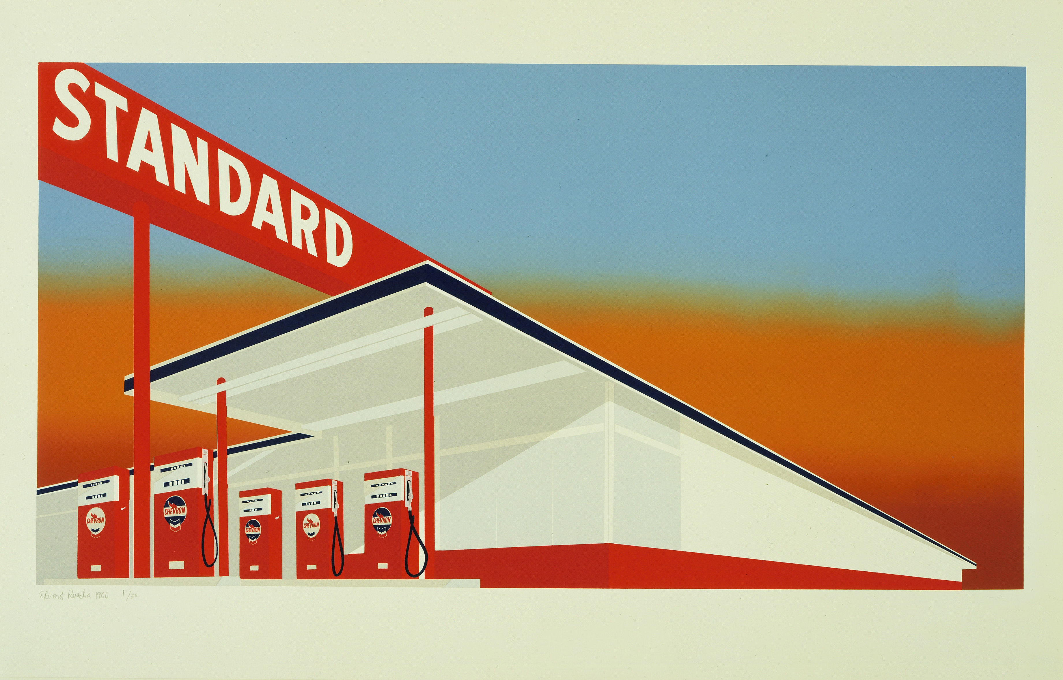
Standard Station (1966) Colour screenprint by Edward Ruscha. The Museum of Modern Art, New York/Scala, Florence. © Ed Ruscha. Reproduced by permission of the artist
The exhibition room-by-room:
Room 1. Pop art
The early 1960s saw an explosion of artists incorporating the imagery of consumer culture, adverts, movie posters, newspaper photos and so on, adapted whole, or cut up into collages, or remodelled into huge spoof cartoons. The first room (and arguably the entire exhibition) is dominated by Andy Warhol and his genius for identifying stand-out iconic imagery. One wall is covered by ten enormous silk prints of Marilyn Monroe (1962), plus the original poster for the 1953 movie Niagara, which inspired them.
Opposite them is a set of ten prints depicting the electric chair (1964) along with the source photo.
Lining another wall is an enormous 86-foot-long print by James Rosenquist called F-111 (1964), a characteristic hymn to gleaming chrome technology and itself an epitome of America’s super-confidence: Bigger. Brighter. Shinier.
There’s a so-so print of Claes Oldenburg’s Three way plug (1970) beside which is hanging the only non-print in the show, an enormous wooden sculpture of the same object suspended from the ceiling.
It’s the 1960s, pre-feminism and awash with kitsch ads and comics from the 1950s, so American babes can be celebrated without guilt, as in Tom Wesselman’s series The Great American Nude (1963). Work on numerous iterations of this image took up most of Wesselman’s 60s, in fact the final, hundredth, version was only published in 1973. It is odd that an exhibition which (later on) features feminist artists being very cross about the sexual objectification of women opens with such a glaring example.
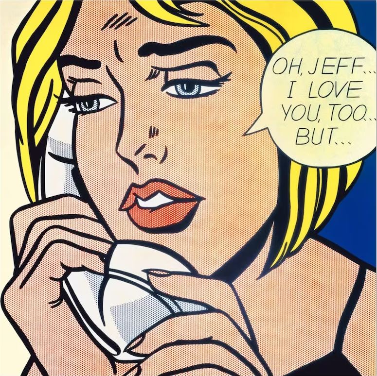
Next to them is king of comic art, Roy Lichtenstein’s Reverie (1965) hanging alongside is one of his canonical action cartoon-paintings, Sweet Dreams, Baby! (1965).
Repetition
The obvious thing about prints is not only that they can be run off in large numbers to be sold and owned by a potentially limitless audience – but, as Warhol above all else discovered – they can also be repeated with deliberate variations, in detail, design or colouring.
Warhol dominates the field with his series of iconic silk prints of Marilyn, Mao, Elvis and so on, but it is striking the way so many of the other artists shown here, right up to the present day, conceived of their prints as parts of sets or series on specific topics, themes, images, issues. This is not possible in painting; it is an artistic option only really available in print.
What is it about these repetitions and iterations – something unnerving, subverting, and yet mythologising at the same time? All those Marilyns become shallower and shallower and yet simultaneously more and more powerful. Ditto Jasper John’s obsessive reiterations of the American flag or Jim Dine’s multiple series of household tools – Repetition equals… what? Maybe we need a perceptual psychologist to explain what they do to the brain.
Room 2. Jasper Johns, Robert Rauschenberg and Jim Dine
Jasper Johns
comes from an earlier generation than Warhol. He began his blank-faced paintings of humdrum objects in the 1950s. He repeatedly uses motifs of numbers, letters and words, generally working in large sets or series which showcase all the types of variations which print-making produces: there are so many variations on Flags I and Flags II it’s difficult to decide which is the ‘key’ example (see first illustration, above). There are also sets devoted to: Grey alphabet, Numbers, Targets.
There’s something about the blankness and the obviousness of these subjects which suggests a kind of zombieness of American culture. I like that Johns has rarely if ever commented or interpreted his work. There it is. The flag. Letters. Numbers imposed over each other (the Colour Numeral series). Make of them what you will. Johns started in the mid-50s and is represented well into the ’80s.
Robert Rauschenberg
Rauschenberg was recently given a massive and hugely enjoyable retrospective at Tate Modern. His prints are as great as everything else he did. Here he is represented by some works from his Stoned moon series, a set of 33 lithographs which he created in response to the manned Apollo flights to the moon (Rauschenberg was actually invited by NASA to be the official Moonshot artist). Make a collage of press photos and technical diagrams. Run off prints of it using different colour washes. Voila! Sky garden at 2.2 metres tall broke the record for the largest hand-printed lithograph of the day. Bigger. Brighter. Shinier.
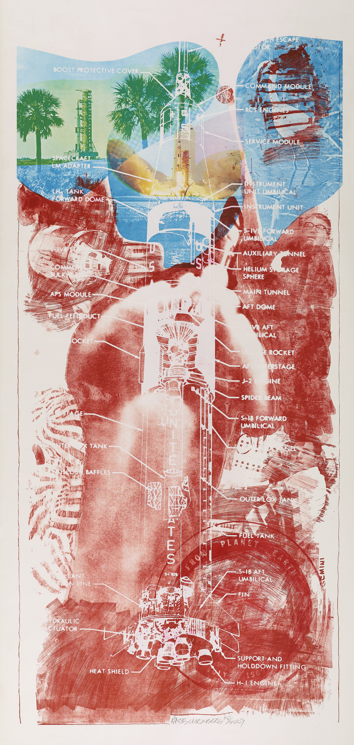
Sky Garden from the Stoned Moon series (1969) Colour lithograph and screenprint by Robert Rauschenberg © Robert Rauschenberg Foundation/DACS, London/VAGA, New York
One of the Stoned moon variations is Sky rite – I like the blurred, half-obliterated image of the NASA technician pointing to the skies. The selection, the arrangement and then the partial obliteration of these bold clear photos and designs by pencil lines and colour washes say so much – about dynamism and thrusting confidence, but at the same time somehow about those things being eclipsed and washed out – so much that is difficult to put into words – as art should. Nearby was one of another large series based on X-rays of his own body, Booster (1967).
Jim Dine
Dine seems to have rejected big grandiose subjects and concentrated on the here and now, banal household objects, a kind of artistic William Carlos Williams. I liked his series about Paintbrushes (1973), showing different numbers of paintbrushes lined up neatly, but with different amounts of sketching, light and shade in each one. Here we had examples of the ‘first state’, ‘third state’ and ‘sixth state’, presumably as the image became more worked over, scarred and scratched and busy. The more you look, the more beguiling they become.
Given the same treatment are images of a saw, hammers – each becoming strangely luminous, charged with meaning – or just beautiful by virtue of the deadpan depiction of their wonderful functional design. Nearby is one of the extensive series he made of his own dressing gown (1975), for me redolent of the cocaine and rock star 1970s. Why not?
There is a kind of wonderful emptiness about so many of these images. They shoot through the retina and flood the image-recognition centres of the brain as a MacDonald’s hamburger floods the hungry palate, pushing all the big obvious buttons. Lots of fun, but taken together, somehow hinting at a huge emptiness, at the isolated unhappiness which has been the subject of so much American fiction these last 60 years.
Room 4. Made in California: the West Coast experience
The next room swaps focus to the West Coast, to the California of swimming pools and endless sunshine.
- Claes Oldenburg Profile airflow (1969) an intriguing three-dimensional relief print made of polyurethane.
- Ed Ruscha – an artist of the archetypal post-War west, with its highways, gas stations and huge signs – Every building on Sunset Strip (1966), Hollywood (1968), Sin (1970), Whiskers (1972) Made in California (1971)
- Wayne Thiebaud – Careful etchings and linotypes of colourful fatty American sweets – Gumball machine (see above), Boston cremes (1962), Suckers state (1968)
- Robert Bechtle’s quiet depictions of California suburbs, mostly empty of people with only a parked car suggesting human presence – Burbank Street: Alameda 1 (1967), 60 T-Bird (1967), Alamedo Carrera (1967) cars which make me think of the movies Bullitt (1968) or Dirty Harry (1971)
- Bruce Naumann – a harsh negative vision obsessed with the power of words, not phrases, just potent words, arranged forwards and backwards, often in slanting italics, often in harsh black and white – Clear vision (1973), Malice (1980)
Talk on the wall label of clear blue skies and swimming pools made me think of David Hockney and, turning a corner, who do we find! Hockney is another great fan of sets and series:
- David Hockney – Mist from the Weather series (1973), Water made of intersecting lines (1978)
Room 5. Persistence of abstraction: gestural and hard-edge 1960s to 1970s
Pop was seen by many as an anecdote to the angst and bleak psychologising of 1950s Abstract Expressionism (as recently displayed at a major retrospective at the Royal Academy). This room shows how some print-makers continued, despite the shiny externalities of real life celebrated by Pop, to experiment with abstract shapes, and blurs and swirls of paint.
- Frank Stella – Double grey scramble (1973)
- Josef Albers – XXIIIb from Homage to the Square (1973)
- Ellsworth Kelly – Coloured paper image XV (1976), Yellow from 27 Colour Lithographs (1965)
- Helen Frankenthaler – Savage breeze (1974)
- Sam Francis – Always in and out of need (1975)
Walking into this room after the previous four was like walking into the screening of some European art movie after spending a couple of hours watching Star Wars and chomping on popcorn. It required quite a change of pace to calm down from the big bright, super-colourful and, above all, instantly recognisable imagery of Pop, to get back to grips with more abstract experiments in colour, texture and design.
Room 6. Minimalism and conceptualism from the 1970s
The sobering up process continued in the next room with a sample of the very black and white, minimalist aesthetic which came in in the early 1970s, as a reaction against everything bright and shiny. I very much like the sculptures of American minimalism – many of which can be seen in Tate Modern – but my palette had been so spoilt by the Mickey Mouse pleasures of the preceding rooms that I found it hard to tune in to their subtleties.
- Alf Taylor – Hanging puddles
- Brice Marden – Painting study I, Painting study 2 (1974), Untitled from Ten Days (1971)
- Donald Judd – Untitled (Ivory Black) (1988)
- Richard Serra – My curves are not mad (1987)
Room 7. Photorealism: portraits and landscapes
Apparently there was a revival in the 1970s of the deeply unfashionable genre of portraiture.
- Alex Katz – Self-portrait (1978)
- Chuck Close – Phil Spitbite (1995), Keith III, Keith/Mezzoprint (1972)
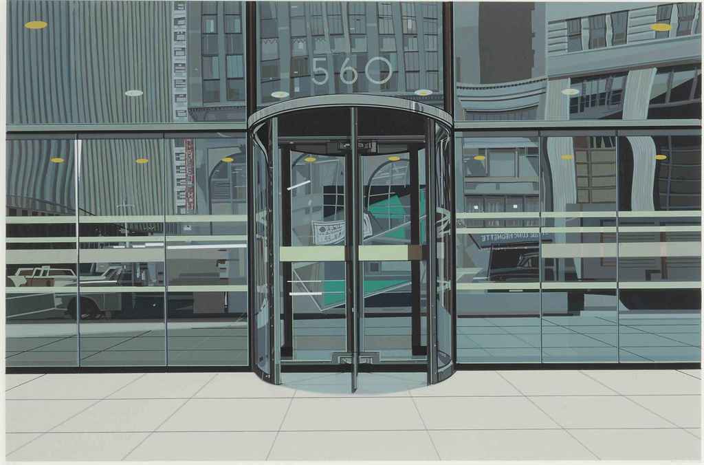
Of the landscapes I liked Craig McPherson’s Yankee stadium at night (1983), a powerful and absorbing image because it is in fact so entirely figurative. Best things in the room were prints of the hyper-realistic / ‘photorealistic’ paintings done by Richard Estes, from his Urban Landscape series.
- Grants (1972)
- 560
- Oriental cuisine
- Danbury Tile
Room 8 The figure reasserted
Had the figure ever been away? Well figurative depictions of the human form were grouped together in this room, though often in a stilted or deliberately naive style – maybe a refreshing change after the blank coolness of ’70s minimalism.
- Philip Pearlstein – Nude on a Mexican blanket (1973)
- Philip Guston – Sea (1980) Room (1980)
- Carroll Dunham – Atmospherics
- Richard Bosman – Man overboard (1981), South Seas kiss (1985)
- Richard Diebenkorn – Seated woman (1968)
The standout images were to almost life size prints wonderfully capturing a fully-clothed man and woman in the act of dancing, writhing, jiving.
Room 9. Politics and dissent
Once again Warhol trumps the room with his fabulous silk prints of Nixon and Mao (1972), alongside the more subdued print of Jackie II (1966).
Vote McGovern (1972) Colour screenprint by Andy Warhol © 2016 The Andy Warhol Foundation for the Visual Arts, Inc./Artists Rights Society (ARS), New York and DACS, London
Note these dates, though. This is very old protest. Johnson? Nixon? Beautiful, striking, imaginative but – old.
- Jim Dine – Drag Johnson and Mao (1967)
- Rauschenberg – Signs (1970)
- Bruce Naumann – Raw/War (1971)
- Chris Burden – Atomic alphabet (1982)
The Politics and dissent room segues into a room about AIDS which was first clinically observed in the United States in 1981. The 1980s was, therefore, among other things, the decade in which medical investigation of the condition went hand in hand with growing public awareness, with attempts to overcome the stigma of illness and then lobby for more research to be done. This room features prints by gay artists responding to the crisis.
- Eric Avery – Blood test (1986)
- General Idea – AIDS wallpaper (1988)
- Keith Haring – Ignorance = Fear (1989)
- David Wojnarowicz – Untitled for ACT UP (1990)
Room 10. Feminism, gender and the body
Big Daddy with Hats (1971) Colour screenprint by May Stevens © May Stevens. Reproduced by permission of the artist and Mary Ryan Gallery, New York
- Ida Applebroog – American medical assocation (1985)
- Dotty Attie – A mother’s kisses (1982)
- Kiki Smith – Red Riding Hood, Born 2002, Black flag (1989), Untitled Hair (1990)
- Lee Lozano – Thesis from S.M.S. (Shit Must Stop) No.2
- Louise Bourgeois – Stamp of memories I, The laws of Nature (2003), St Sebastienne or the errors of stress (1992)
I found a lot of this work a little understated, almost amateurish. The correctness of your beliefs or vehemency of your faith don’t of themselves make for particularly interesting art.
- Kiki Smith – Ginzer (2000), Bird skeleton (2000)
- Kiki Smith – Blue prints – Dorothy, Wolf Girl, Virgin Mary, Emily D, Melancholia, Virgin with Dove
For a palette spoiled by big shiny consumer images, the most immediate impact in this room was made by the sharp, advert-based images of the Guerrilla Girls.
- Guerrilla Girls – Do women have to be naked to get into the Met. Museum? (1986), The Advantages Of Being A Woman Artist (1988)
If Pop in the ’60s cut up and pasted cheesy adverts, the GGs in the ’80s create what amount to striking ads in their own right. They’re still very active.
Room 11. Race and identity: unresolved histories
The inclusion of a room of Feminist art and a room of Black art gives the visitor a strong sense of the academic background of the exhibition’s organisers. I’m not saying they’re not big issues, but the inclusion of these issues, and only these issues, at the end of the show reflects their dominance of academic life and university campuses and doesn’t necessarily reflect the major social, economic and technological upheavals of the last 30 years.
- Andy Warhol – Birmingham race riot (1964)
- Roy Lichtenstein – I love liberty (1982)
- Emma Amos – Stars and stripes (1992), Mississippi wagon 1937 (1992)
- Glenn Ligon – Black rage (2015), Warm broad glow (2011) I feel most colored when I am thrown against a sharp white background (1992)
- Willie Cole
Stowage (1997) Woodcut on Japanese paper by Willie Cole © Willie Cole. Reproduced by permission of the artist courtesy of Alexander and Bonin Publishing, New York
In this room the standout artist for me is Kara Walker, with her stylised black and white silhouettes of slave figures. I’ve seen an exhibition of these before, so there’s an element of recognition and familiarity in my positive response. Coming towards the end of a rather exhausting exhibition featuring over 200 images, the clarity, purity of line and savage humour of her work sets her apart.
- Kara Walker – Restraint (2009), Confederate prisoners being conducted from Jonesburgh to Atlanta (2005)
But it is also capable of a strange dreamlike quality, fantasias of colour, exploitation, journeying across the seas, converting history into eerie illustrations for a very grown-up set of fairy tales.
no world from An Unpeopled Land in Uncharted Waters (2010) Aquatint by Kara Walker © Kara Walker. Reproduced by permission of the artist
Room 12. Signs of the times
The wall label in this last room mentions 9/11 and the financial crash of 2008 but addresses neither of them directly. Instead the 12 prints in this concluding section comment obliquely on the sense of America’s economic decline, or at least the decline of traditional industries and jobs. Commercial collapse, bankruptcy and anomie. The unwinding of America.
It is a depressing conclusion, but it follows logically from the AIDS, feminism and black rooms. Somewhere in the 1980s America began to hate itself and look for someone to blame. A lot of the AIDS images are angry at the slowness of medical research into the condition, the stigma attached to it, Reaganite persecution of gays, the slander of calling it a ‘gay plague’. The feminist room is full of anger at the Patriarchy, at the countless ways women have been suppressed, silenced, objectified and abused. And the black room is also angry at the grotesque abomination of slavery, the slave trade, the systematic abuse of millions of men, women and children bought and sold like cattle, worked to death, raped and murdered and ongoing discrimination against people of colour, police shootings of black men, the huge black prison population.
A sympathetic reading of these three rooms leaves the visitor shaken and exhausted, and this final small downbeat section matches your mood with images of an America which has somehow reached the end of the line. The breezy confidence of the 1960s has evaporated. Gays, blacks and women are just the most vocal of the groups attacking a culture which seems on its knees.
- Mel Bochner – Going out of business (2014), I’ve had it up to here (2012), It doesn’t get much better than this (2015)
- Ed Ruscha – Dead end (2014) Cash for tools (2014)
The most haunting image, deliberately and carefully chosen to end the show, is Ed Ruscha’s reprise of his 1966 brilliant iconic image of a gas station – now redone in pure white, emptied out, a ghost of itself. In fact one of the stylish ‘windows’ cut here and there into the exhibition walls, means you can look directly back into the earlier gallery where the 1966 print is hanging and compare the two.
The hollowing out, the blanking of Ghost station suggests that the chrome-plated consumer paradise depicted in thePop art of the 1960s has become a drug-addicted, derelict shell of itself.
- Ed Ruscha – The standard station (1966)
- Ed Ruscha – Ghost station (2011)
What happened? Where did it all go wrong? And if Donald Trump is the answer, what on earth is the question?
Post script 1. The elephant in the room
This is a panoramic and exciting exhibition which brings together many of the biggest names in American art, alongside lesser-known but just as interesting artists, to give a vivid sense of the boundless experimentation and creativity of this huge country. Above all it successfully stakes a claim for print as a medium as creative, varied and beautiful as painting or sculpture. You exit the show, mind ringing with all kinds of images, ideas, issues and reflections.
For me, at the end, one big question stood out. The exhibition’s publicity encourages us to combine the art with history and politics, to experience post-war American history through these artists’ eyes. Which is why it seems to me extraordinary that there is only one throwaway mention of the single most important event in 21st century American history – 9/11.
From this traumatic attack stem the War on Terror, the Patriot Act, the war in Afghanistan and the ill-fated invasion of Iraq, the abuse of prisoners at Abu Ghraib, official defence of waterboarding and torture at Guantanamo Bay, further acts of domestic terrorism, along with armed interventions in Libya and Syria and the ever-increasing use of drone attacks.
All these events have contributed hugely to the sense contemporary America has of being embattled and threatened by forces it doesn’t understand and can’t contain, to the tide of anxiety and xenophobia which helped Donald Trump to the White House. It seems to me extraordinary that an exhibition which at least in part claims to survey American history ‘to the present’ omits this seismic subject.
Surely there are American artists making prints on these subjects – 9/11 is burned into our minds as a set of horrible images, not to mention iconic images of Osama bin Laden’s face, Saddam’s statue being pulled down, the torture victims in Abu Ghraib, drones cruising the skies. I can’t believe that scores of American artists haven’t addressed these issues and haven’t mined these images for creative purposes.
Why aren’t they here?
Postscript 2. Native Americans
The feminist artists complain about the oppression of women in general, of women artists in particular, of the suppression of their stories and experiences by the Patriarchy, which women artists are only now bravely telling. The black artists complain about the oppression of Africans, the brutality meted out to slaves, the suppression of their narratives and stories, which black artists are only now exploring.
My son asked me, So where’s the room for Native Americans? There isn’t one. Why not? If there aren’t many Native American artists, why not? Isn’t that a bit of an issue? And if there truly aren’t many Native American artists, doesn’t that mean that any history of America told through its art will inevitably privilege European forms of expression and necessarily exclude the voice and experience of its original inhabitants?
In between the endless artworks, books, documentaries and conferences about gender and the body or slavery and the black experience – just possibly the occasional mention should be made of the original inhabitants of this huge continent who were almost exterminated and the survivors shunted to the edge of American life and for so long written out of the American story. And – in this exhibition at least – are still written out of the American story.
No Native American artists? No Native American print makers? No Native American narratives or stories? Not even one solitary mention of them? No.
Gays, blacks, women – these are the academically-approved minorities, the groups which have their own political movements and voices, novels, plays, movies, Hollywood stars lobbying for them, TV shows about them, and art and criticism and exhibitions and academic papers and dissertations and conferences and books devoted to them, which are, in other words, part of the state-approved cultural discourse.
As for the original victims of European colonisation? Silence. Absence. Invisibility…
The video
Related links
- The American Dream: pop to the present continues at the British Museum until 18 June 2017
- The American Dream: pop to the present edited by by Stephen Coppel and Catherine Daunt
- American Colonies: The Settlement of North America to 1800 by Alan Taylor – one of the best history books about any period I’ve ever read, which fundamentally readjusts your entire view of American history
- The Honeymoon: Donald Trump’s First 100 Days – BBC documentary presented by Michael Goldfarb
Newspaper reviews of The American Dream
- Guardian review by Tim Adams
- Guardian review by Jonathan Jones
- Independent review by Michael Glover
- Telegraph review by Alastair Sooke

