
‘You have a genius in your life as well as in your art’
(Art critic Roger Fry to his sometime lover, artist Vanessa Bell)
More than anything I can write, this YouTube montage of Vanessa Bell’s paintings set to music by Chopin gives a good overview of her work.
Biography
Vanessa Stephen (1879 to 1961) was born into an upper-middle-class and well-connected Victorian family. She was the eldest daughter of Sir Leslie Stephen and Julia Prinsep Duckworth, Julia being a niece of the pioneering Victorian photographer, Julia Margaret Cameron, and cousin of the noted temperance leader, Lady Henry Somerset.
Her siblings were a younger sister, Virginia (later renowned as a great novelist under her married name of Virginia Woolf), brothers Thoby (Clifton College and Trinity, Cambridge) and Adrian (Westminster school and Trinity, Cambridge), and half-brothers, George and Gerald Duckworth (both educated at Eton, Gerald went on to found the publishing house named after him, and was able to help Virginia set up her publishing house, Hogarth Press).
The Stephen family lived in a smart house at 22 Hyde Park Gate, Westminster, with lots of servants where Vanessa was home educated in languages, mathematics and history. She showed an early gift for art and had drawing lessons from Ebenezer Cook, before she attended Sir Arthur Cope’s art school in 1896, and then went on to study painting at the Royal Academy in 1901 under John Singer Sargent.
After the death of her father in 1904, Vanessa sold the Hyde Park Gate house and moved to Bloomsbury, along with Virginia and the brothers. Here they began socialising with the like-minded artists, writers and intellectuals who would form the ‘Bloomsbury Group’ who, in all areas of life, art and literature, set themselves to overthrow the stifling influence of their Victorian parents.

Self–Portrait (c. 1915) by Vanessa Bell © The Estate of Vanessa Bell, courtesy of Henrietta Garnett
Vanessa married the art critic Clive Bell in 1907 and they had two sons, Julian and Quentin. The couple had an open marriage, both taking lovers throughout their lives. Bell had affairs with art critic Roger Fry and with the notoriously bisexual painter, Duncan Grant, with whom she had a daughter, Angelica, in 1918.
Vanessa and husband Clive, their lover Duncan Grant and his boyfriend ‘Bunny’, all moved to the Sussex countryside shortly before the outbreak of the First World War, and settled at Charleston Farmhouse near Firle in East Sussex. By farming here the menfolk, all pacifists and conscientious objectors, evaded service in the Great War.
Here Vanessa and Grant painted and also worked on commissions for the Omega Workshops, an artists’ co-operative for decorative arts established by Roger Fry that operated between 1913 and 1919, and which produced interesting work in a Vorticist/Futurist style. Her first solo exhibition was at the Omega Workshops in 1916. The influence of contemporary radical experiments in Futurism and Vorticism are immediately obvious in many of these bold, colourful designs.

Design for Omega Workshops Fabric (1913) by Vanessa Bell © The Estate of Vanessa Bell, courtesy of Henrietta Garnett
Bell lived a long life and painted right through to the 1950s, but even her most devoted fans admit that the 1910s represent her most creative and innovative period. In the 1910s, 20s and 30s she was a member of a group of friends and acquaintances who pioneered new ways of living, open marriages and a very liberal approach to sexuality. But works from the 1940s and 50s show her slowly losing the radical edge of the period either side of the Great War, her depictions of the Sussex countryside or of interiors with vases of flowers, becoming steadily more conventional.
The exhibition
This is the first ever retrospective of Bell’s work. It brings together some 100 paintings, book jackets she designed for the Hogarth Press, ceramics, fabrics, photos, diaries and letters to present a themed overview of Bell’s life and career. As always with the Dulwich Picture Gallery, it offers a beautifully laid out and informative opportunity to assess a rather neglected figure in English modern art.
Several things emerge from a slow perusal of the exhibition’s six rooms:
Blocky painting style
Bell’s earliest paintings reflect the sophisticated sheen of her teacher John Singer Sargent (note the telltale flecks of white on the vase to give the illusion of reflected light in Iceland Poppies 1908). But even then she was being exposed to the revolutionary influence of Picasso, Matisse and contemporary French painting. In fact right from the earliest portraits shown here, she seems more naturally to take a slabby, blocky approach to paintwork – instead of trying to capture the smooth contours of a fabric or a face, preferring to map out areas of solid colour, depicted with broad chunky brushstrokes. The rough, sketched-out feel, the deliberate lack of finish and the deliberate use of non-naturalistic colour are all suggestive of contemporary experiments in Europe, but are done with a distinctive English gentleness. Despite this, something of all her formal training comes out in the naturalistic outline and presence. these traits are exemplified in one of her many portraits of her novelist sister, Virginia:
Portraits of friends and family
In fact portraits of family and friends are a recurrent feature of Bell’s work and occupy one of the six rooms here.
They represent a decisive break with Victorian naturalism and Salon art, and a wholesale incorporation of the unreal colours, simplification of pattern, crude brushstrokes and awkward anti-aesthetic shapes found across the continent in the work of Gauguin, Die Brucke, the Fauves and so on.
The portraits of her sister are among the most persuasive or gripping. I think this is the best one, all the more powerful for its ‘modern’ blanking of the face, the part which should, traditionally, be the most detailed, revealing the sitter’s character etc. All that has been rejected in favour of an interest in composition and colour.

Virginia Woolf (c. 1912) by Vanessa Bell © National Portrait Gallery, London
- Virginia Woolf (1912)
- Virginia Woolf (1912)
- Iris Tree (1915) ‘a free spirit, a poet an actress’
- Mrs St John Hutchinson (1915)
- Molly McCarthy, wife of the literary critic Desmond McCarthy
- Lytton Strachey (1913)
- Char’s head
In the portraits, as in her other genres, the later work becomes noticably more conservative and straighforwardly figurative. Enjoyable, but in a different way.
Derivative
After a few rooms I felt I had seen a lot of these paintings before, or ones very much like them – most recently in the early-twentieth-century rooms of the excellent Courtauld Gallery, which contains works by Matisse, Derain, Vlaminck, Bonnard and other post-impressionists. (The term ‘Post-impressionism’ was in fact coined by Vanessa’s friend and sometime lover, art critic Roger Fry, as an umbrella term to cover developments in French art since Manet.)
This feeling was confirmed by many of the wall labels for individual paintings and by the (very useful) audioguide by exhibition co-curator Sarah Milroy. Both frequently pointed out the influence of the Nabis (a group name given to the French painters Vuillard, Bonnard et al), of Cézanne, of Matisse, of Picasso, on individual Bell works.
For example, it is hard not to see the largest work in the show, The Other Room (1930) as anything other than a homage to Matisse – the emphasis on design and areas of bright colour over detail, the interest in the design on fabrics (the curtains, the chair cover), the wilful indifference to anatomical realism in the human figures.

The Other Room (late 1930s) by Vanessa Bell © The Estate of Vanessa Bell, courtesy of Henrietta Garnett. Photo credit: Photography by Matthew Hollow
Landscapes
When Bell moved to the country, she took the urban continental style developed in her portraits (and the occasional, rare depiction of urban scenery) with her and applied it to numerous images of the landscape around the Sussex farmhouse. Many of these are strikingly composed in a kind of flat, blocky, post-impressionist style. They apply a continental mentality to the south of England countryside, a blockiness derived from Cézanne, along with the big slab brushwork of maybe Vlaminck or Derain.

Landscape with Haystack, Asheham (1912) by Vanessa Bell © The Estate of Vanessa Bell, courtesy of Henrietta Garnett
Bell painted landscapes for the rest of her life and the selection here allows you to see how her style, over the decades, lost the modernist edge it once had, and reverted to a tamer figurativeness. Thirty years separate the painting above from the one below.
Flowers and vases
Bell painted flowers and vases throughout her long working life. There is a room devoted just to this subject. I found these a lot less interesting than the landscapes or portraits.
- Oranges and lemons
- Chrysanthemums (1920)
- Arum lilies (1919) I particularly liked the decoration on the chair
- Pink, white and blue flowers in a vase
- Violet and pink chrysanthemums (1940s)
Once again, a careful examination of the chronology suggests a falling away of intensity in the later paintings. The later flower paintings lack oomph. Maybe they’re content. Happy.

Wallflowers by Vanessa Bell (c. 1950) © The Estate of Vanessa Bell, courtesy of Henrietta Garnett. Photo credit: © Christie’s Images / Bridgeman Images
A note on colour and reproduction
Despite the brightness of many of the images included in this review, the colour which perhaps came over most from these paintings was a kind of turd brown, obvious in a work like The Conversation, or the double portrait of Frederick and Jessie Etchells (1912). A congeries of dark and murky browns, emphasised by the often plain wooden frames.
Without exception all the reproductions I’ve seen online – and even the reproductions on the hand-held audioguide – come out brighter and more colourful than the actual works themselves which, in the flesh, are mostly dour and drab, with a particular deep brown the prevailing tone. As one of the commenters I quote below put its – with some notable exceptions – ‘muddy’ gives a good summary of the majority of the paintings’ visual impact. In fact, the main visual takeaway from the show has been to make me notice just how much brown there is around us in everyday life – bricks of walls and houses, reddy-brown roof tiling, brown fences and so on.
The Bloomsbury group
More than enough has been written about the loose group of artists, writers, novelists and critics, economists and philosophers who lived in and around Bloomsbury Square near the British Museum, and also had connections with Trinity College Cambridge. They shared a desire to overthrow the stuffy prudery of their Victorian parents. The philosopher G.E. Moore in his vast Principia Ethica emphasised the centrality of honest personal relationships in his definition of ‘the good’ and ‘the good life’. This represented a massive break with the strongly social basis of Victorian ideals of Duty, Honour and so on.
Thus Bell’s wholesale rejection of the Victorian naturalistic tradition in painting can be seen as part of the wider rejection of Victorian values among her wider family and friends, and her ‘open’ marriage and the complex love lives of herself and her friends constituted a breath-taking departure from the norms of her parents and the stuffy Edwardian society she worked in.
The importance of Bloomsbury as a hotbed of new ways of seeing and living is emphasised throughout the exhibition – it is unavoidable since her portraits were all unofficial depictions of her family and close friends, and so the audiocommentary and wall labels insistently namecheck members of the Group, providing details of Bell’s lovers and associates. The show features a display case showing photographs of friends and family together in the garden of the Sussex house, which convey the casual informality of this impressive group of thinkers and artists.
Bell and feminism
The Canadian curator Sarah Milroy emphasises that Vanessa was a feminist pioneer. The first wall panel claims that Bell’s:
‘portraits of women offer bracing encounters with female subjects given startling new force and agency.’
With the best will in the world, I couldn’t quite see this. Some of the earliest work captures an odd, alien effect which I enjoyed, for example the worrying intensity of the female figures in:
and many of the first room of portraits are deliberately unnerving and unsettling:
and amount to a full-frontal assault on Victorian aesthetics of female beauty:
The commentary tells us that the strange and ominous Studland Beach is considered one of her masterpieces. It certainly has a kind of Expressionist alienation and Symbolist portentousness. But I don’t see it as particularly giving the women depicted in it ‘agency and force’.

Studland Beach (c.1912) by Vanessa Bell © The Estate of Vanessa Bell, courtesy of Henrietta Garnett. Photo credit © Tate, London 2016
And these are exceptions to the majority of works here. The more frequent portraits of Virginia, Iris, Molly and so on, although modernist in form, are supremely calm and placid in tone. Her sitters are generally ensconced in a comfy chair in a nicely furnished living room – and the presence in the surrounding rooms of so many depictions of the peaceful Sussex countryside, not to mention the umpteen paintings of tasteful vases of flowers – the overall effect is a great feeling of calm and tranquility.
And the early experimentalism in this genre, as in the others, slips away as the later paintings become more conventional.
The final wall label repeats this feminist emphasis, which is clearly important to the show’s organisers:
‘One of Bell’s greatest legacies is her reimagining of the image of womanhood, with her powerful female bodies and countenances claiming pictorial space with a kind of brute force.’
Many of the female portraits from her glory years around the Great War are strange rebellions, and just focusing on the work from that specific period does emphasise their originality in the hidebound English tradition. But even the weirdest of them feel to me static and dreamlike. ‘Brute force’ is just not a phrase I would apply to Bell’s work.
As to subverting or revolutionising women’s roles, which the commentary claims she did, I also couldn’t really see it. Bell designed fabrics and painted vases of flowers; she moved to a lovely farmhouse in the countryside where she hosted charming weekends for her artistic friends; she was the loving mother of two adorable sons (Julian, who went to private school and King’s College before becoming a poet, and Quentin, who went to private school before becoming an art historian). I genuinely don’t see how this is revolutionary or subversive.
Possibly I don’t understand the times well enough, and the ongoing weight of conformity to Victorian gender stereotypes which most of her contemporaries endured. Maybe it was precisely Bell and her friends who opened the door to this kind of lifestyle, which eventually became so widespread as to become a cliché in succeeding generations.
The Omega workshop and abstraction
The works of Bell’s which approach nearest to the dynamic abstractions of her contemporaries on the English art scene – Wyndham Lewis, David Bomberg or C.R.W. Nevinson – derive from her period with the Omega workshop, set up by close friends Roger Fry and Duncan Grant, with the idea of producing fabrics and textiles based on their own designs. It opened in 1913, produced a wide range of domestic furnishings to modernist designs, before closing in 1920.
One of the six rooms is dedicated to Bell’s Omega phase, with patterns and designs for rugs, curtains and so on, for example the Design for Omega Workshops Fabric reproduced above. There are also examples of the book jacket illustrations she provided for the Hogarth Press, the small publishing house set up by Leonard and Virginia Woolf in 1917.
The biggest object in the show is the painted screen from this period, Tents and Figures – a big powerful work which conveys Bell’s interest in abstraction and bold geometric design – but with a power, you can’t help thinking, borrowed from Cezanne’s landscapes and the Fauvist use of African masks for the faces. It’s good but haven’t I seen these clashing diagonals and mask-faced figures before?
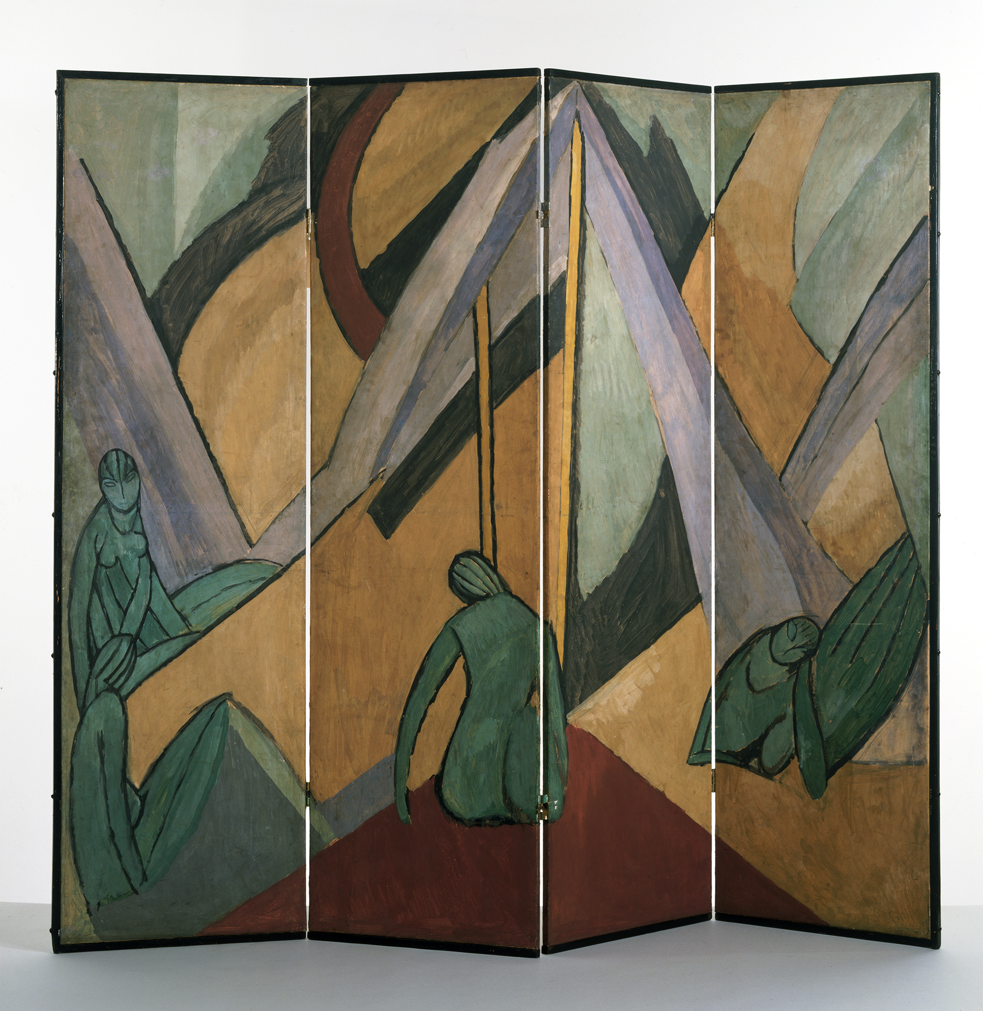
Tents and Figures (1913) by Vanessa Bell. A painted folding screen. Victoria & Albert Museum. © The Estate of Vanessa Bell, courtesy of Henrietta Garnett. Photo credit: © Victoria and Albert Museum, London
Conclusion
I found many of the the early portraits novel and fresh, some of her odder stuff (e.g. The Conversation) bracingly disconcerting, the Omega workshop designs and artefacts an interesting variation on the Modernism of her contemporaries. I found a number of the landscapes evocative, especially the earlier, more modernist ones, and some of the still lifes prettily decorative.
But, in general, the paintings which make the biggest impact are the ones most obviously derived from Continental exemplars. Bell is an interesting artist, who produced lots of good work but maybe, in the end, is an example of the way hundreds, maybe thousands of artists in the 1910s, were gripped and liberated by wholly new ways of seeing and painting created by a handful of pioneers in France and Germany (the Expressionists, the Fauves).
One of the best paintings in the show is Nude with Poppies – admirable but… isn’t it almost entirely Matisse?

Nude with Poppies (1916) by Vanessa Bell © The Estate of Vanessa Bell, courtesy of Henrietta Garnett
I worried that maybe I was failing to ‘get’ Bell, so I was reassured by these comments added to the online Guardian review of the exhibition:
- “Looks very derivative to me. Not a patch on the originals i.e. Matisse, Mondrian, Gauguin, Munch”
- “Not in the same league as the greats of the period, though, but still… pretty pictures.”
- “I love her early work – the abstracts and experimental portraits. The later stuff is too muddy and repetitive, and the radical edge disappears pretty quickly.”
- “Probably nice above the mantlepiece in a suburban villa. Nowt wrong with that, I’m a great lover of domestic art. But put her in a public gallery and her work withers to almost nothing. A very second rate artist.”
- “you really have to work hard at liking them – and that’s because they are poor; badly done, lazily composed, arrogantly confident. “
Summary
So: some arresting and some eerie portraits, a few impressive semi-abstract landscapes, lots of vases of flowers. But with the nagging sense that they are very derivative, throughout. And – to step back a bit – the enormous social, political and philosophical upheavals which were going on at exactly this time (1914 to 1930) and are represented in the Royal Academy’s exhibition of Russian Revolutionary art – or the impact and experience of the two cataclysmic world wars as captured in, say, the recent big exhibition of Paul Nash at Tate Britain – are completely absent.
It is interesting that the curators chose to arrange the exhibition by theme and not chronologically. Is it because a chronological presentation would highlight the way the impact of the European post-impressionists set off a storm of creativity in Bell’s work during the 1910s – but also show how that energy faded in the 1920s so that by the 1940s and 1950s she is painting capable enough works, but many so bland they wouldn’t be out of place in a local jumble sale.

On the Steps of Santa Maria Salute, Venice (1948) by Vanessa Bell © The Estate of Vanessa Bell, courtesy of Henrietta Garnett. Photo credit: The Bloomsbury Workshop
As ever with the Dulwich Picture Gallery, it’s a thorough, well-presented and elegant exhibition of a neglected artist, and so a welcome opportunity to find out more, to range over Bell’s work, to try and formulate a view. Maybe I’m missing something but for me, although it contains some arresting work and some surprises and convinces me that her name should be better known and more of her work displayed in public collections – it ultimately doesn’t persuade me that Vanessa Bell was in any way a major figure.
DPG promotional video
Related links
- Vanessa Bell continues at Dulwich Picture Gallery until 4 June 2017
- The Bloomsbury Group at Charleston
- Vanessa Bell Wikipedia article
- Evening Standard review by Ben Luke
- Guardian review by Lauren Elkin
- Guardian review by Maev Kennedy
- Telegraph review by Mark Hudson
Unintentional comedy
There are three articles about this show in the Guardian, all of which complain that Bell has too long been in the shadow of the more famous Bloomsburyites. But ironically, the subtitles of all three articles define her in precisely the terms they claim to be trying to rescue her from:
- “Vanessa Bell to break free from Bloomsbury group in Dulwich show – The sister of Virginia Woolf and lover of Duncan Grant is long overdue recognition as pioneer of modern art, say curators”
- “Vanessa Bell: stepping out of the shadows of the Bloomsbury set – The artist, best known for her tangled love life and being Virginia Woolf’s sister, gets her first major solo show”
- “Design and desires: how Vanessa Bell put the bloom in Bloomsbury – She was best known as a member of the Bloomsbury group and sister of Virginia Woolf – but will the first major show of her artwork change her reputation?”
The answer to the last question is surely No, not as long as her biggest fans, her most knowledgeable curators and her most supportive journalists, continue to define her in terms of her better-known sister, her numerous lovers and her social set – and not as an artist in her own right, which is surely how she should be presented.
