
Chaïm Soutine
Chaïm Soutine (1893 to 1943) was one of the leading painters in Paris in the 1920s and 1930s. He was a Russian Jew who fled to Paris in 1913, soon settling into bohemian Montparnasse where he befriended, among others, the young Amedeo Modigliani.
His paintings are garish, heavily distorted and reveal a strong sympathy for working people. Because of this some contemporary critics considered him the successor of van Gogh, but Soutine’s works are really painted in a quite different way.
Among his themes or subjects Soutine developed the notion of painting portraits of the service staff from the fashionable hotels and restaurants of 1920s Paris. After ten years of penury, in 1923 the American collector Albert C. Barnes saw one of the hotel staff paintings and bought it and everything else Soutine had to sell (50 paintings in all), giving Soutine financial security and art world credibility at a stroke.
Nowadays the hotel staff portraits are considered among Soutine’s greatest achievements and this exhibition – the first devoted to Soutine in the UK for 35 years – is the first ever to focus on the hotel portraits, bringing together an unprecedented number for us to compare and contrast.
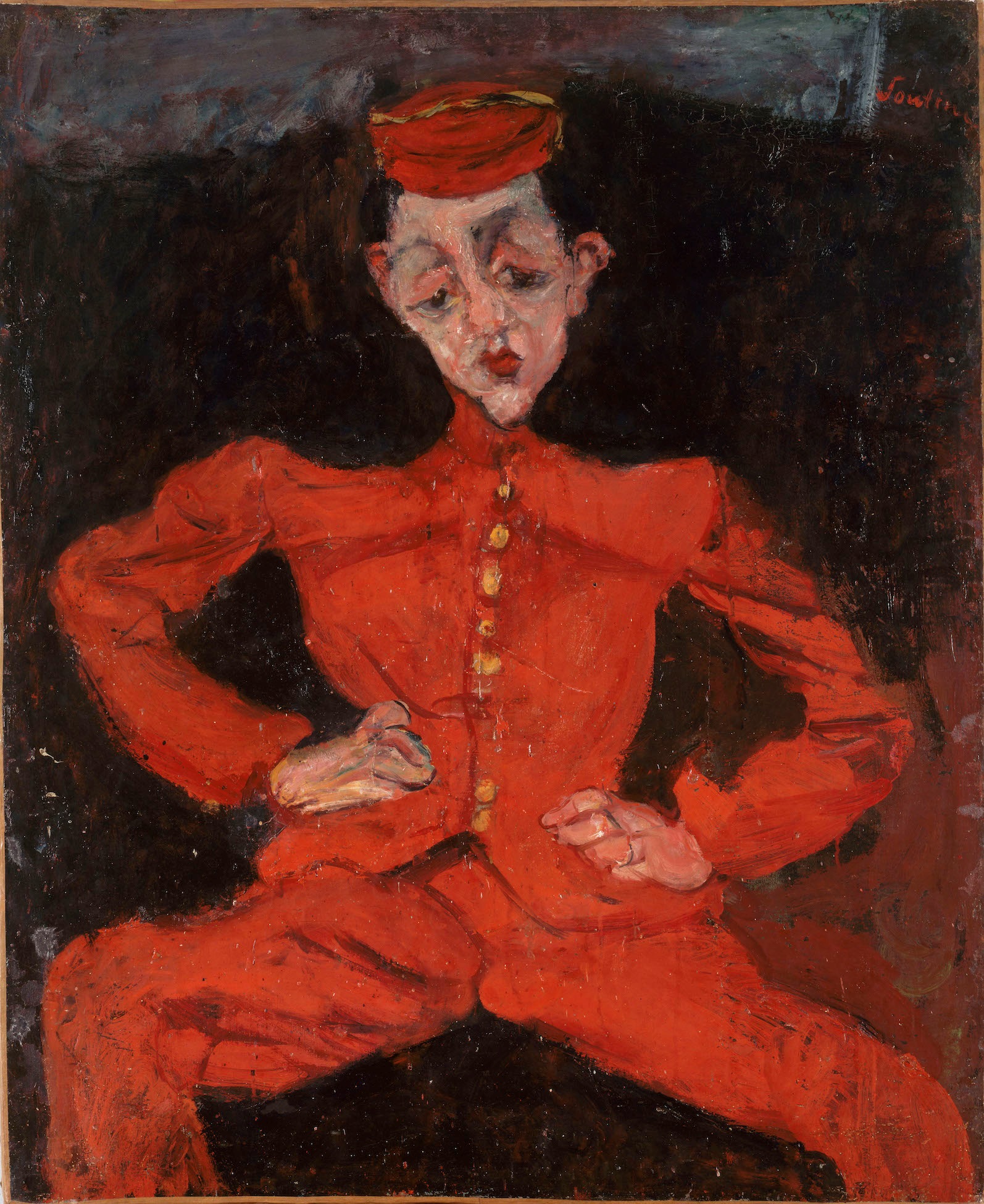
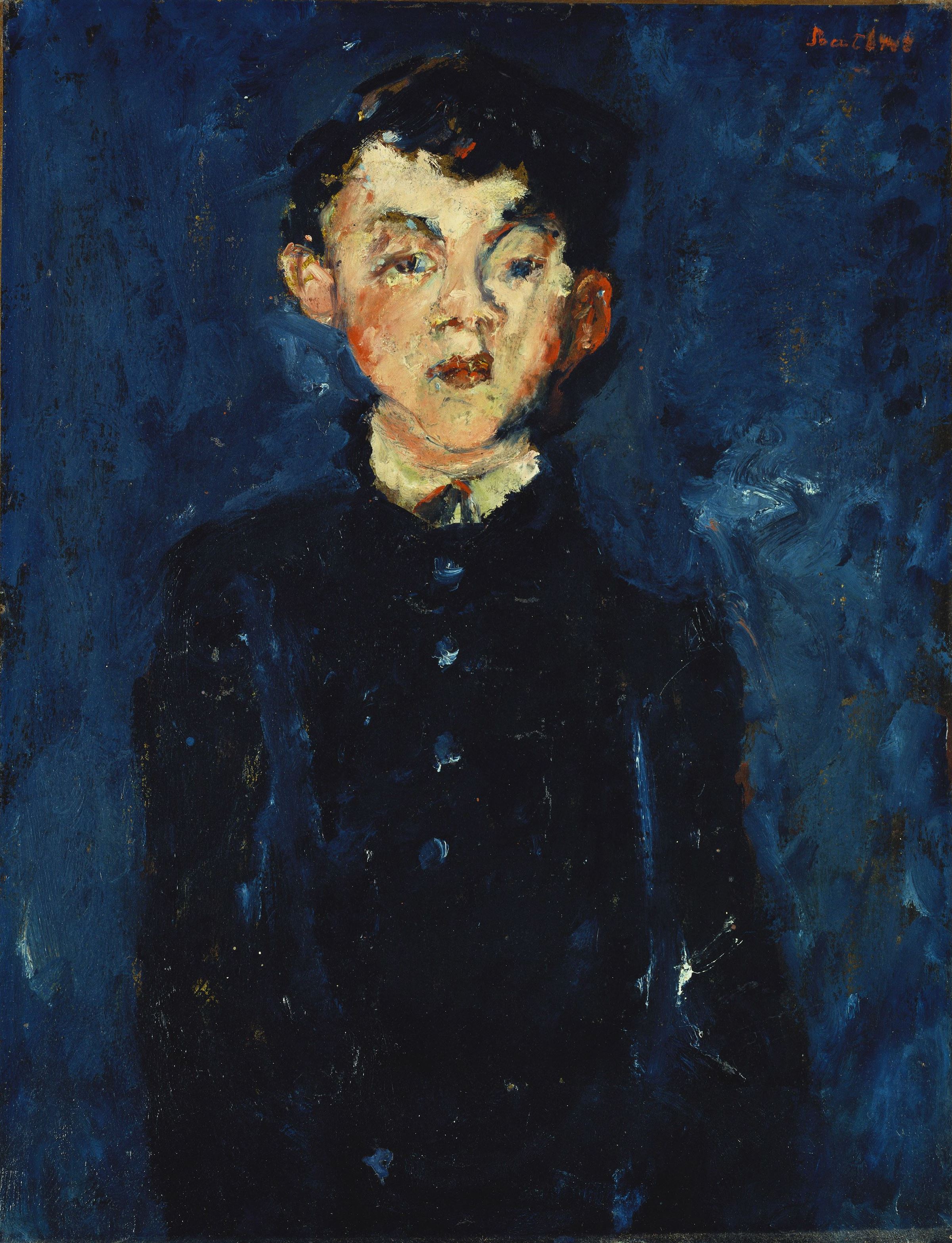
Bellboy (c.1925) Chaim Soutine © Courtauld Gallery, Centre Georges Pompidou
As with all the Courtauld Gallery exhibitions, it is small (two rooms) but thoughtfully and beautifully presented. In total there are 21 paintings, brought in from a variety of collections, public and private, hung and spaced in just the right way, with wall labels which give you just the right amount of information.
The Roaring Twenties
It was the Roaring Twenties and Paris was a cheap tourist destination, especially for Americans. The grand hotels boomed and seethed with an elaborate hierarchy of staff – waiters and maitres d’, cooks and chefs, bellboys and chambermaids.
Although all was luxury up above, in the lobby and dining room and luxury suites, the staff making it all happen and jumping at rich people’s beck and call, worked very long hours, under constant pressure, for minimum wages. George Orwell describes the hellish world of the kitchens of such a hotel in Down and Out in Paris and London.
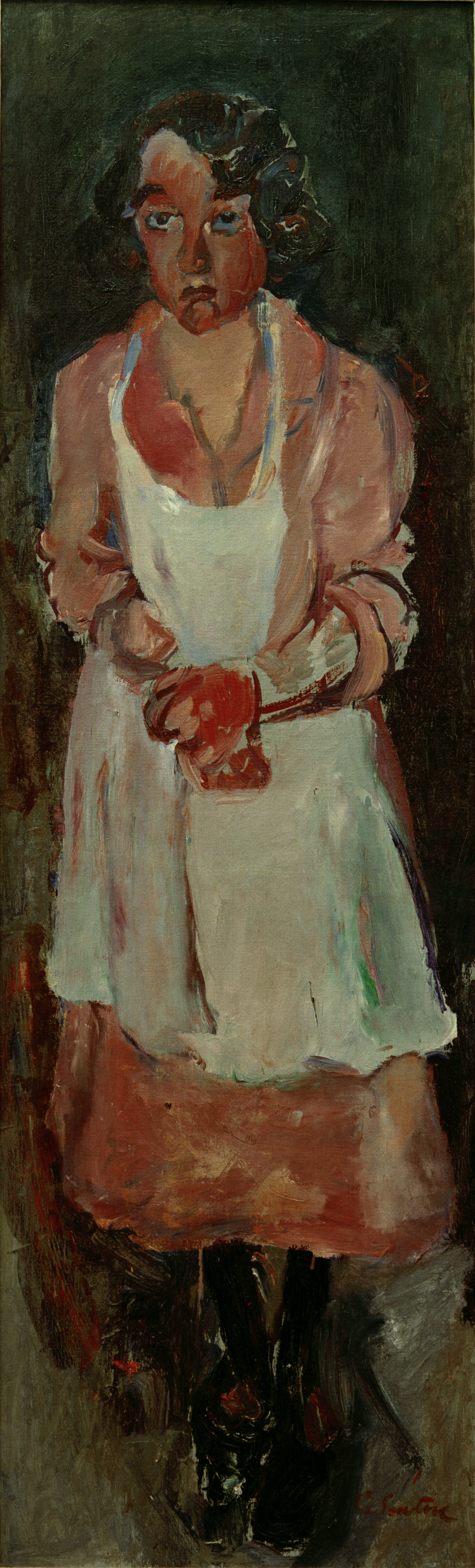
The Chambermaid (c.1930) by Chaim Soutine, Courtesy Kunstmuseum Lucerne
Twisted and distorted
Quite obviously these are figurative works in that they depict real objects, real people. Just as obviously, they are all hideously, perhaps nightmarishly, twisted and distorted. As with the current exhibition of Cézanne portraits at the National Portrait Gallery I found the commentary a touch sentimental in that it dwelt on the supposed characters, personality or feelings of the sitters. The one above, The Chambermaid, is one of the few which seem to have any facial expression and is ‘realistic’ enough to perhaps warrant a psychological interpretation. (Which is, unsurprisingly, that she looks pretty unhappy.)
But the great majority of the portraits are, in my view, too elaborately bent and deformed to really lend themselves to psychological interpretations, certainly of individuals – not least because they are unnervingly similar, the faces deliberately asymmetrical, the eyes on different levels, the skulls elongated or unnaturally thin.
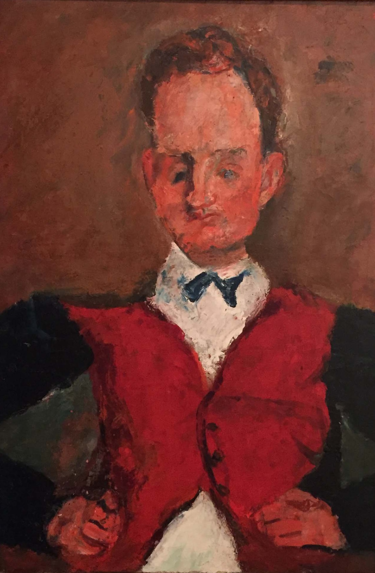
Le Valet de Chambre (c.1927) by Chaim Soutine. Private Collection, Courtesy of Ordovas
The commentary invokes one of the great cultural themes of our times, identity, to suggest that the figures are straining against the constraints of their uniforms which categorise, pigeonhole and limit them. It’s a plausible idea. But its rather undermined by the fact that Soutine nowhere, anywhere, gives his sitters names. The reverse, they are titled solely by their job description – chambermaid, cook, maitre d’.
Maybe the no-name thing was part of the general aim, to create a kind of pathos. Maybe we are meant to think: ‘Poor people, stripped of their personality, stripped even of their names, and reduced to slavish flunkeys’.
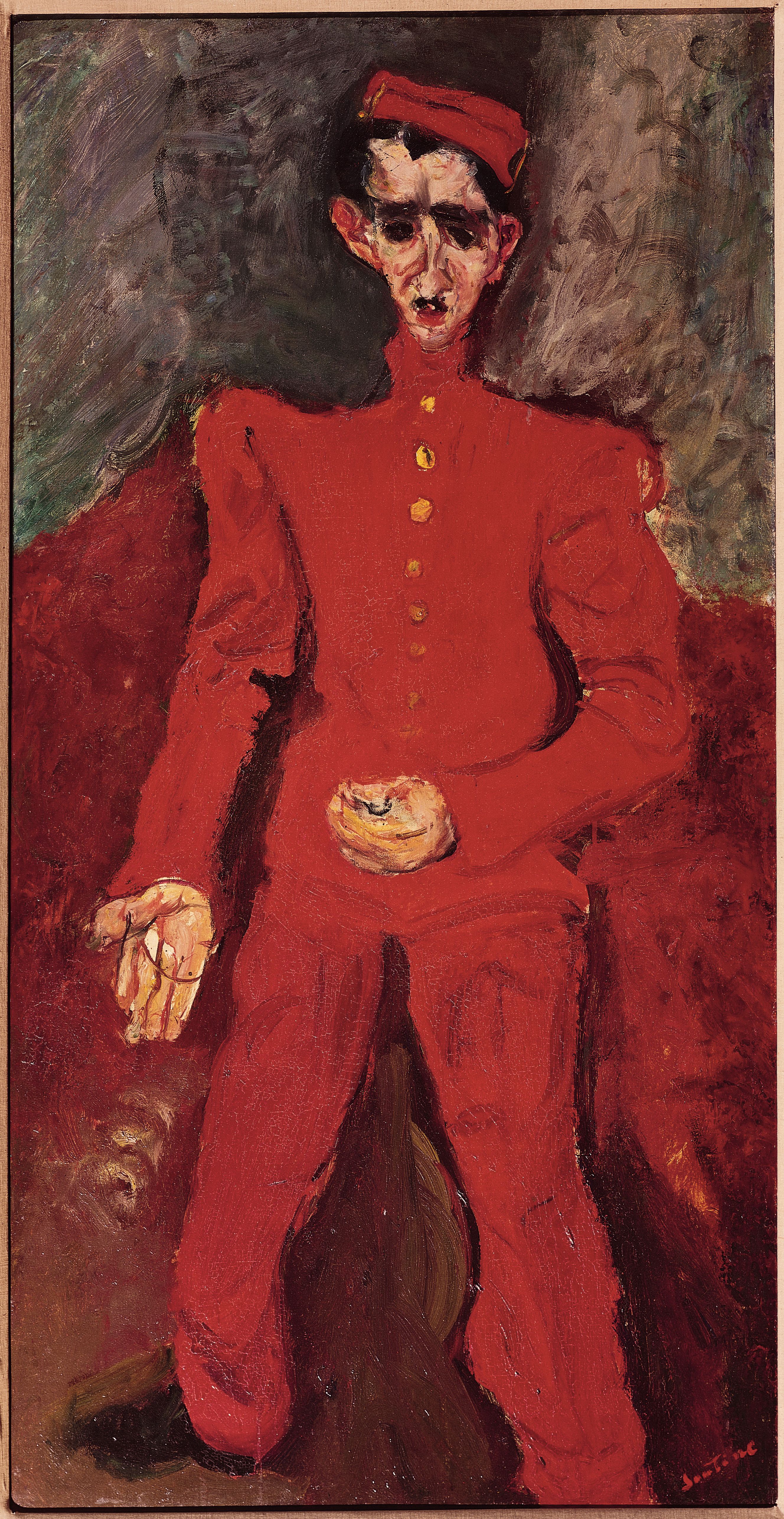
Page Boy at Maxims (c. 1927) by Chaim Soutine © Courtauld Gallery, Edmund Hayes Fund, Albright-Knox Art Gallery
Rather like in Cézanne, the sitters are placed in straightforward, point-blank frontal poses, a posture which tends to emphasise a kind of forlorn helplessness. Maybe all of this does contribute to a triste vibe.
So much for the psychology. But what I haven’t mentioned yet is the colour.
Colour
These paintings are intensely colourful. The visitor’s first impression as you enter the gallery, before you’ve even got to grips with the hotel staff idea, is of flaring reds, intense midnight blues and big whites.
There may be some kind of pathos of poverty in the pictures, but what is beyond doubt is their intense colourfulness. In particular I was bowled over in the first room on the first wall by Soutine’s use of an intense midnight blue as the abstract background to two portraits of a page-boy.
The Page Boy (c.1928) by Chaim Soutine © Courtauld Gallery, Private Collection
A blue deep enough to swim in, to merge into, to walk into and be lost forever.
In other portraits the dominant colour is white, the colour of the uniforms of the cooks and kitchen staff. But when you look closer you see it is a white made up of all kinds of shades of white, and laced with lines of blue and dabs of pink to create an intense and ravishing visual experience.
Up close you can see how the paint has been laid on thickly in confident strokes and sweeps to create a very dynamic experience. The pastry cook of Cagnes is one of the works where the commentary thinks we’re meant to feel moved by the pathos of his character etc, but I didn’t get any of that. What I saw was a brilliantly confident exercise in colour, an experiment in whites, and a dashing confidence in the sheer technique of painting with oils – the browns of the distorted chair, the shadowed whites of his buttons, the sudden flare of his red handkerchief.
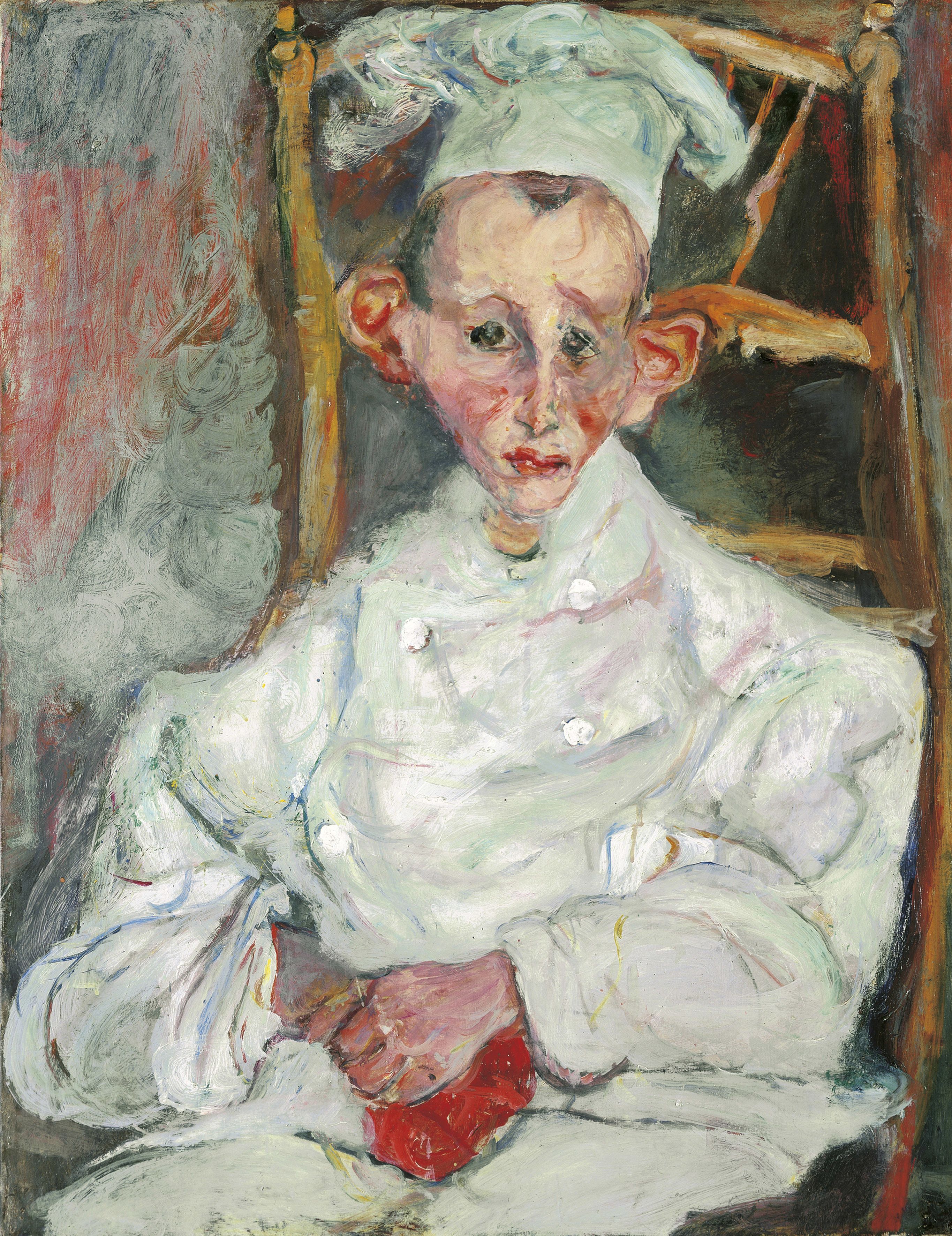
Pastry Cook of Cagnes (1922) by Chaim Soutine © Courtauld Gallery / Museum of Avaunt-Guard Mastery of Europe (MAGMA)
The humanist interpretation focuses on the standardised uniforms of maitre d’, waiter, chef and so on as constraining straitjackets. But I think it’s quite obvious that – whatever effect their uniforms had on the staff – Soutine himself was, on the contrary, inspired and liberated by the extremes of colour which they offered.
Here was a God-given excuse to create really forceful effects of colour from the bold whites, reds and blues of the different liveries, all emphasised by the full-on frontal poses, to create an almost physically jarring effect.
In this respect, maybe my favourite was Le petit patissier – not for her expression (which, quite frankly, looks much the same as the expressions of all the other sitters i.e. unreadable) – but for the extreme contrast between the midnight blue of the background and the stark white of her uniform. And for the way the two interact, so that the theoretically white smock is invaded by squiggly lines and dabs of not only blue but green and red and flesh colour – to create a strikingly bold and declarative statement.
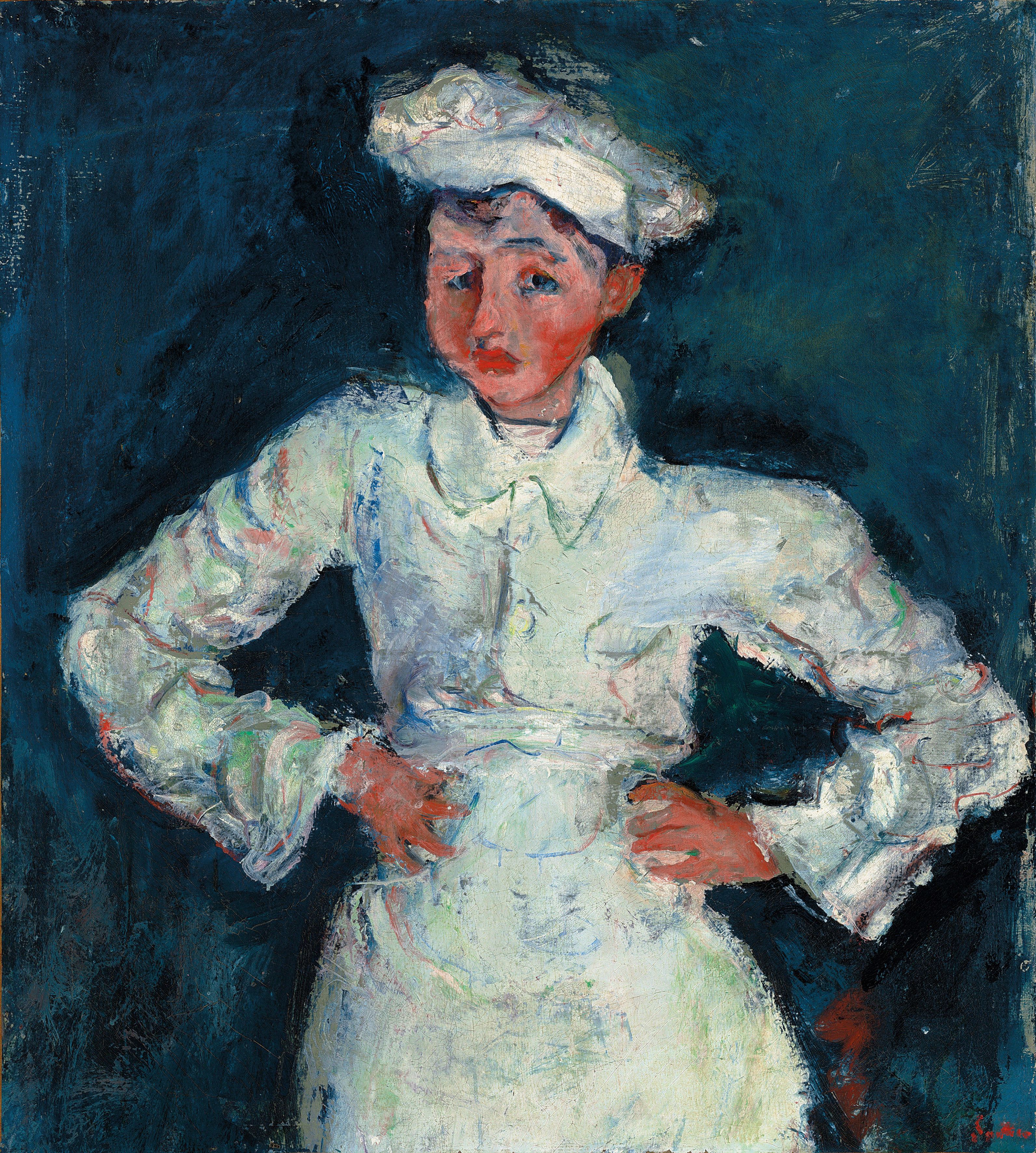
The Little Pastry Cook (Le Petit Pâtissier) 1927 by Chaim Soutine © Courtauld Gallery, The Lewis Collection.
The bold brushstrokes and really fierce colour contrasts look forward to Abstract Expressionism, a thought which had occurred before I read in the commentary that the Abstract Expressionist painter Willem de Kooning singled Soutine out as his favourite artist.
And you can also see why British artists like Frank Auerbach and Leon Kossoff, and especially Lucian Freud, cited Soutine as a key influence. The thick impasto paint. The distorted figures. Soutine got there first.
Reading around the subject, I discover that Soutine was also well known at the time for painting a series of still lives of sides of beef. Not much sentimental pathos in these portraits! although they share the same visual language, of a distorted subject depicted in extreme reds and blues.
In 2015 one of them was sold for $28 million.
The video
Every modern exhibition has a promotional video. The Courtauld had the bright idea of getting Fred Sirieix, a French maître d’hôtel best known for appearing on Channel 4’s First Dates programme, to give his professional view. Oddly for something so bang up to date, all the colours are very bleached out in this film, so that Soutine’s virulent reds look misleadingly cosy and orange.
This short montage gives you a better idea of the paintings’ vibrant colouring, but still doesn’t capture the intensity of the dark blues, bright red and wild whites which Soutine uses. To experience that fully, you have to visit this exhibition.
Related links
- Soutine’s Portraits: Cooks, Waiters & Bellboys continues at the Courtauld Gallery until 21 January 2018
