
‘Can sculpture capture what it is to be human?’ That is the question posed at the beginning of this small but varied and high-quality exhibition at the Bristol Art Gallery.
Spread over two floors, Being Human shows a selection of very different twentieth century sculptors (and a brace of film-makers) have conceived, worked, shaped and reproduced the human body.
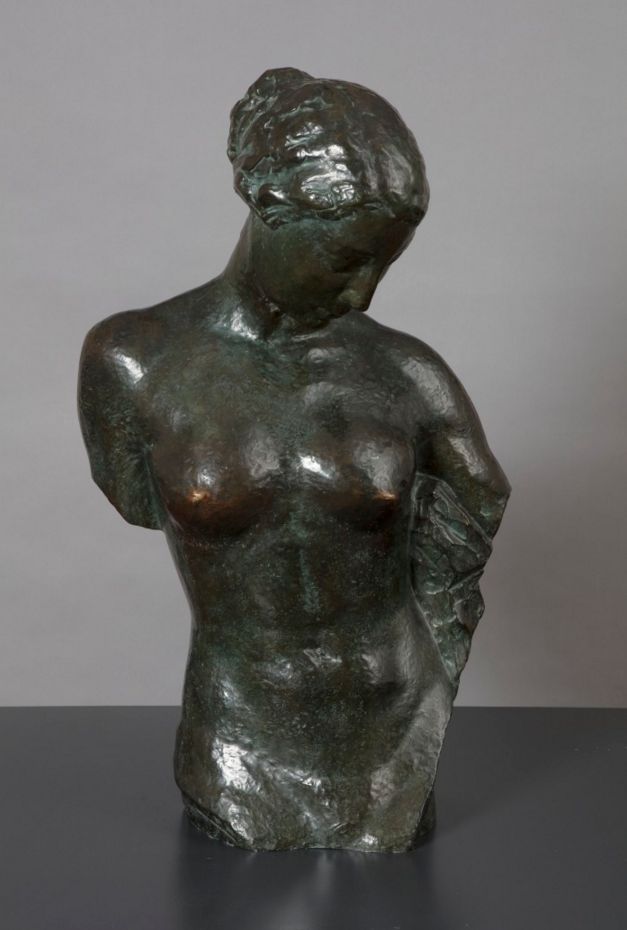
At the traditional end of the spectrum, there are female nudes such as Wilhelm Lehmbruck’s Small female torso (1910). Wearing its Greek origins on its (armless) sleeves, the hair braided like a statue of Aphrodite, looking demurely down, her diaphragm and belly button nicely defined, the nipples oddly burnished as if generations of gallery goers have touched them for good luck or other purposes.
La Jeunesse by Robert Wlerick (1935)
Whereas only a few yards away, and well on the way to the abstract end of the spectrum, is Ken Armitage’s Moon Figure of 1948. This was my favourite piece in the second room, although a moment’s reflection suggests it is less a bold leap forward into modernity than an appropriation of Cycladic art from around 3,000 BC – even down to the crossed arms, which feature in so many really ancient Greek statues.
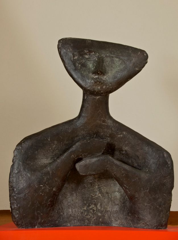
Moon Figure by Kenneth Armitage (1948)
More thoroughly abstract were Yee Soo Kyung’s Translated vases number 8 of 2012. Yee has smashed up ceramics into fragments which she then reassembles using the traditional art of kintsugi, visible repairs in gold, to create something which is only vestigially ‘human’ at all in form.
In the first room is maybe the best, or my favourite piece, from the exhibition, Help by Bernard Meadows. It’s from as long ago as 1966, and is one of a series Meadows began to make in the mid-60s expressing ‘human fear and anxiety’. The idea is that crushed sphere is crying for help, and that the piece pays tribute to the harrowing existentialist philosophy of Jean-Paul Sartre. Does it, though? If you hadn’t read all that, might you not mistake it for a bit of sculptural fun by a jokey modern artist like Anish Kapoor?
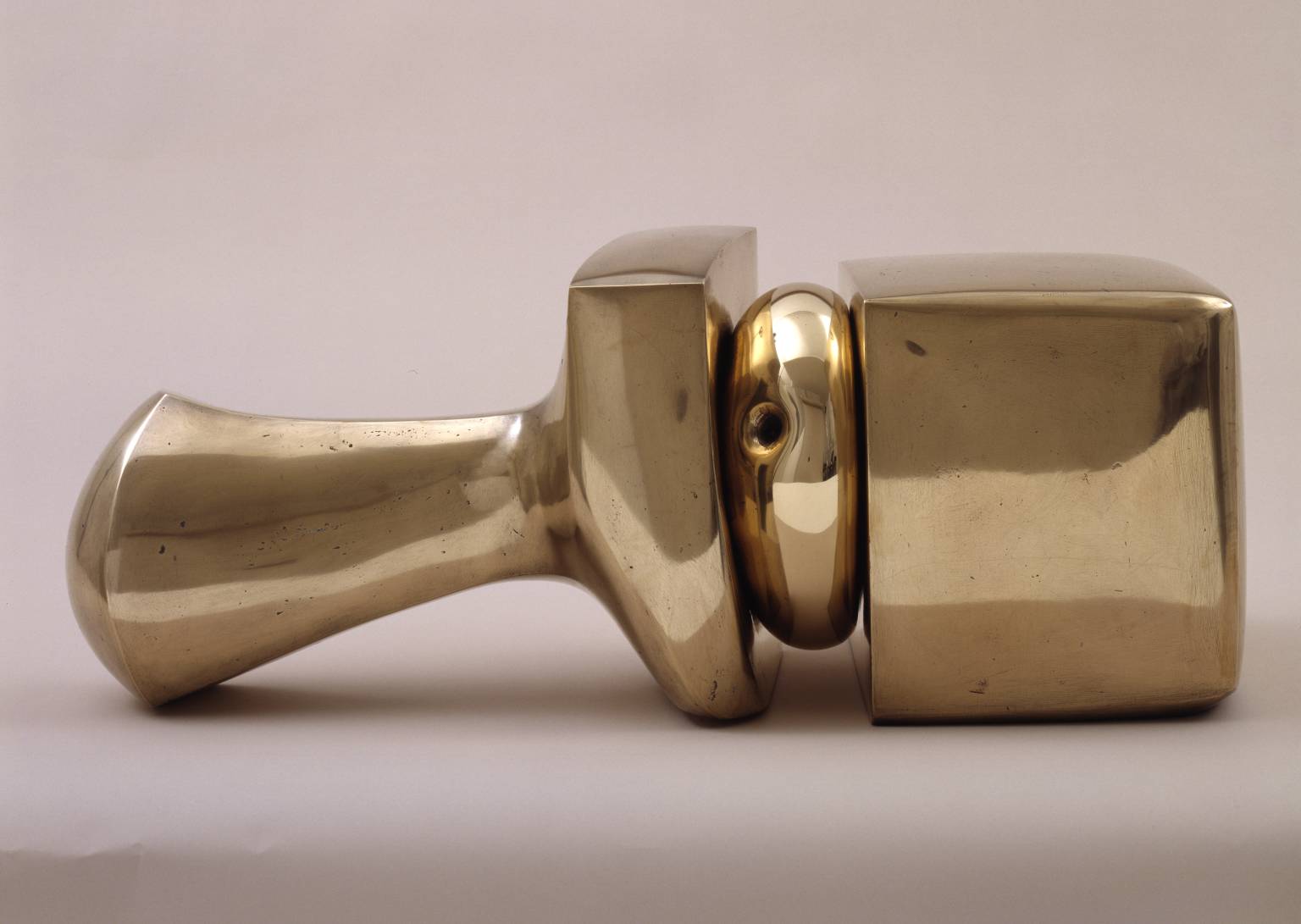
Help by Bernard Meadows (1966) Tate
The wall labels tell us that at the core of the exhibition is a set of works associated with the so-called ‘Geometry of Fear’ school of British sculptors. According to the Tate website:
Geometry of Fear was a term coined by the critic Herbert Read in 1952 to describe the work of a group of young British sculptors characterised by tortured, battered or blasted looking human, or sometimes animal figures.
Read used the phrase in a review of the British pavilion at the Venice Biennale of that year. The British contribution was an exhibition of the work of the group of young sculptors that had emerged immediately after the Second World War in the wake of the older Henry Moore. Their work, and that of Moore at that time, was characterised by spiky, alien-looking twisted and tortured figures.
They were executed in pitted bronze or welded metal and vividly expressed a range of states of mind and emotions related to the anxieties and fears of the post-war period. The artists were:
- Robert Adams
- Kenneth Armitage
- Reg Butler
- Lynn Chadwick
- Geoffrey Clarke
- Bernard Meadows
- Eduardo Paolozzi
- William Turnbull
Of their work Read wrote:
These new images belong to the iconography of despair, or of defiance; and the more innocent the artist, the more effectively he transmits the collective guilt. Here are images of flight, or ragged claws ‘scuttling across the floors of silent seas’, of excoriated flesh, frustrated sex, the geometry of fear.
Possibly the most ominous figure here is one of Elizabeth Frink’s many space-age, sculpted heads, brooding and minatory.
Prisoner by Elisabeth Frink (1988)
To quote the wall label:
As a child in the Second World War, Elisabeth Frink witnessed falling planes and burning soldiers in the airfield near where she lived. On a holiday in Devon she had hidden in the bushes to avoid getting caught in the crossfire of a battle. These visions haunted her sculpture which examines the human capacity for cruelty. She was taught by Bernard Meadows, one of the postwar ‘Geometry of Fear’ artists. Frink added pity to their earlier generation’s images of alienation. Prisoner has a hypnotic vulnerability.
Maybe all this angst is true of half a dozen of the works on show here, but there are plenty of other utterly angst-free enjoyments of the physical heft and thews of the human body conceived as a big solid object in space.
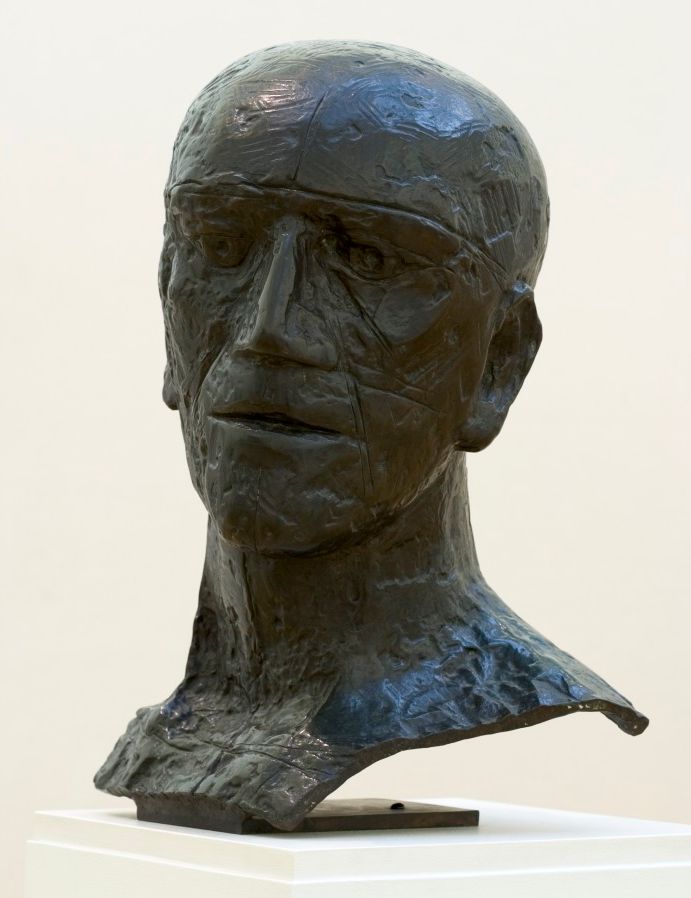
Thus there is nothing particularly fearful about Henri Gaudier-Brzeska’s bust of Horace Brodzky. Brodzky was an artist and critic, and Gaudier-Brzeska made the work as he was falling under the influence of – or influencing – the pre-war London movement known as Vorticism, which was much fascinated by planes and lines and angular shapes, cubes and squares.
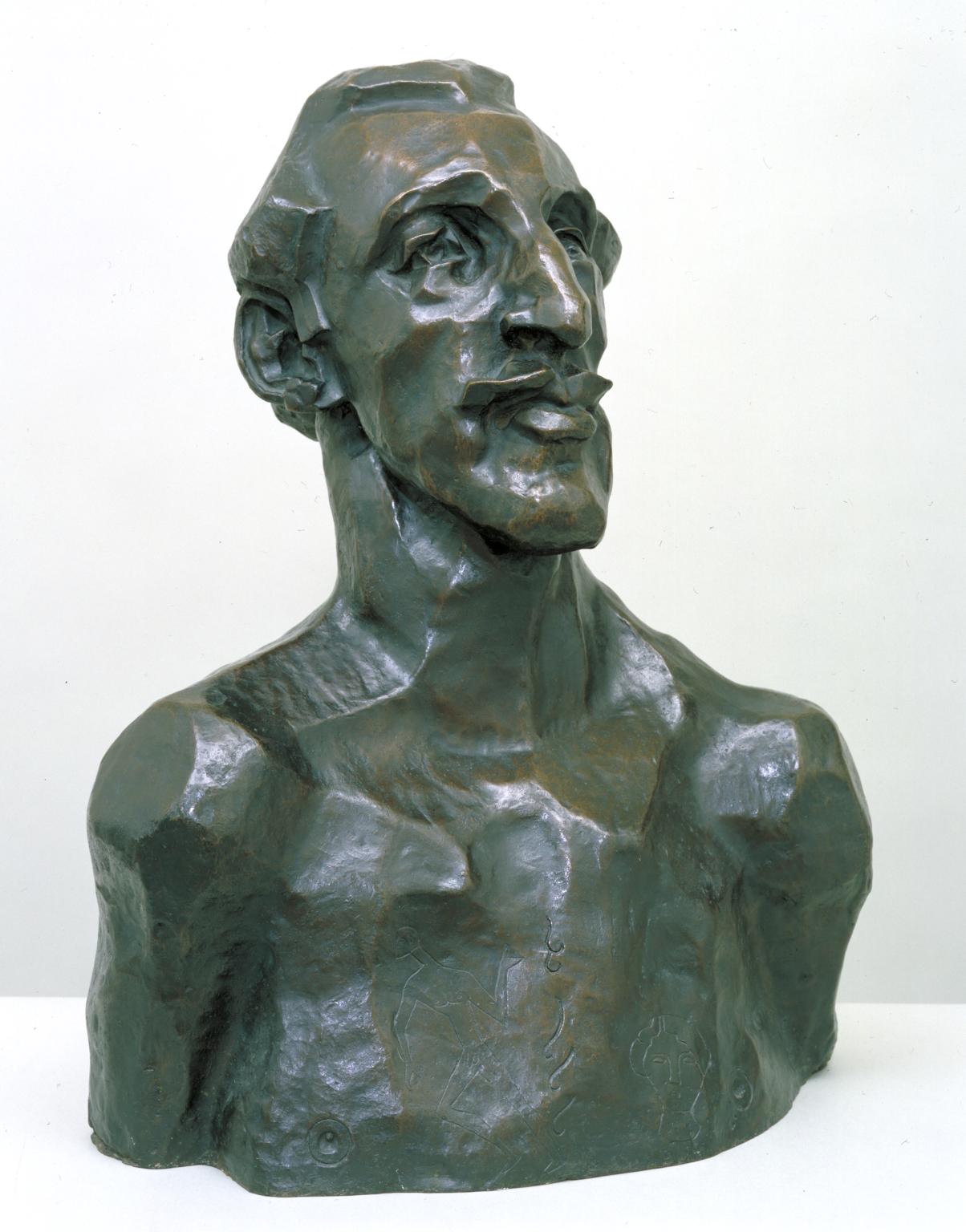
Horace Brodzky by Henri Gaudier-Brzeska (1913, cast 1956)
And what could be more prosaic than a sculpture of a woman bending over to dry her feet, which combines a posture from degas with the clunky clayiness of Rodin’s sticky fingers.
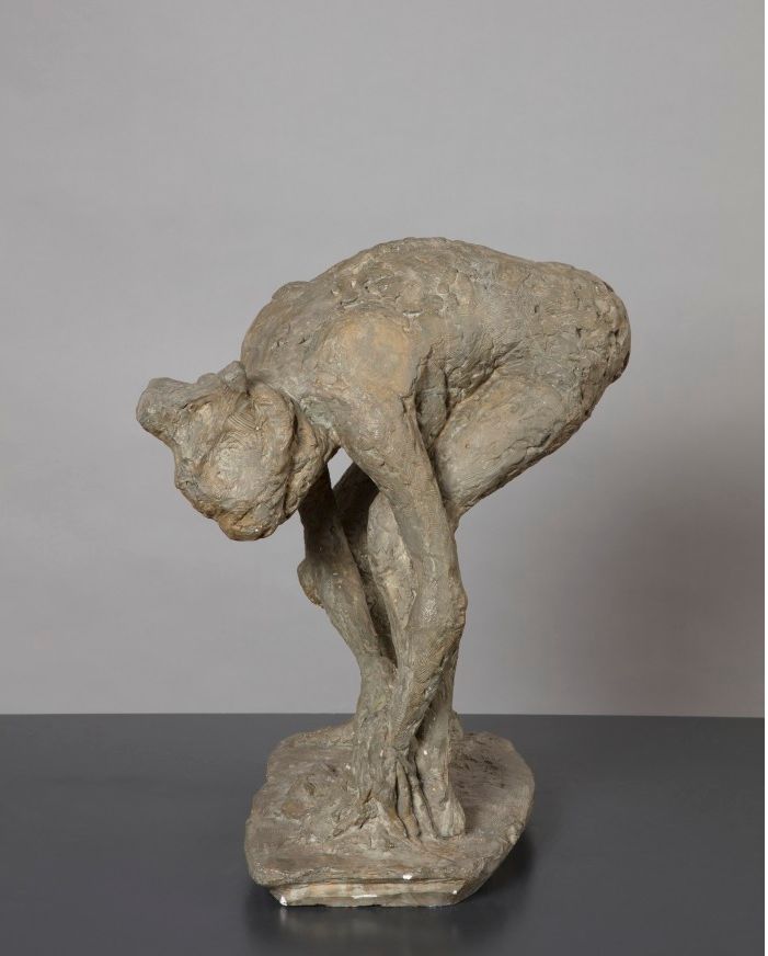
Woman Drying her Feet by Hubert Dalwood (1955)
And the curators astonished me by singling out as one of the most sexy or erotic statues, this exercise in elongation by Reg Butler, one of the geometry of fear sculptors who didn’t let his existentialist alienation stop him from producing numerous sculptures of naked or nearly naked girls.
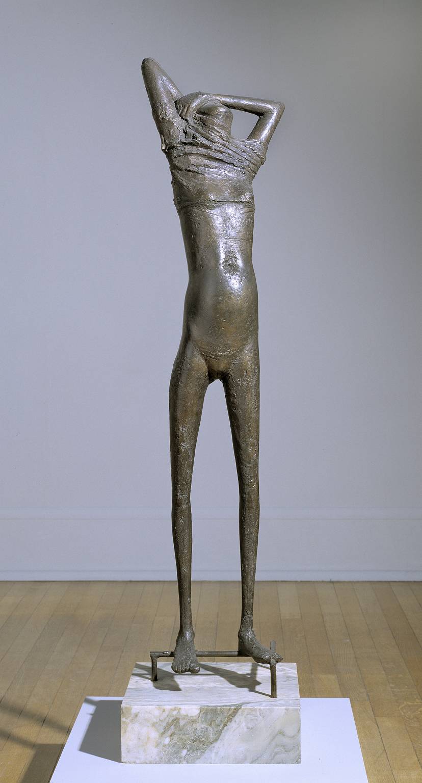
Girl by Reg Butler (1953 to 1954)
An example of post-war deformation, influenced by Alberto Giacometti’s walking stick people, her head worryingly disappearing into a blunt dollop, her bulemic pre-pubescent body scrawny with malnutrition… but sexy? Not to my mind.
Featured sculptures
- Ken Armitage – Moon Figure (1948)
- Emile-Antoine Bourdelle – La Bacchante (1909)
- Ralph Brown – Lovers
- Reg Butler – Girl
- Lynn Chadwick – Idiomorphic Beast 2017
- Frank Dobson – Noni
- Hubert Dalwood – Woman Drying her Feet
- Jacob Epstein – Sleeping Baby
- Jacob Epstein – Hands of Nan
- Jacob Epstein – Kathleen (1935)
- Elisabeth Frink – Prisoner bronze
- Henri Gaudier-Brzeska – Bust of Horace Brodzky
- Henri Gaudier-Brzeska – The Wrestler
- Wilhelm Lehmbruck – Small female torso (1910)
- Bernard Meadows – Help
- Robert Wlerick – La Jeunesse (1935)
- Yee Soo Kyung – Translated vases number 8 (2012)
Drawings
- Elizabeth Frink – Horse and rider (1970)
- Henri Gaudier-Brzeska – Woman on horseback
Films
Two films are included. What have they got to do with sculpture? Nothing whatsoever, that I can make out. A film is a film is a film, although they are both about ‘the body’.
- Mary Reid Kelley – This is Offal
- John Wood & Paul Harrison, 1994 – Harry Houdini (there’s no escape that I can see)
Conclusion
Curators have to come up with themes and ideas for exhibitions, and ‘twentieth century sculptures of the human body’ is a reasonable enough theme – although it is odd to include a couple of very average drawings, and some completely off-the-wall videos into the mix.
But then its quirkiness is, maybe, the appeal of this small-ish exhibition. Coherence is over-rated. The very fact that the pieces are so disconnected and random creates more space for the visitor to wander around them and relate to each one individually, trying to figure out which ones you like, and why.
And, incidentally, hints at the extraordinary explosion in ways of seeing and conceiving and making art which occurred in the twentieth century and which this tiny but intriguing selection represents.
Related links
- Being Human: An exhibition of modern sculpture continues at Bristol Museum and Art Gallery until 4 October 2020


