
Fidel Castro’s revolutionary 26th of July Movement and its allies defeated the military dictatorship of Cuban President Fulgencio Batista in January 1959. The new revolutionary government enacted a wide array of new domestic laws and policies, but Castro always saw the revolution in Cuba as just the beginning of the liberation of the oppressed masses in not just Latin America but war-torn Africa and around the world, wherever the poor and downtrodden were oppressed by colonial or neo-colonial masters.
OSPAAAL
And so the Organization of Solidarity with the People of Asia, Africa and Latin America (in Spanish the Organización de Solidaridad con los Pueblos de Asia, África y América Latina – abbreviated to OSPAAAL) was set up to fight globalisation, imperialism, neoliberalism and defend human rights, in Havana, in January 1966, after the Tricontinental Conference, a meeting of over 500 delegates and 200 observers from over 82 countries.
One of the first things the organisation did was establish a magazine to publicise its causes and titled Tricontinental. From 1966 into the 1990s more than fifty designers working in Havana produced hundreds of posters and editions of the magazine which expressed solidarity with the U.S.A.’s Black Panther Party, condemned apartheid in South Africa and the Vietnam War, and celebrated Latin America’s revolutionary icons, as well as criticising the ongoing existence of U.S. military bases in Guantanamo Bay, calling for the reunification of North and South Korea and many other radical causes.
The exhibition includes some 33 of the total of 50 or so artists and designers who worked for OSPAAAL, including leading lights such as Alfredo Rostgaard, Helena Serrano, Rafael Enríquez and Gladys Acosta Ávila.
Unlike artists in the Soviet bloc the OSPAAAL designers weren’t shackled by the deeply conservative doctrine of Socialist Realism, but were free to pick and choose from all the best streams of current art, including Pop Art and psychedelia. They also co-opted images and ideas from capitalist adverts into what they called ‘anti-ads’.
The plan was for the posters to be stapled into copies of Tricontinental, and so distributed around the world. Because the posters were intended to be internationalist they had to use strong primal languages or find inventive ways of conveying their message. If any writing was used it was generally in the three major languages of Spanish, English, French, and sometimes Arabic.
By the mid-1980s heavy trade embargos and sanctions imposed by American had created such shortages that it ultimately forced the organization out of production. By that time approximately 326 OSPAAAL posters had been produced.
Altogether it’s estimated that some nine million OPSAAAL posters were distributed around the developing world. At its peak the magazine had more than 100,000 subscribers, mostly students. At one time, it was common for posters from issues of Tricontinental to be put up on the walls of student community centres.
This exhibition brings together 170 works (100 posters and 70 magazines) produced by 33 OSPAAAL designers, created between 1965 and 1992, which are not only striking and dramatic art works in their own right but shed unexpected insights onto the long history of the Cold War.
The Mike Stanfield Collection
While originally distributed freely in editions of thousands, OSPAAAL posters and magazines are now rare and highly sought-after. The works in the exhibition are all drawn from a single UK private collection – The Mike Stanfield Collection, the largest collection of OSPAAAL material in the world, gathered by British collector Mike Stanfield over a 25-year period. Every work in the exhibition is drawn from his collection.
Posters
The poster designers used every trick in the toolbox of capitalist advertising plus a lot more they invented. The diversity and inventiveness of approaches is astonishing. Obviously the cause, the fundamental political aim of the posters, was deadly serious – but this didn’t stop them using scathing satire to make their points.
And above all they didn’t limit themselves to one aesthetic but seized an extraordinary freedom to experiment, with the result that you see everything from bold typography and photomontage to psychedelic colours and pop culture-inspired graphics, iconic modern imagery or ancient native objects pressed into service, silhouettes, psychedelic reverberating, cartoons and biting satire.
Cuba
The first edition of Tricontinental included an article by Ernesto ‘Che’ Guevara and a folded poster by Alfredo Rostgard, thus inaugurating its two-pronged approach to radical propaganda: text for those who could read, stirring images for those who couldn’t.
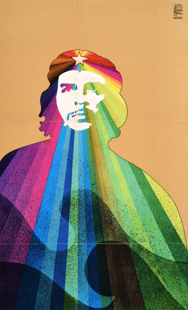
Che Guevara (1969) © Alfredo G. Rostgaard, OSPAAAL. The Mike Stanfield Collection
It’s almost too obvious to point out but, in the Soviet bloc, the canon of revolutionary heroes from Marx through Lenin, Stalin on down, were all portrayed in real, or heroically socialist realist style. It takes a moment’s reflection to realise how utterly unlike that dull stifling tradition the OPSAAAL images are, freely taking from contemporary pop and op art and psychedelic art.
Africa
The designers were tasked with distilling complex anti-colonial conflicts down into simple but striking images, symbols which would require little or no explanation. This image of African women in traditional costume and carrying their babies in baby-carriers is made vivid and powerful by the addition of the semi-automatic rifles slung over their other shoulders.
The all-consuming nature of the struggle, the need to balance ordinary life with the struggle, the empowered role of women in the struggle, and the lack of facial features indicating that these are just two out of millions and millions anonymous fighters across the continent, are all brilliantly conveyed.
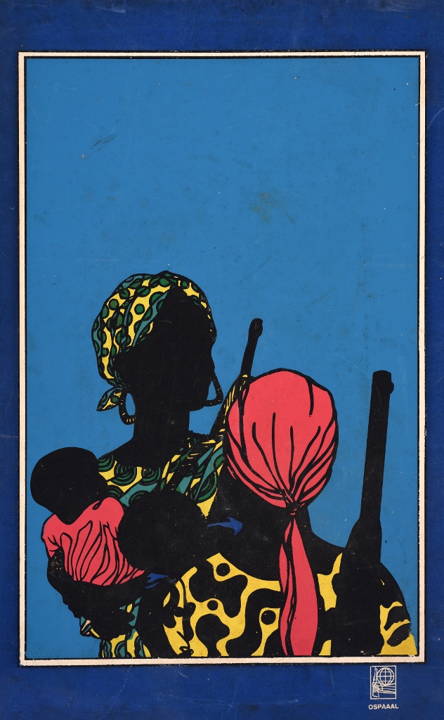
After Emory Douglas (1968) © Lízaro Abreu Padron, OSPAAAL. The Mike Stanfield Collection
Apartheid
Apartheid was a sore on the conscience of the world throughout the 1960s, 70s and 80s. Many of the OPSAAAL posters were simple images of oppression. This is unusual in being a more narrative image, with its four pictures showing the progressive, and inevitable, collapse of the repressive regime. Note the use of the four cardinal languages, Spanish, English, French and Arabic.
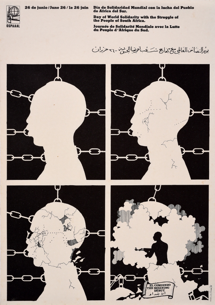
Day of Solidarity with the Struggle of the People of South Africa (1974) Olivio Martinez Viera, OSPAAAL. The Mike Stanfield Collection
Asia
The Vietnam War came to symbolise neo-imperialist Western super-violence against nationalist independence struggles and crystallised America’s reputation as the great enemy of freedom for many Third World countries.
This clever poster shows the word Saigon slowly morphing from being dominated by the Stars and Stripes to bearing the flag of the communist North, suggesting that the rebels would win in the end. As they did.
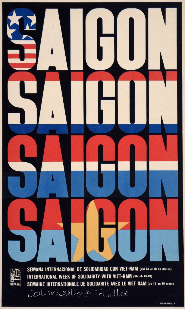
Saigon, International Week of Solidarity with Vietnam (1970) © Rene Mederos Pazos, OSPAAAL. The Mike Stanfield Collection
Anti-America
Cuba is just 90 miles from the American mainland.
From the moment Castro’s revolution succeeded, the Americans tried to overthrow it. In 1961 they launched the embarrassing Bay of Pigs invasion which ended in humiliation, but continued making intermittent attempts to assassinate Castro, as well as imposing crippling sanctions on its tiny neighbour.
In response Cuba helped to focus the world’s attention on America as the heartland of neo-colonial oppression. Some of the most powerful images in the exhibition distort and subvert imagery and symbols central to American culture, such as the Great Seal, the Bald Eagle, the Statue of Liberty or, as here, Uncle Sam himself, zapped by the power of the World Revolution.
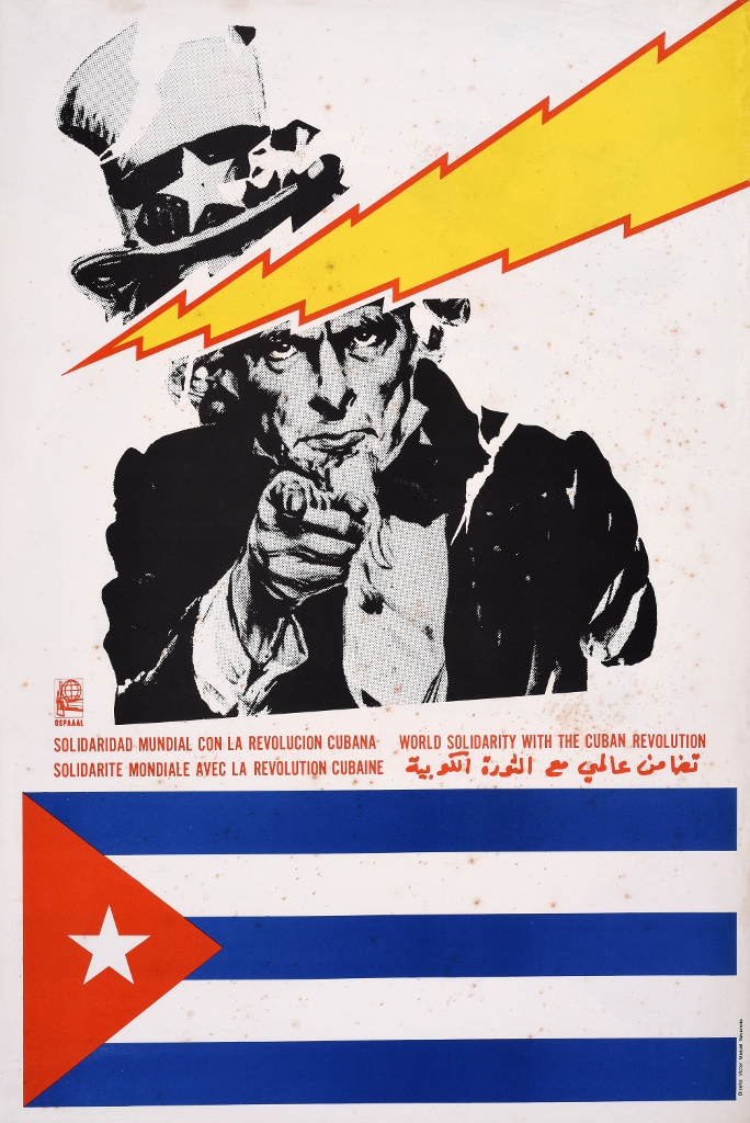
World Solidarity with the Cuban Revolution (1980) © Victor Manuel Navarrete, OSPAAAL. The Mike Stanfield Collection
Using native cultural heritage
As a way into contemporary liberation struggles in Latin America, Asia or the Far East, some OPSAAAL designers had the idea of taking traditional indigenous artefacts and giving them a modern spin, mostly putting a machine gun in their hands. Some of these aboriginal peoples also represented the very first resisters to the colonial oppression which their distant descendants were now fighting against.
This approach tapped into nationalist feelings in the respective countries, and also made contemporary protesters feel, or realise, that they were in fact part of a long, long lineage of resistance and protest. The ten or so images which used old imagery like this were among my favourites.
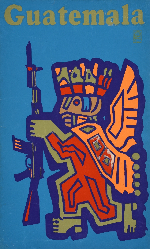
Guatemala (1968) © Olivio Martinez Viera, OSPAAAL. The Mike Stanfield Collection
Magazine covers
To some extent the designers’ style was dictated by a shortage of materials, including good quality paper and printing ink, embargoed by the United States. This encouraged the designers to eschew subtlety in shade and contour and favour high-contrast photography and large areas of clearly defined colour. Tricontinental’s often starkly simple covers were printed in four colours by offset lithography.
Anti-America
Although little Cuba suffered badly from American sanctions, during the 60s and 70s there were many radical American supporters of the revolution. The San Francisco-based People’s Press published a North American edition if Tricontinental, and images created by Emory Douglas for the Black Panther Party newspaper were adapted for use by OPSAAAL.
There are posters here supporting the imprisoned black activist Angela Carter, as well as memorials for various black radicals shot or imprisoned in America. But in a way, it was the imaginative symbols of American oppression which make the most impact.
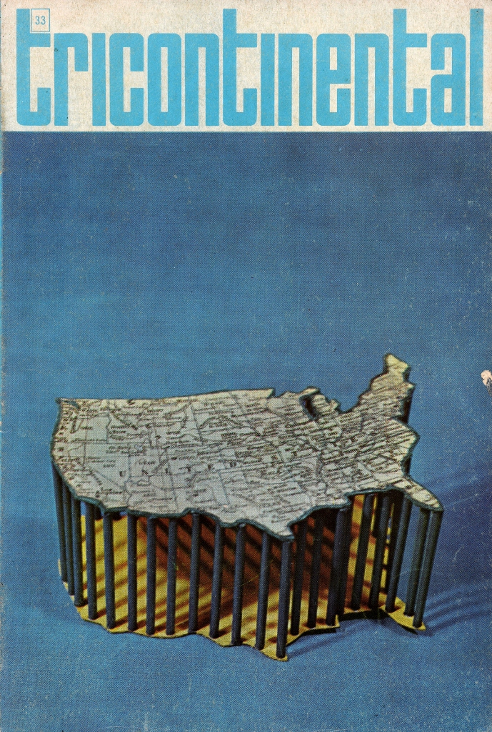
Tricontinental magazine 33
Anti-apartheid
Apartheid was in force in South Africa from 1948 to 1994. It was only the most extreme version of institutionalised white racism, which also included the segregation laws in America, so vehemently protested by the Civil Rights Movement.
For me the OPSAAAL posters and Tricontinental cover art are at their best when they embody a really strong design idea, as in this simple but scathing image, a piece of Pop Art collage used to withering effect.
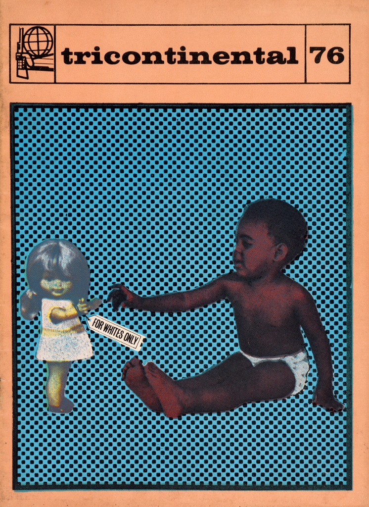
Tricontinental 76
Thoughts
1. Taken together they make up a fascinating review of visual styles and approaches available to political poster makers in the late 60s and 70s. In many ways the magazine covers are even more inventive and biting than the posters. Lots and lots of them have a really strong visual and intellectual impact, like the image – blown up, here, into a wall-sized hanging – of an American astronaut reaching out to the moon while standing on the backs of two prone African Americans.
2. It’s a reminder of just how much conflict there was around in the world in the 1970s when I grew up, with military dictatorships running most of South America, with colonialist regimes and apartheid South Africa still repressing millions of Africans, while millions of others were caught up in brutal civil wars, and then topping everything the nightmare of Vietnam which was promptly followed by the living hell of the Khmer Rouge regime in Cambodia.
When you factor in that half of Europe was under Communist tyranny and there was an endless diet of scares about whether this or that incident might trigger World War Three, the world I grew up in seemed a much more violent and dangerous place than it does today.
3. This is embodied in the way there are so many guns in the posters. Almost all the native artefacts-updated ones simply put guns in the hands of tribal gods. In the last room in particular, almost every poster seemed to feature a man or woman or sometimes an inanimate object, holding a sub-machinegun. Stepping back from the rights and wrongs of the causes, the final room in particular gave me a claustrophobic sense of violence and fighting going on in every part of the world.
That’s maybe the main feeling the exhibition gave to me, but other visitors will find their own threads and meanings. Above all I defy you not to be thrilled by the sheer inventiveness and exuberance of so many of the works on display.
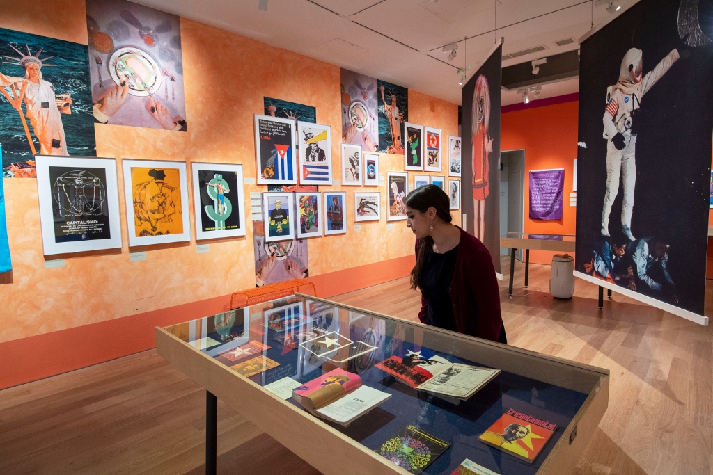
Installation view of Designed in Cuba at the House of Illustration. Photo by Paul Grover
And it’s worth pointing out that the curators of the exhibition flew to Cuba specially to interview the surviving OPSAAAL designers and that the exhibition includes the resulting video, in which leading designers such as Alfredo Rostgaard, Rafael Enríquez and Gladys Acosta Ávila explain at length their motivation and approach, the design ideas and technical constraints, which lay behind the Tricontinental phenomenon.
This is another brilliantly conceived and beautifully laid out exhibition from the House of Illustration.
Related links
- Designed in Cuba: Cold War Graphics continues at the House of Illustration until 19 January 2020
- Tricontinental website
